Westminster Online Learning

Education Without Limits

Westminster Online Education Web Design Responsive

Quick Overview

The Background

The exceptional quality of the education provided at Westminster Theological Seminary has been internationally renowned for decades. But how can classes be redesigned to enhance learning for a new generation of online students, who aren’t physically present on campus? As a long-term partner to the Seminary, we stepped up to address the challenge of marketing their new online education initiative and ultimately, bring the classroom to the students.

Student Centered

We developed campaign messaging that taps into the real physical and emotional value of distance learning.

Data Driven

We featured key student metrics and a star-based review system to communicate the real-world value of the program at a glance.

Forward Thinking

We developed an impressive brand and website that showcases the technology-forward learning experience without losing the institutional credibility of WTS.

01

A Strategic Brand Foundation

How can we leverage the historical prestige and credibility of a renowned Seminary, while simultaneously promoting a new, technology-driven model of learning? We started to explore this and many other fundamental questions as we developed a brand strategy for the new program.

Research & Audit

Our market research and comprehensive industry audit revealed that the world of online education was lacking in visual consistency and thoughtful brand hierarchy. Without a standard industry playbook to start from, we looked to the equity of the strong residential WTS brand.
Developing a Sub Brand

After reviewing an array of solutions, we recommended that the new logo clearly reference the parent brand, while ensuring the new program could be identified as online education at a glance with a more modern, tech-driven feel.

Communicating the Real Value

Inspired by the diverse success stories of online education graduates, we developed a marketing campaign that highlighted the important responsibilities and commitments of remote students rather than program features or benefits. From homeschooling to elder care to essential jobs, we represented a variety of meaningful life scenarios to express the real value behind this modern format of education.

02

A Smart Digital Strategy

What might compel a potential student to request more information about the Seminary’s online programs? What content is most critical in their journey throughout the site? We audited existing online learning websites, developed thorough user profiles, and mapped a strategic approach to the website’s content.  

Finding What Works

Exploring the websites of peer seminaries and online education leaders offered the opportunity to discover what was working well, what could be done better, and what was commonly being offered by other programs. This helped us compile lists of musts, shoulds, and differentiators on which to build the digital strategy. By better solving users’ problems, we helped position WTS as more qualified than the competition.

Building an Effective Structure

We built an effective site architecture and wireframes that considered the journey for each of our audience groups. We structured the site to be simple and straightforward, with clear conversion points throughout.

Understanding the Audience

User personas and audience journey maps allowed us to pose scenarios of interaction with the site, ultimately leading to a more targeted and intuitive experience for each identified audience. Initial surveys and social media feedback indicated that interest was broad, resulting in a comprehensive set of profiles that covered various levels of technical aptitude, global geographic locations, and wide-ranging age groups.

03

A World-Class Web Design

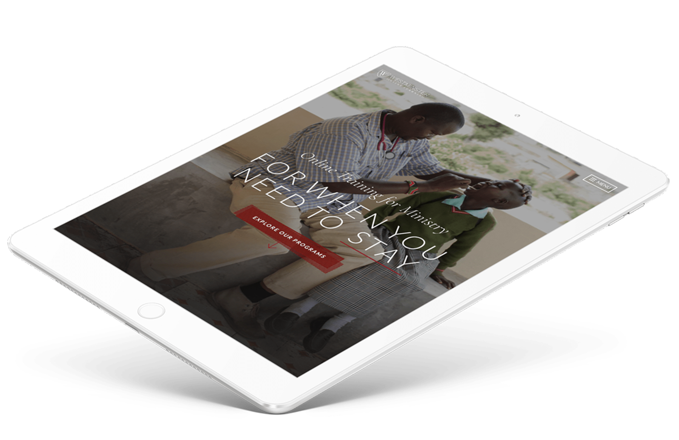
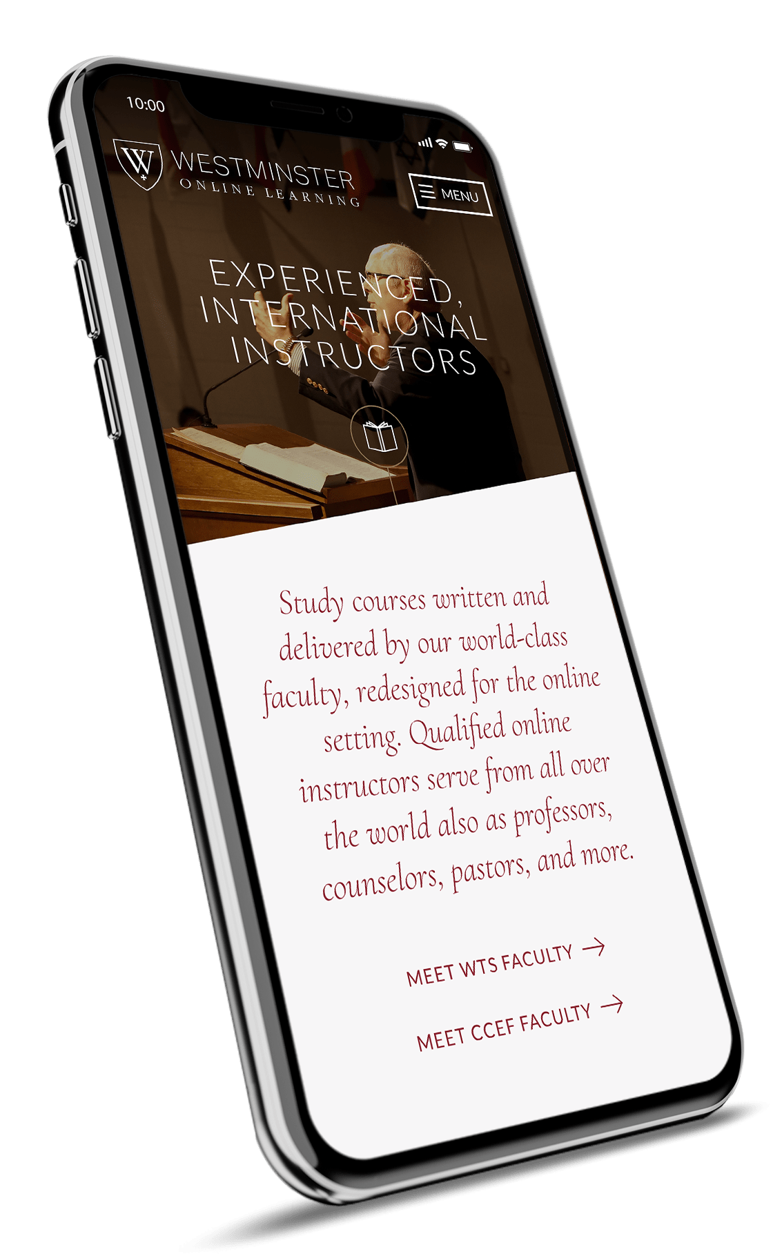
We recommended an overall approach to technology that focused on a user-centric experience while taking special care to remain simple and minimal. Built on WordPress, the site is quick to load, seamless on mobile, and full of subtle animations that bring a sense of sophistication to the user experience.

A Cutting-Edge Experience

We built a unique page dedicated to the experience of learning online with Westminster that showcases the exciting platforms and tools available to students. From engaging online instruction videos and animations to the integration of Facebook’s Workplace platform, this section of the site was designed to impress.

Program Details

As students drill down into specific programs, detailed information on the program structure, schedule, and benefits is presented alongside compelling testimonials and star-based student reviews. When it’s time to apply, the Admissions page allows prospective students to schedule time with a counselor or get started with the innovative, interactive video-based application process.

04

Web Development & Technical Considerations

We recommended an overall approach to technology that focused on a user-centric experience while taking special care to remain simple, minimal, and user friendly. Built on the robust WordPress platform, the website is quick to load, seamless on mobile, and full of subtle animations that bring a sense of sophistication to the experience.

Instant Assistance

We integrated Intercom to facilitate instant engagement between prospective students and the WTS admissions team. Intercom allows the admissions staff to receive direct notifications and to respond personally – maximizing lead generation and customer service.

Seamless Scheduling

We embedded Calendly on the site to streamline the admissions process. Users can schedule a time directly on an admissions counselor’s calendar in real time without ever leaving the site.

05

A Resounding Success

The buzz around the new Westminster Online Learning program was so great that classes were sold out well in advance of the first semester. The new web design helped attract customer interest across 60 countries that grew revenue $4M+ in the first two years with nearly 60% annual growth thereafter.

Online Education Web Design Results
Initial Revenue Growth
$4M+
Seminary revenue grew $4M+ in first two years as a result of the new Online program, with nearly 60% annual growth year-over-year thereafter.
Student Retention Rate
98%
The student experience is excellent, with 98% student retention, 100% student support satisfaction, and hundreds of 5-star course and instructor reviews.
Quote
Our team is floored with the direction on this. Love everything. Agree with literally every idea you have here – just fantastic!
– Director of Online Learning, WTS

More Like This

Brand Strategy // Logo Design // UX Strategy // Web Design & Development // Graphic Design

Push10 Arrow

UX Strategy & Planning // Web Design & Development

Push10 Arrow