The Woods System of Care Website Design & Development
Transforming a World Class Health System

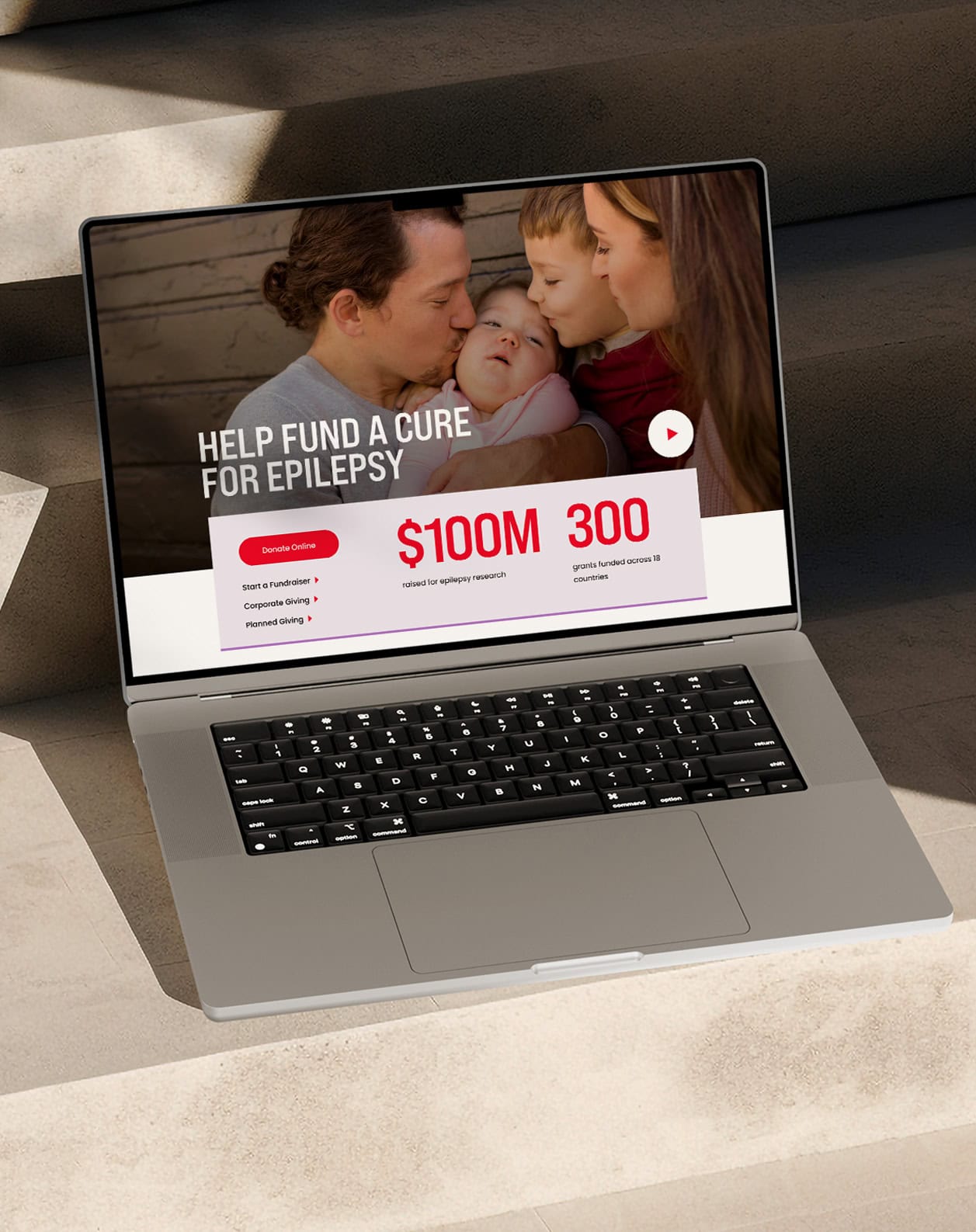
The Woods System of Care is a network of healthcare and direct support providers that specialize in serving people with disabilities of all ages. They needed a website that could effectively connect service users with affiliate providers – all while establishing their presence as a world-class health system.
01
A Fresh New Look
When redesigning the site, our goal was to increase the Woods’ brand professionalism by balancing soft, welcoming elements with clean, sophisticated components to create depth and invite visitors to engage. This new approach positions Woods as a modern health and human services organization.
Accessible Typefaces
Our primary typeface, Family, has the professionalism of a typical serif typeface but with softer elements. The secondary typeface, Karla, is open, friendly, and legible. We choose these typefaces because they paired well with the Wood’s logo and passed legibility requirements for folks with disabilities.


A Defining Color Palette
The color palette separates Woods from its competitors. It has the flexibility to look like a professional health system, with the bolder blue and purple hues, while also remaining friendly and welcoming with the pastel colors.

02
A Seamless Search Tool
Developing an easy way to navigate affiliate services was a primary goal for the site. We worked together with the Woods team to identify important search functions, filters, and information – resulting in a robust and seamless services search tool.


Modern Motion
Lightweight line animation is used throughout the site to add interest and highlight key information.
Keeping it Fun
We incorporated seamless microanimations to give the site a modern, dynamic feel.
03
Designed to Build Trust
Overall, the website’s architecture, visual style, and content were designed to establish the Woods System of Care as a health network you can trust and count on – using a healthy balance of human elements and professional layouts.
Designed to
01
02
03


Push10 was a great team to work with – specifically Ashley, Sabrina and Ken. They did a very good job working with our team that often consisted of ‘too many cooks in the kitchen.’ Our favorite part of the journey was the people.
The Woods System of Care
Jared Levin, Vice President of Marketing
VISIT THE WEBSITEView Related Work

Aurora Staffing
We crafted a visual identity and website for Aurora Staffing that attracts direct support professionals.