01
brand strategy
The brand strategy focused on highlighting OnCourse's most valuable differentiator: saving educators time so they can focus on what matters most—student growth. Through surveys, workshops, and competitive research, we repositioned the brand to emphasize its role in driving better outcomes for students and schools.
Less Admin, More Growth
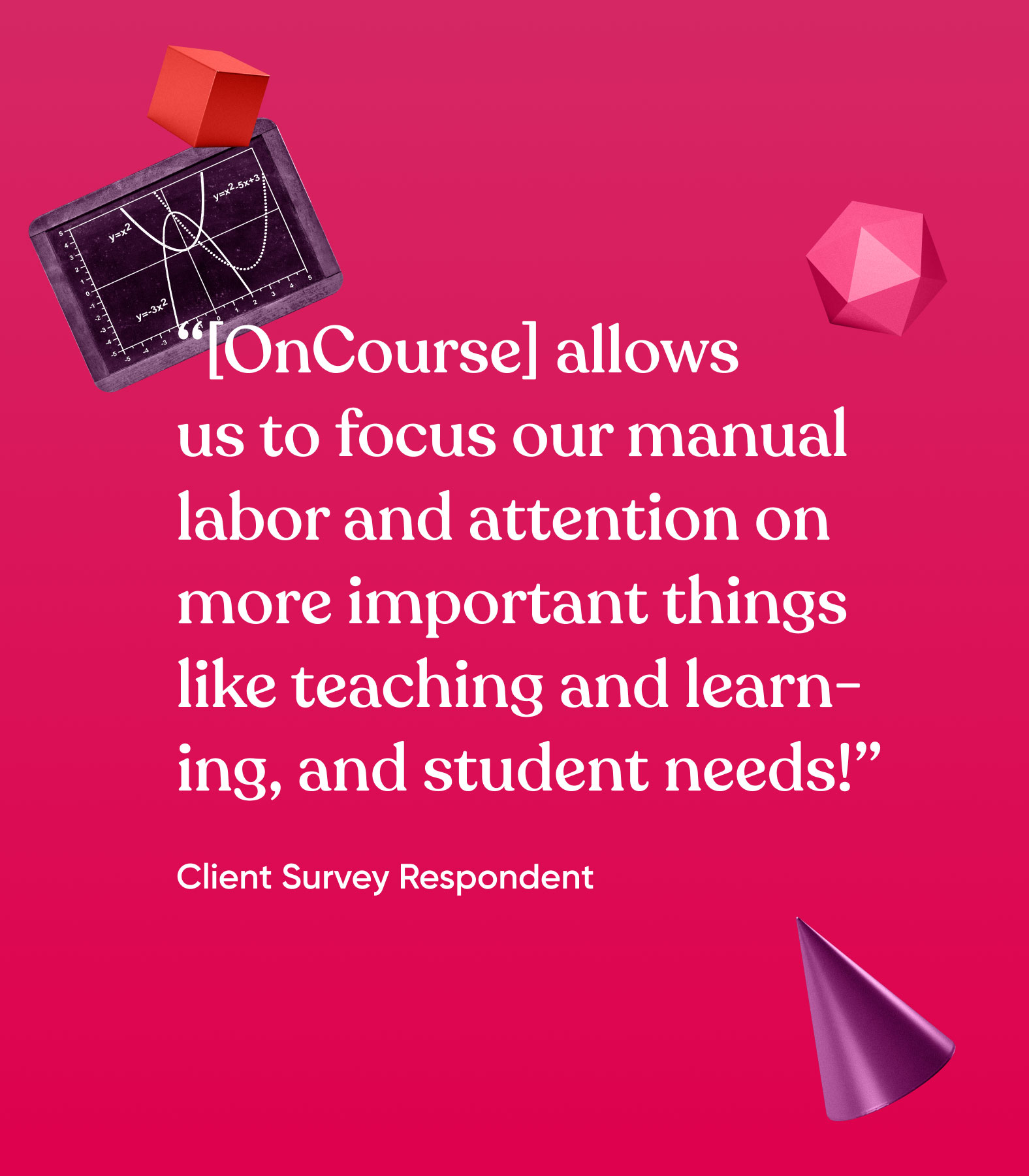
We surveyed clients and school districts, workshopped with the internal team, and reviewed competitors in the space. Ultimately, we found that the time-saving aspect of OnCourse was the most valuable differentiating message. Less time spent on administrative tasks means more time spent with students. Ultimately more time for students means greater student growth – and that’s an outcome everyone can rally around.


Positioned for Impact
We updated OnCourse’s tagline, mission, vision, and values statements to highlight the company’s ability to spur student growth initiatives. We also made sure to incorporate the unique state-centered approach and personalized support OnCourse brings to clients.

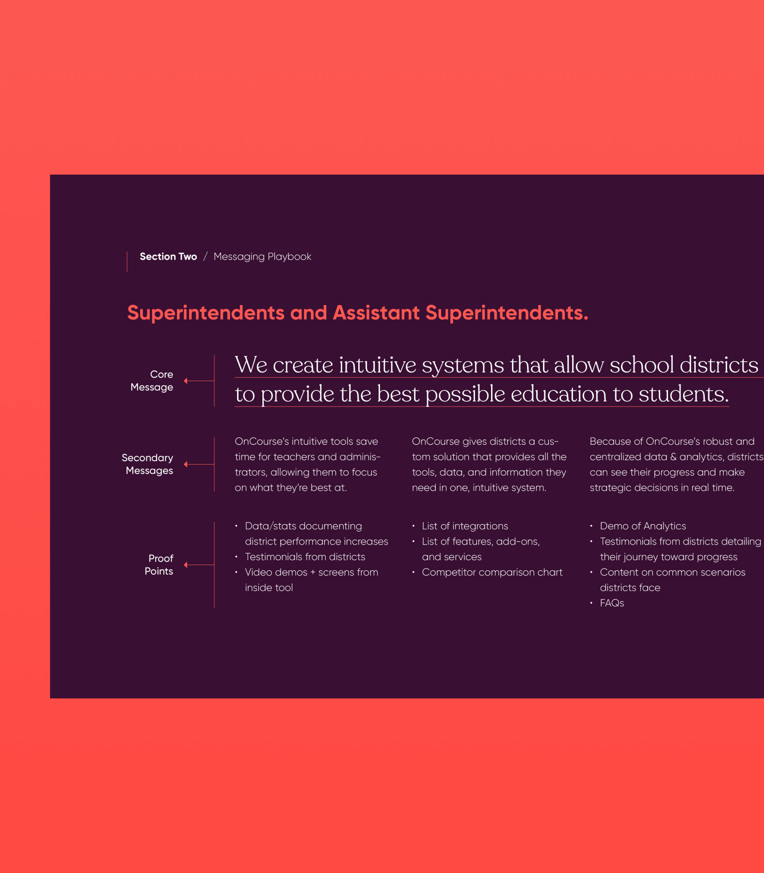
A Textbook Segmented Messaging Strategy
Prior messaging used phrases common among the competition and highlighted OnCourse’s technology rather than student outcomes. With our new growth-focused differentiator in mind, we established a messaging playbook that segments the student growth message for each audience. This plug-and-play guide forms the foundation for future marketing efforts.

02
A Fresh New Look
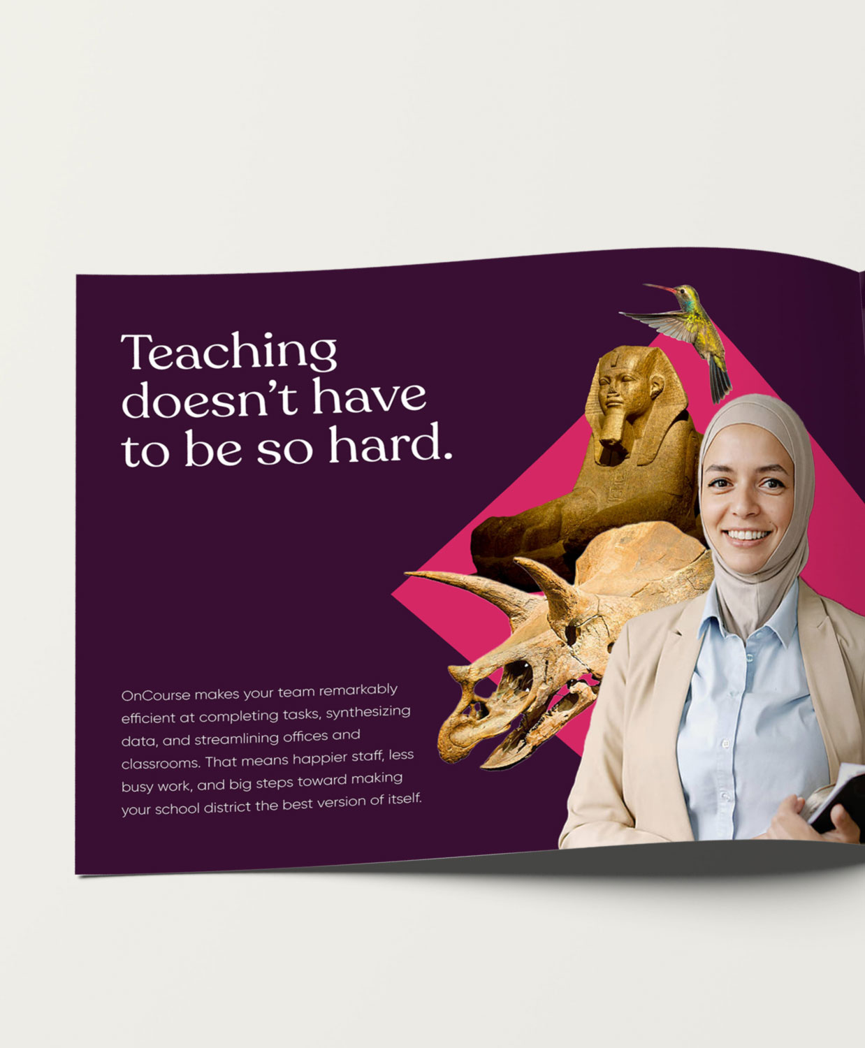
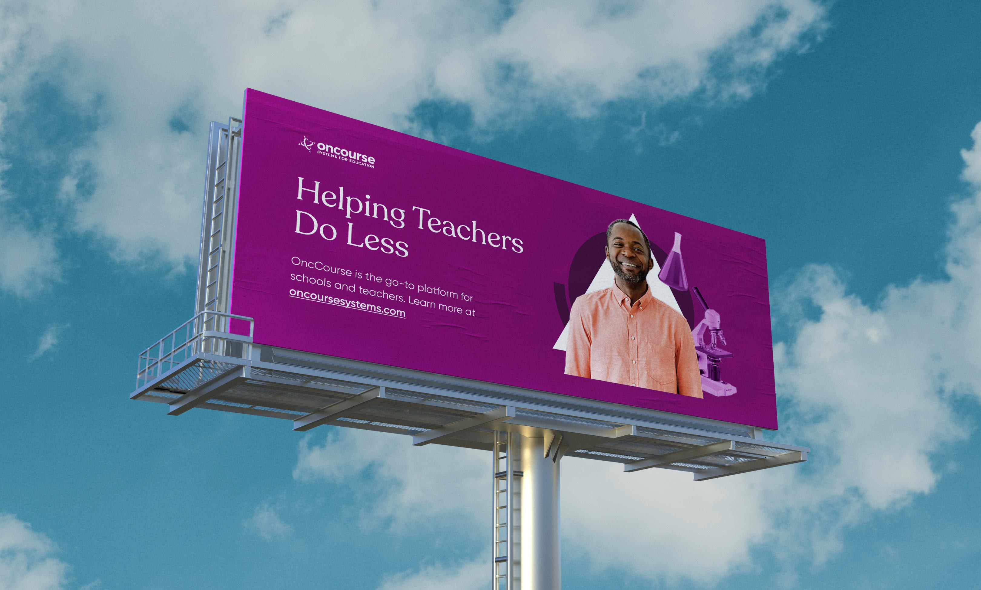
While our research indicated that there was equity in the current logo, the larger visual style was failing to differentiate OnCourse. We pushed the visual brand to feel more unique and memorable, and moved away from common technology cliches.
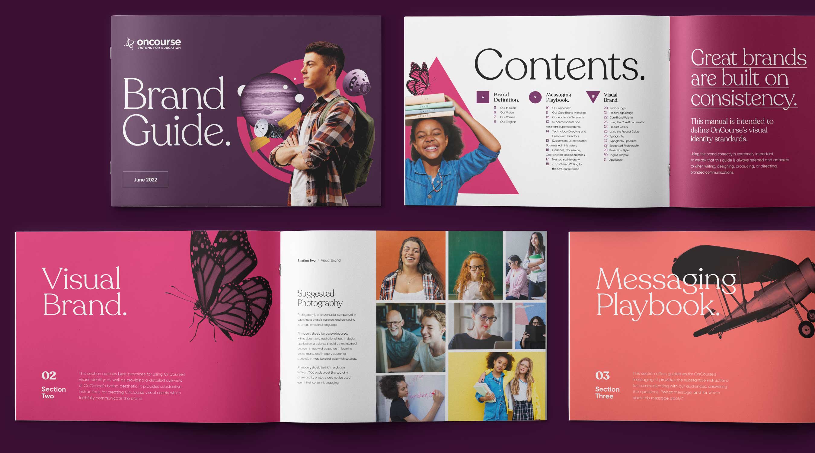
Education is About People
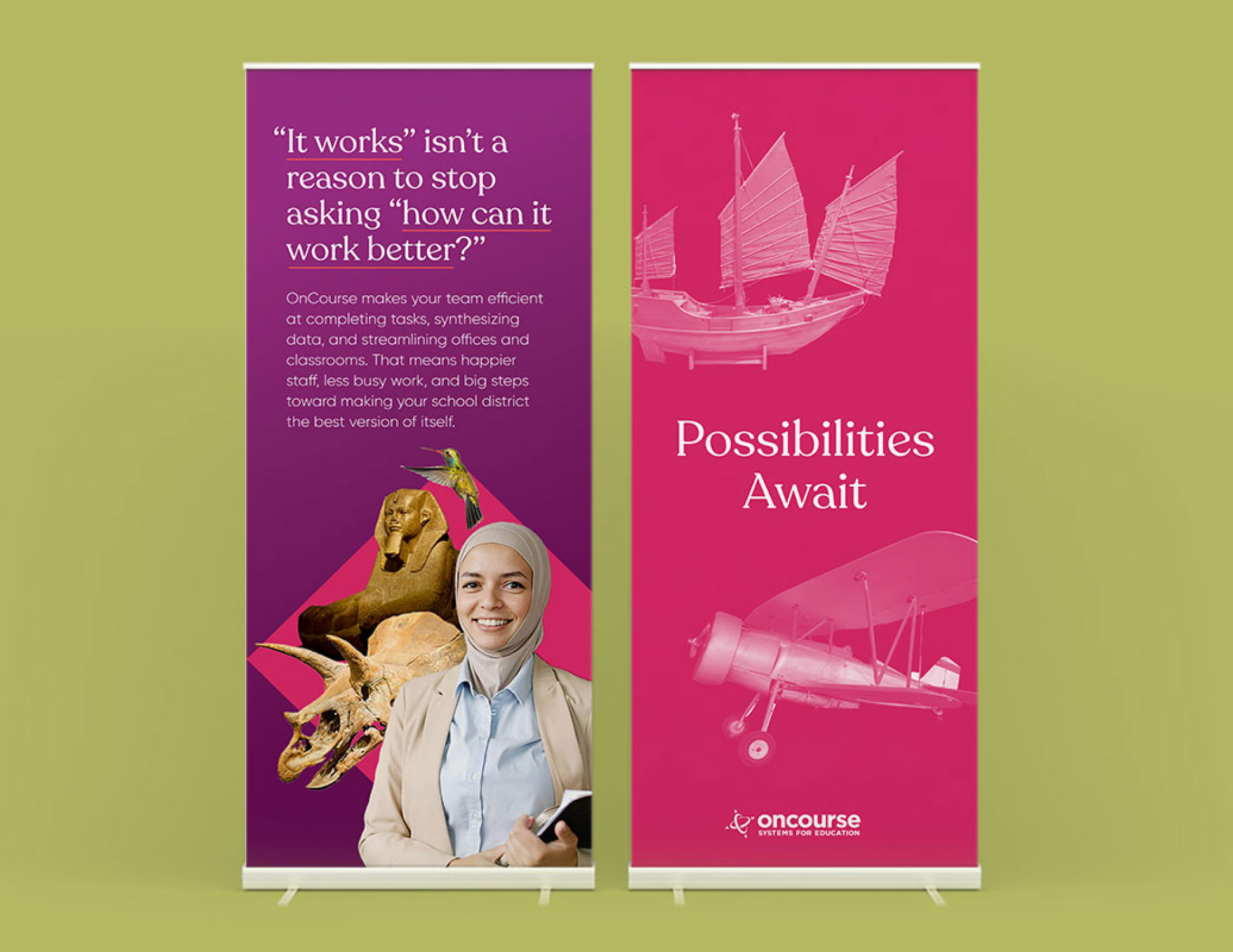
In addition to a new approach to photography, iconography, typography, and color, we developed a custom illustration style that was designed to inject the brand with more humanity – and shift the focus to the students and teachers who benefit the most from reduced administrative work.

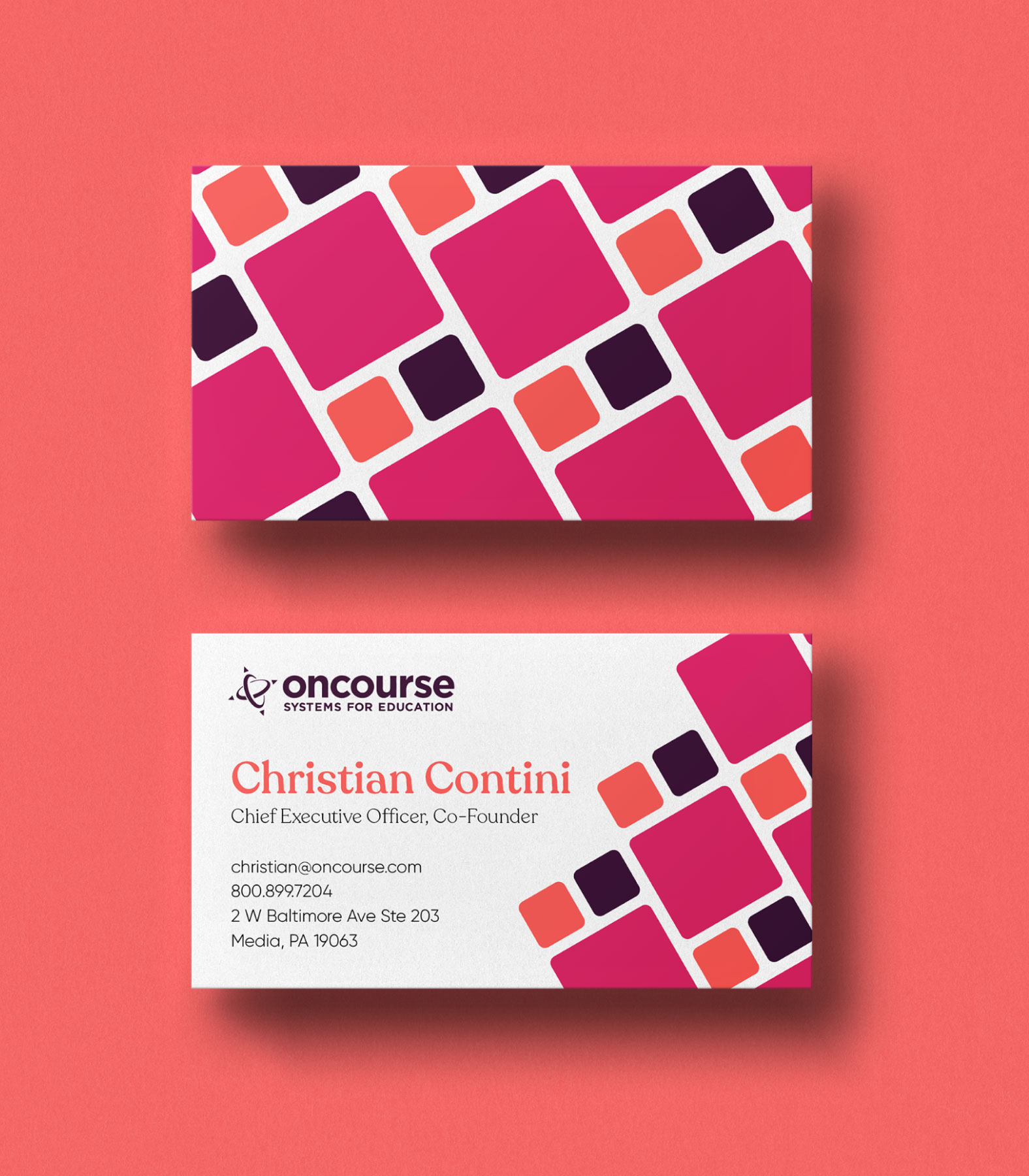
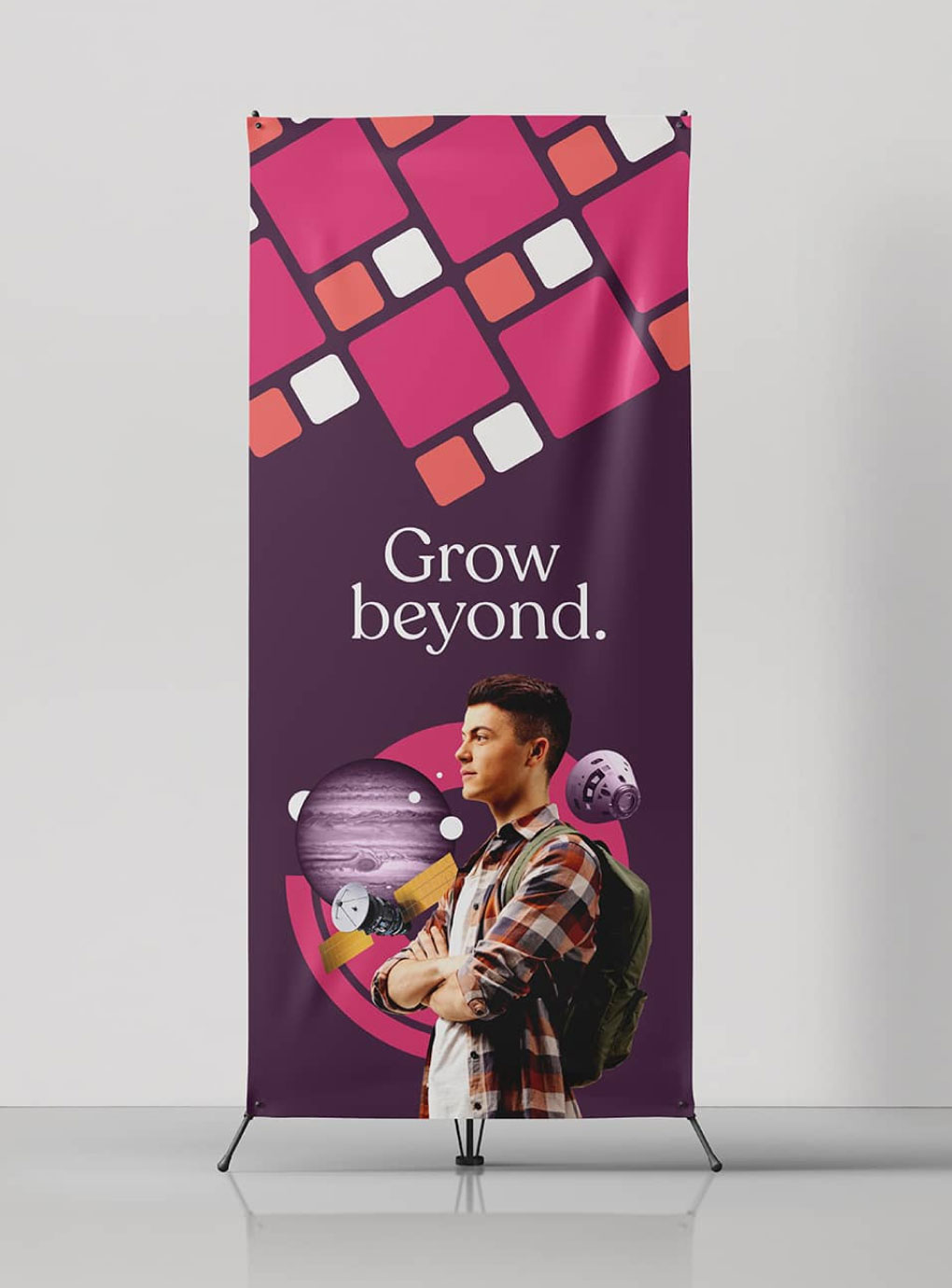
Reducing the Learning Curve
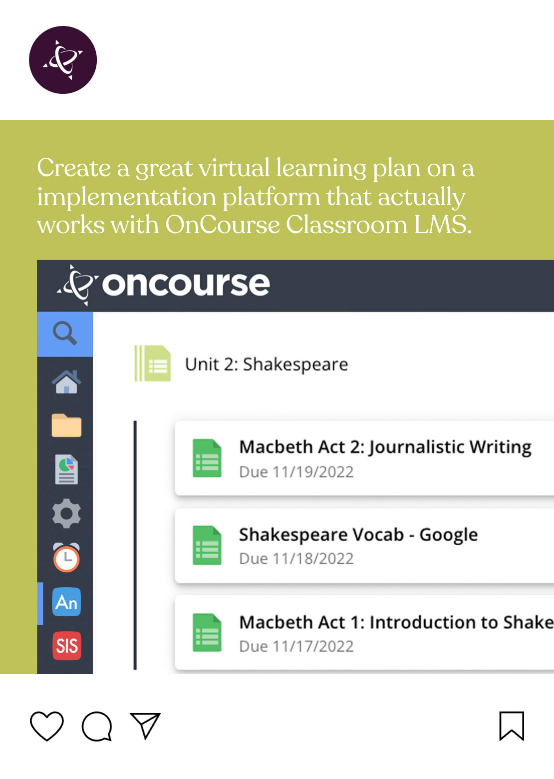
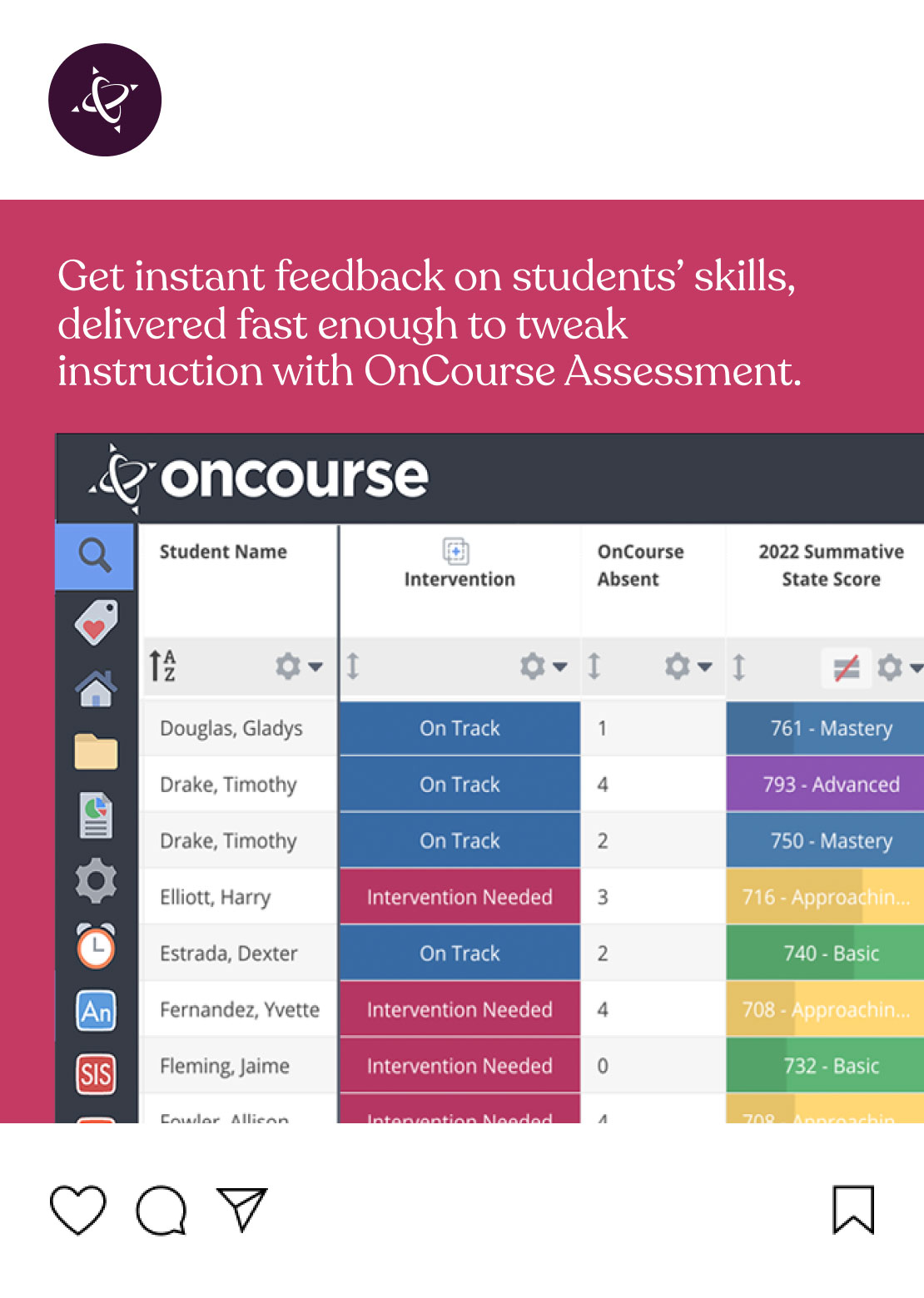
We created a robust visual language and applied the new brand to a variety of collateral to help set the OnCourse marketing team up for success.


03
A Best in Class Website
To bring the brand alive on the web, we outlined a new site architecture and content strategy that highlights client transition and success stories, makes the technology adoption process more transparent, and showcases the real impact OnCourse makes on school districts.
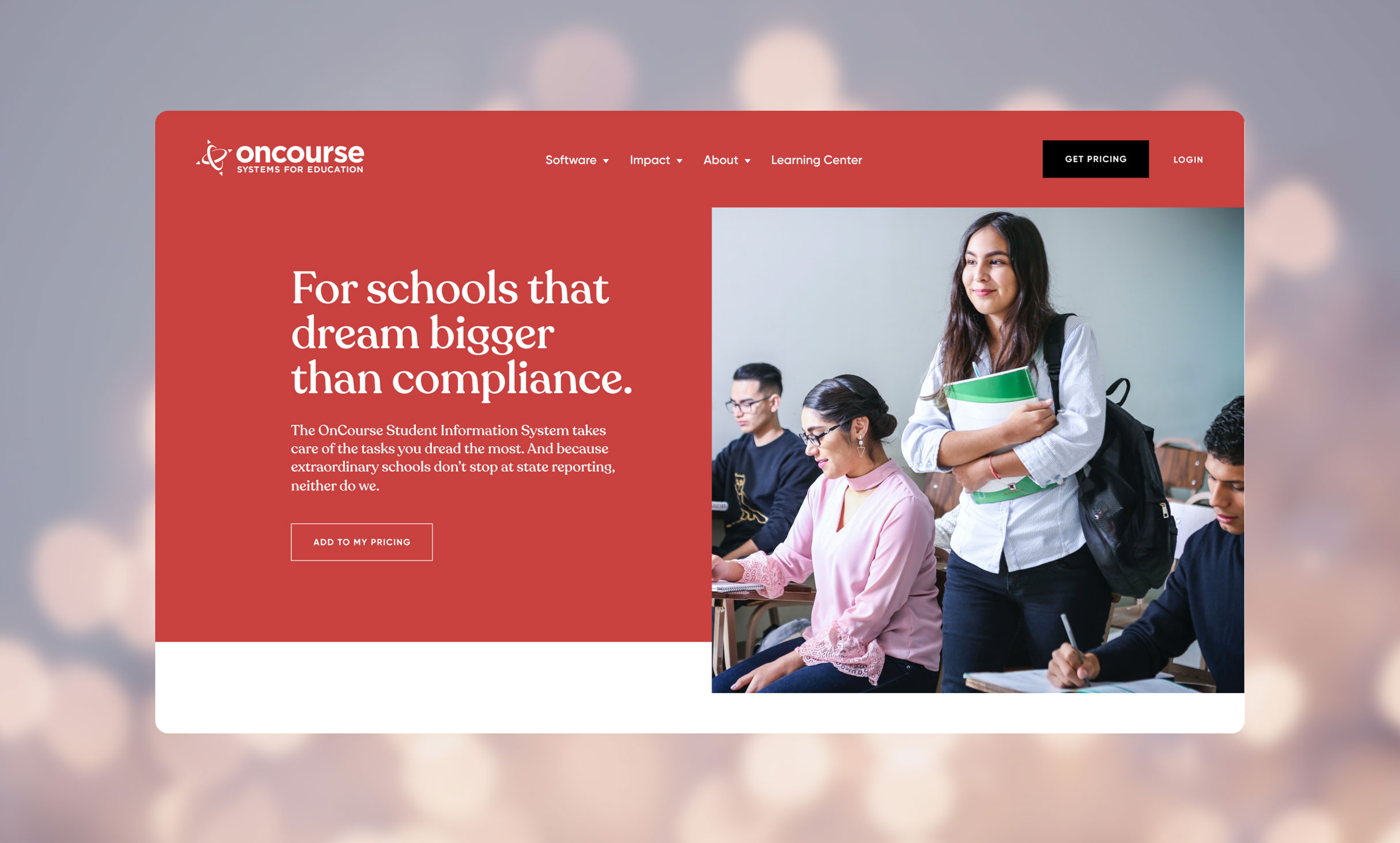
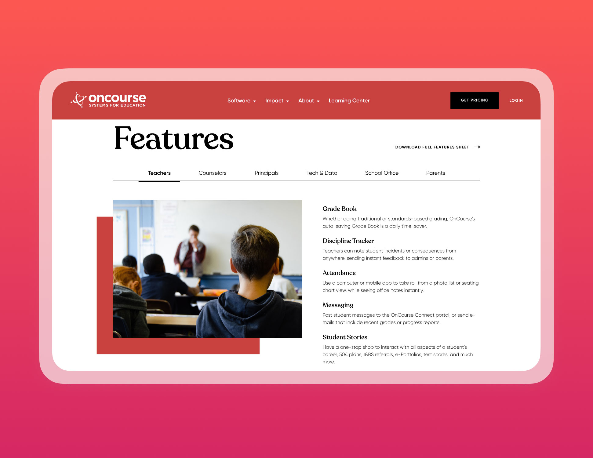
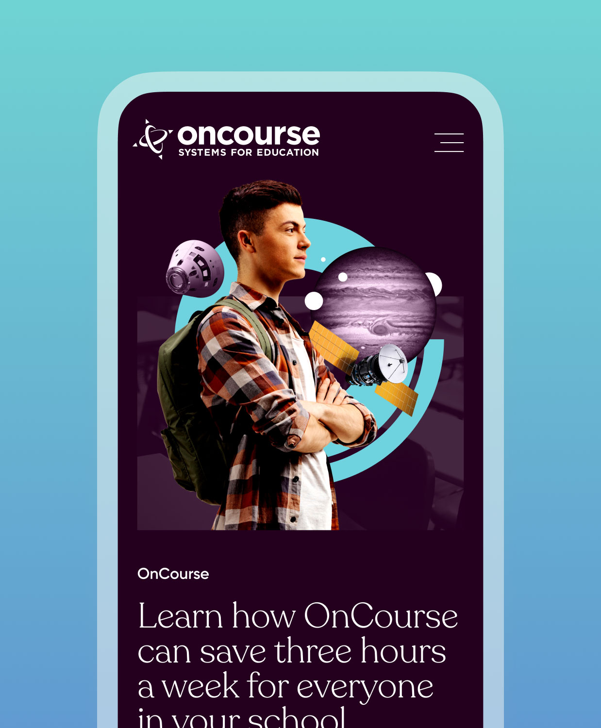
Keep it Simple
We created custom stylized mega menus to ensure that busy educators can find the information they need, when they need it.
Keep it Fun
We incorporated seamless microanimations to give the site a modern, dynamic feel.
Our customers are raving over the dramatic makeover of the OnCourse brand. We have put significant distance between us and our competitors, which we believe fairly reflects the difference in products. We wanted our customers to have an exceptional end-to-end experience from the very first interaction with OnCourse. Push10 helped us get there.
OnCourse Systems
M. Tre Gonzalez, Director of Sales and Marketing
VISIT THE WEBSITEView Related Work
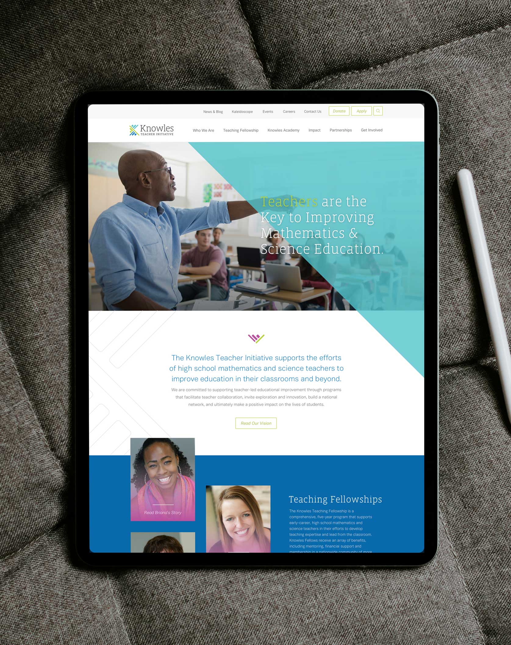
Knowles Teacher Initiative
In a year-long partnership, Push10 worked to redefine the Knowles brand from their name to their logo to their website.


