01
Research & Strategy
Our strategy team took a deep dive into TMS’s existing site, uncovering strengths and pinpointing areas for growth. By engaging and gathering feedback from newly admitted students we gained valuable insights to attract prospective future applicants. These discoveries laid the foundation for our content strategy and interactive wireframes.
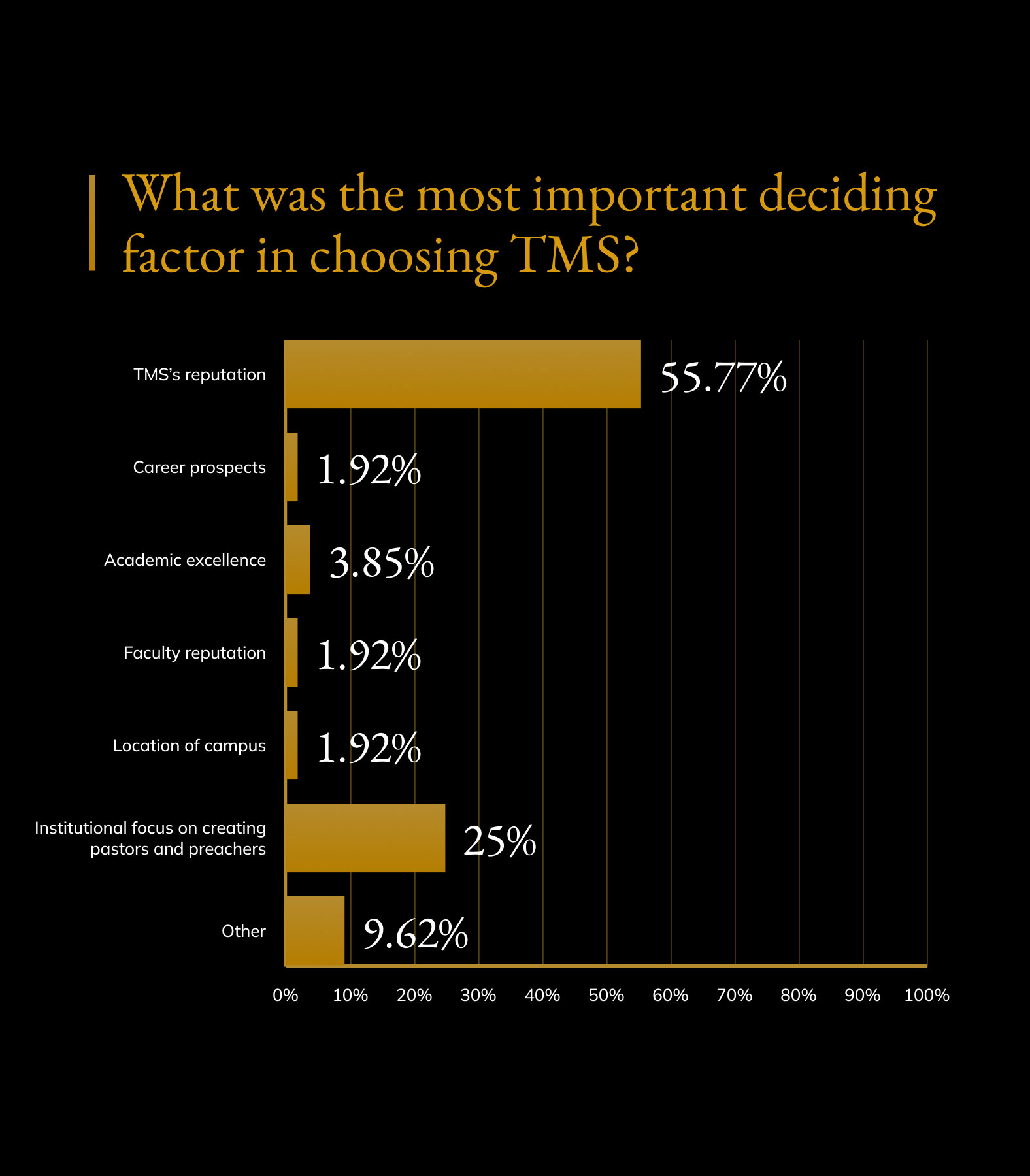
What Can the Existing Experience Teach Us?
We started the project by turning over stones to understand what made the existing site strong, and more importantly, what could be improved. Soliciting the voices of current students was critical, as their feedback helped us craft messaging that appeals to the next generation of applicants.

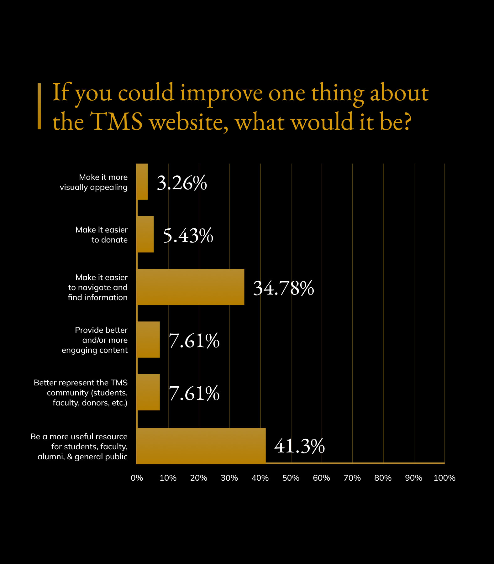
How Could the Site Be Better?
One of the most powerful yet underrated research tactics is to ask your audience, simply, “what would you do to make the site better?” We asked this question to the Seminary’s diverse audience segments to help us identify any opportunities that were hidden in plain sight.

Turning Preliminary Research into Site Architecture
After completing the research phase, we translated our findings into a new sitemap and content plan. We established a clear user-centric content hierarchy for each key page of the site.
02
Design with Purpose
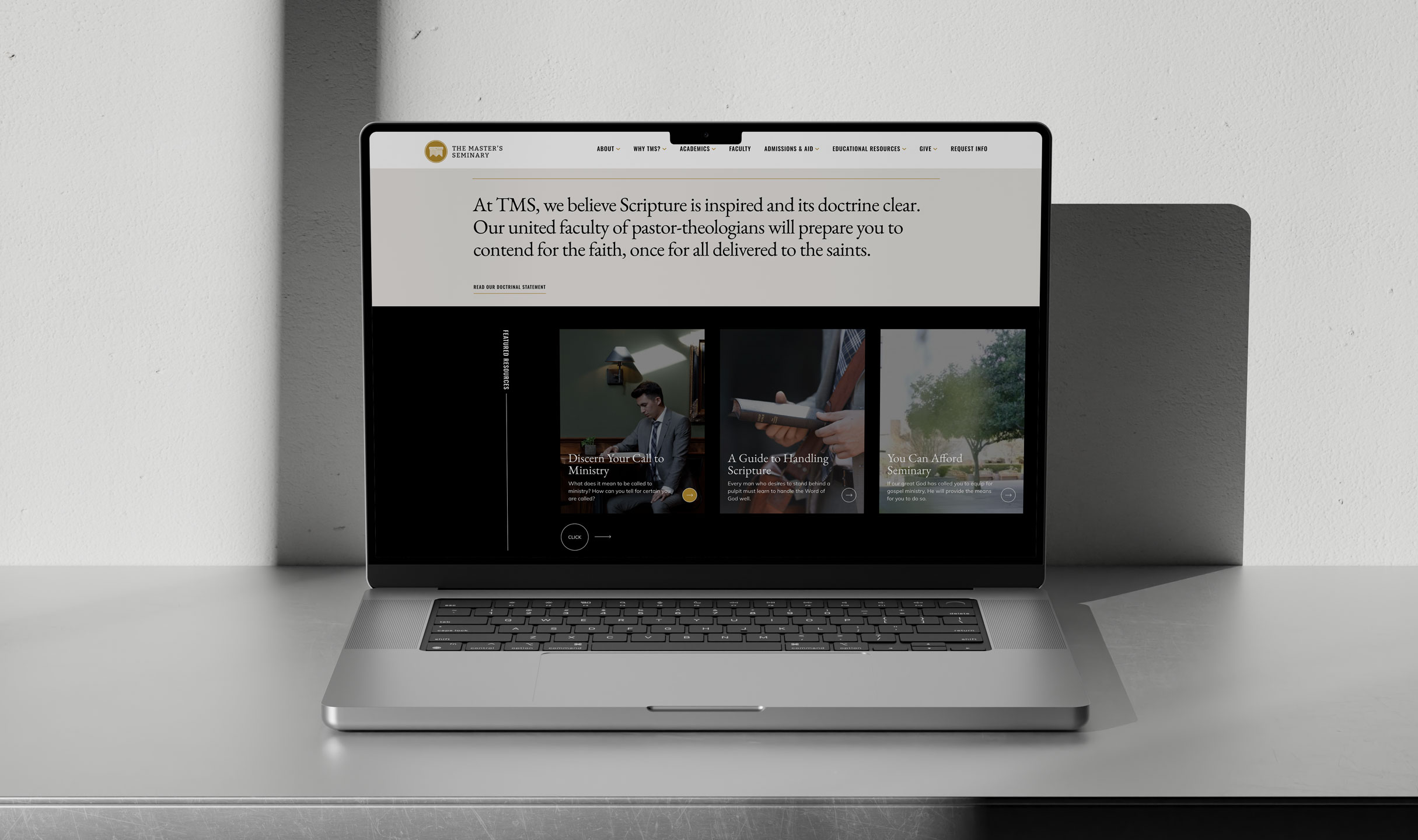
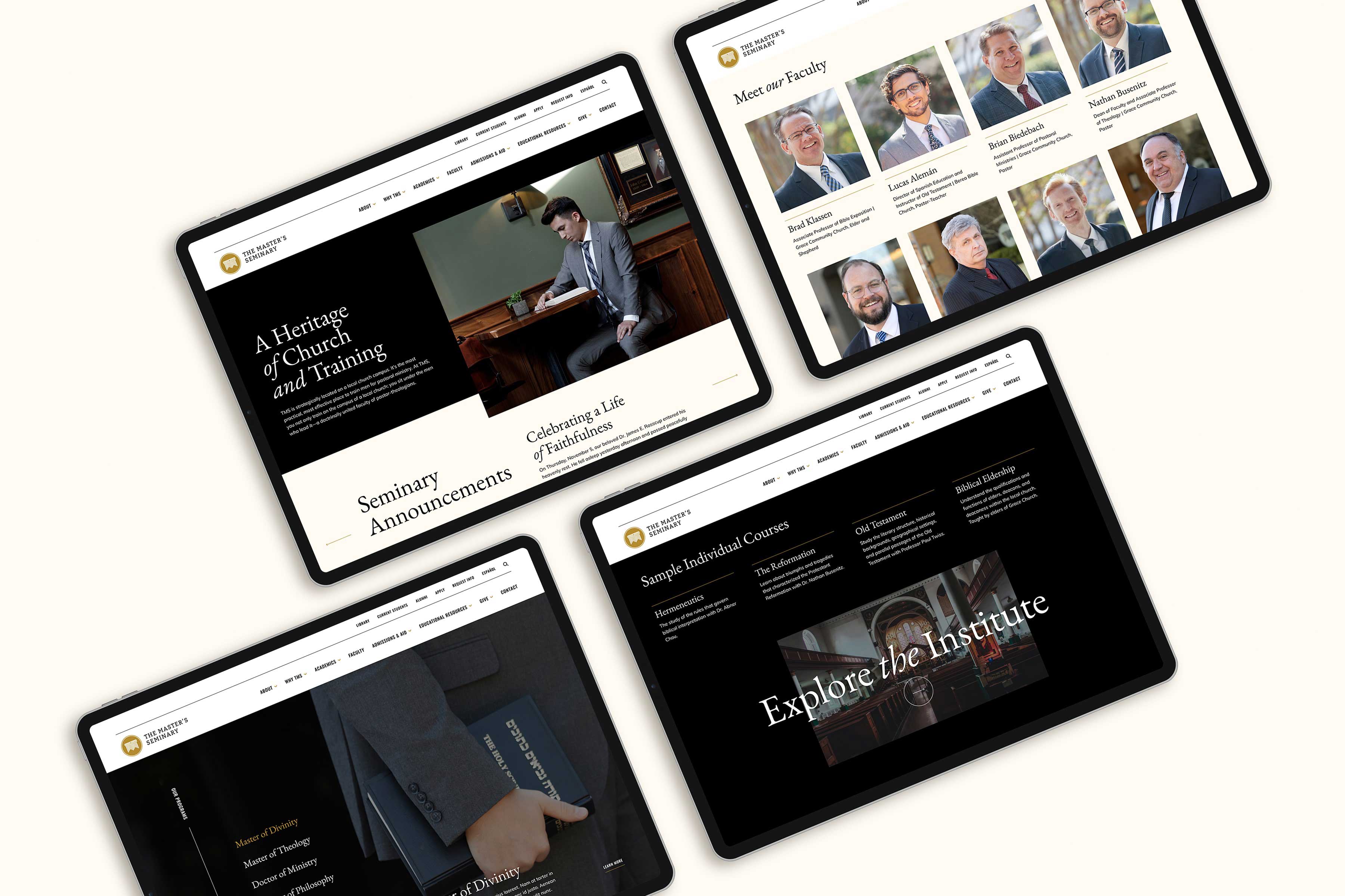
As the single most important marketing tool for the Seminary, the new website needed to reflect the brand, personality, and mission of the school. We collaborated closely with the Seminary's brand managers to bring the brand promise to life, designing an experience that reflected the Seminary’s purpose and prestige.
03
Website Development
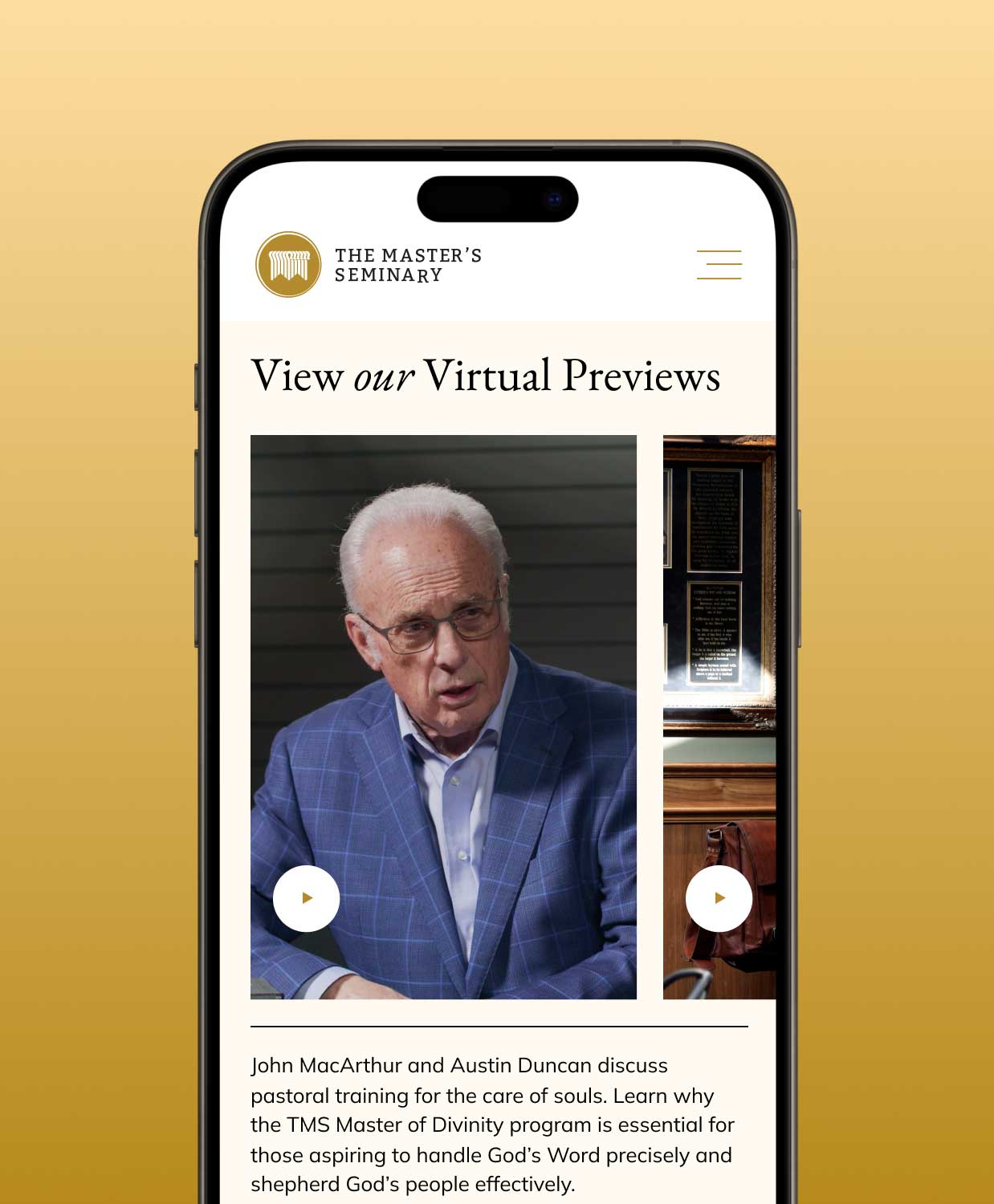
As we wrapped up the design phase, we turned our attention to building the site with a fully responsive interface, thus providing an ideal user experience across a wide variety of devices. We created a highly-customized backend on the WordPress platform, providing the Seminary with a robust, yet user-friendly CMS. The site consisted of numerous custom features and functionalities, including an interactive map and searchable archives.
A Welcoming Homepage
We built a custom, accordian style animation in the homepage banner to elegantly and efficiently show and hide content. Right from the start, visitors to the Seminary’s website are greeted with a special experience.
A Reputable Church is Only a Click Away
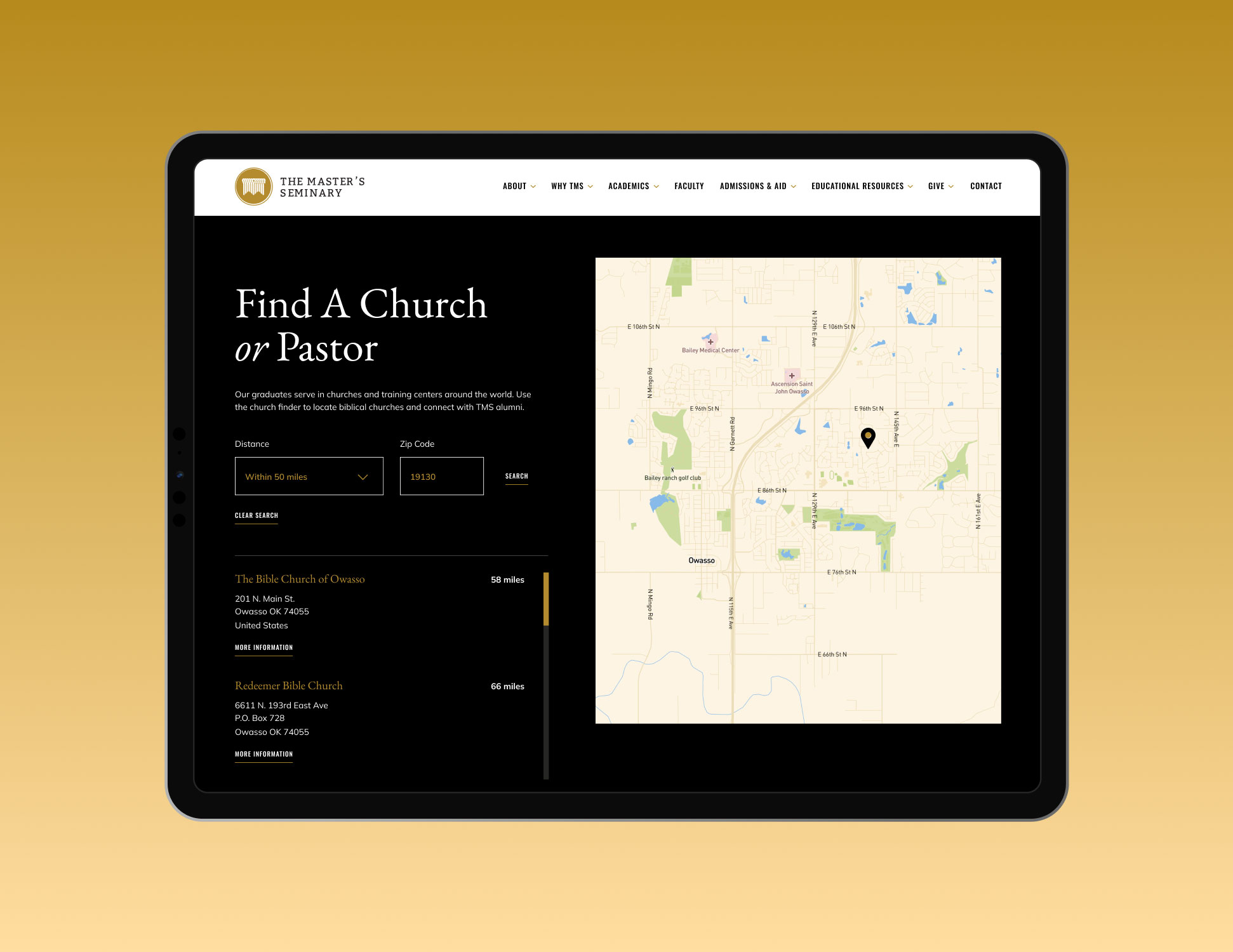
Our initial research revealed several primary goals of site visitors. Specifically, users wanted to find a church led by a Master’s Seminary paster. To fulfill this requirement, we built an interactive map that enables site visitors find a church wherever they are in the world.
The new site is elegant, modern, and best of all, effective at recruiting the next generation of pastors. We couldn’t have asked for a better partner, and we’re thrilled with the final site!
The Master's Seminary
Corey Williams, Chief Communication Officer
VISIT THE WEBSITEView Related Work

Candler School of Theology
We partnered with Candler to create a distinctive brand and enhanced web experience that repositions the school as the change agent behind the brightest minds in theology.
