Innovations for Poverty Action
Disrupting Poverty With Evidence
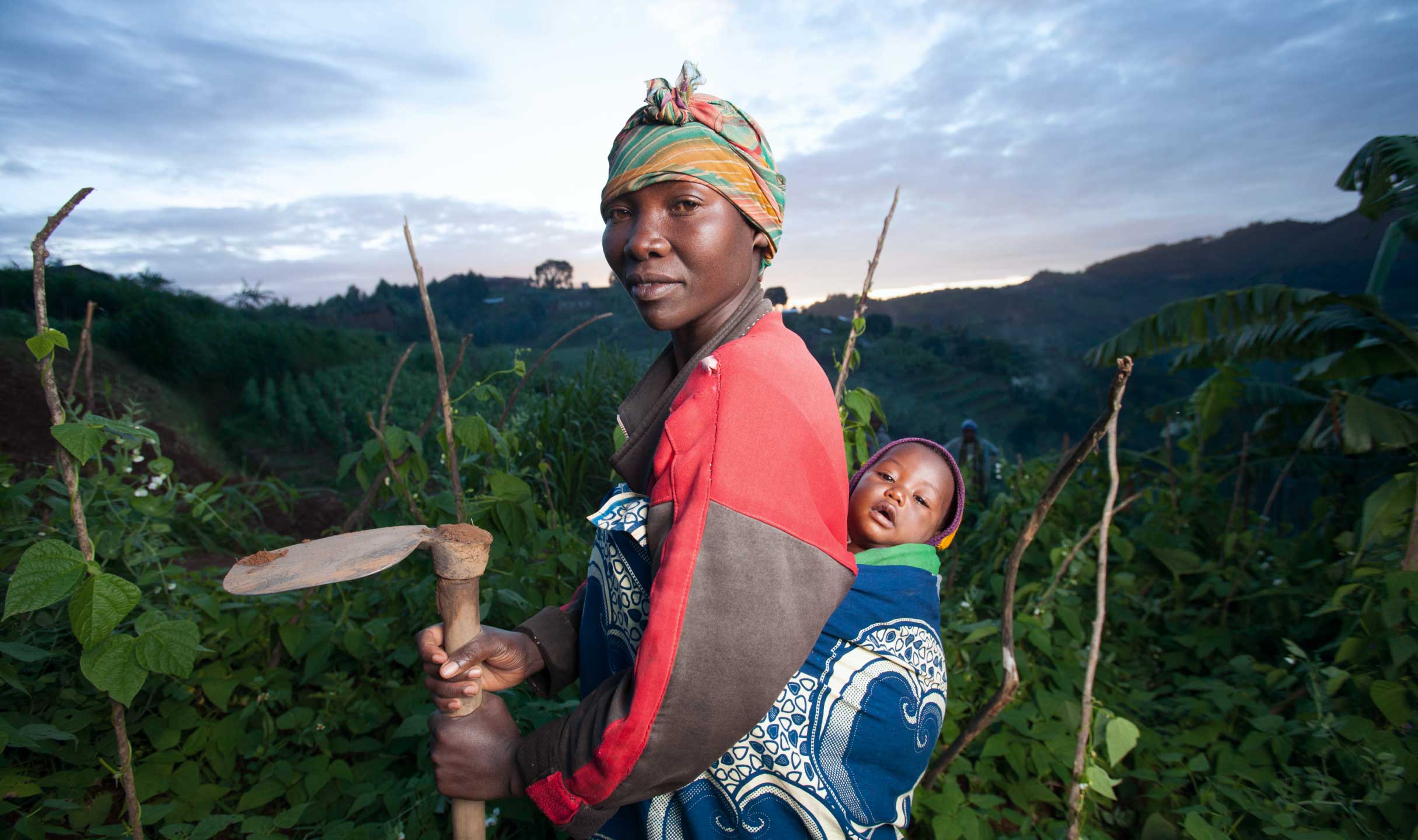
With an extensive network of local country offices, Innovations for Poverty Action (IPA) is the only independent nonprofit that creates and shares comprehensive rigorous evidence for public good. With a fresh new strategic plan, IPA engaged Push10 to construct a brand platform aimed at captivating and motivating a broader audience of researchers, policymakers, and donors to unite in the battle against poverty.
01
Improving Lives Shouldn’t Be a Guessing Game
We began our work by reviewing the data. We gathered stakeholder insights, analyzed the competitive landscape, defined key target audiences, and conducted a series of collaborative exercises to lay the foundation for future brand development.
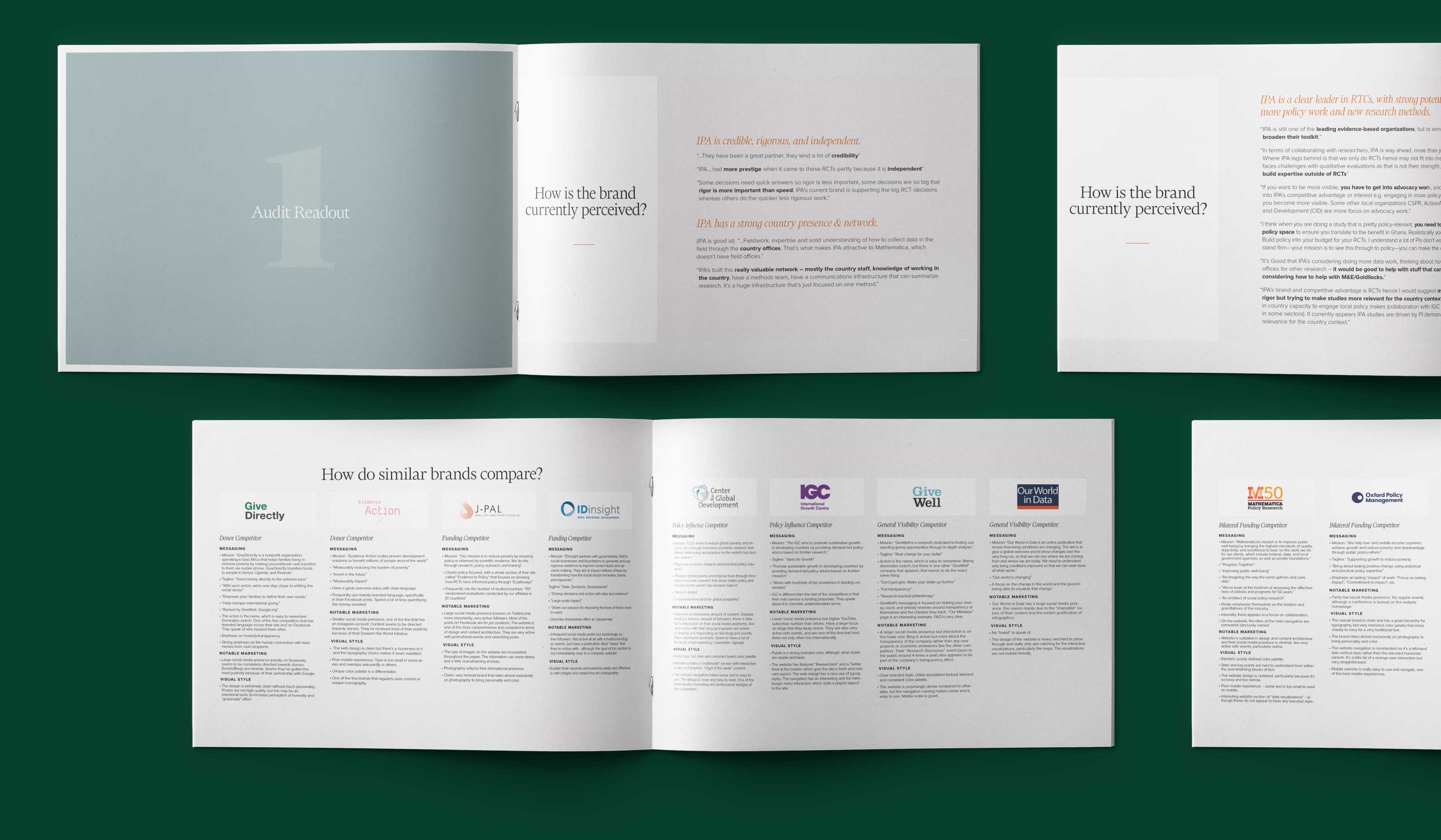
What sets IPA apart?
While IPA’s vision of a world with more evidence and less poverty was crystal clear, the brand lacked a distinct personality. We carefully reviewed comparable organizations to identify the defining traits that could set IPA apart.
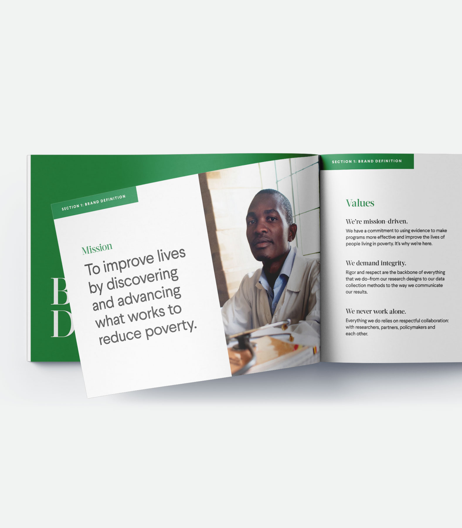
Putting Our Words to Work
From the beginning, we asked ourselves how we could make IPA’s purpose easier to understand. Together we crafted a simplified mission statement, unique values, and a clear brand story. All messaging was thoroughly vetted by trusted global stakeholders and carefully edited to avoid academic jargon.
02
A Visual Brand That Takes Action
Through a series of moodboards and logo sketches, we collaborated with the IPA team to identify a new visual style that felt both rigorous and actionable, yet approachable.
Creating New Connections
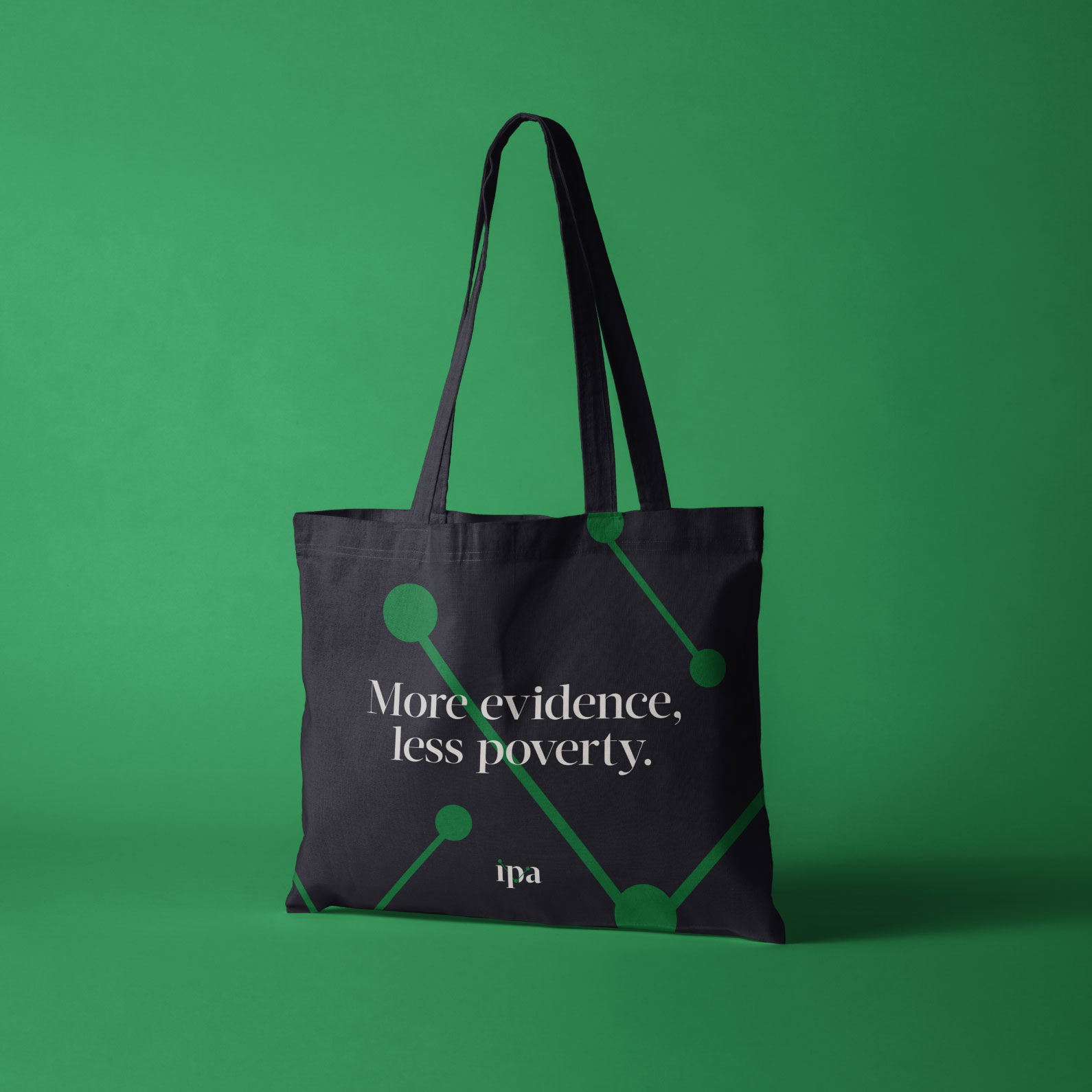
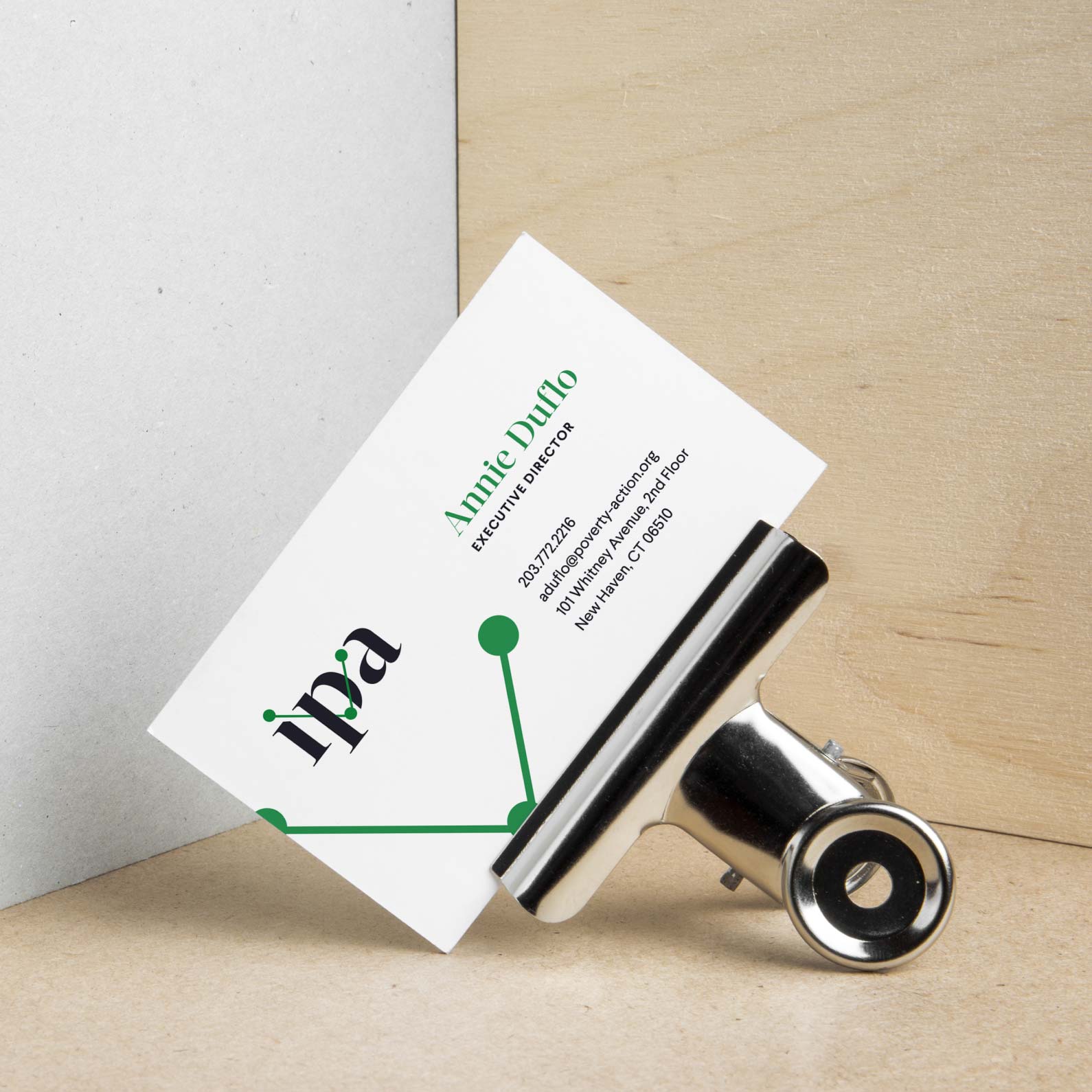
The former IPA logo was outdated and occasionally illegible, indistinguishable from competitive marks, and appeared to focus exclusively on Africa (which was misleading). In the new logo, we deconstructed a serif typeface, then isolated the ball terminals to create a connected line. While the mark obviously alludes to data and connection, it can also be interpreted as a strong “through line” showcasing IPA’s ability to create strong evidence, share evidence strategically, and ultimately equip decision makers to use that evidence.


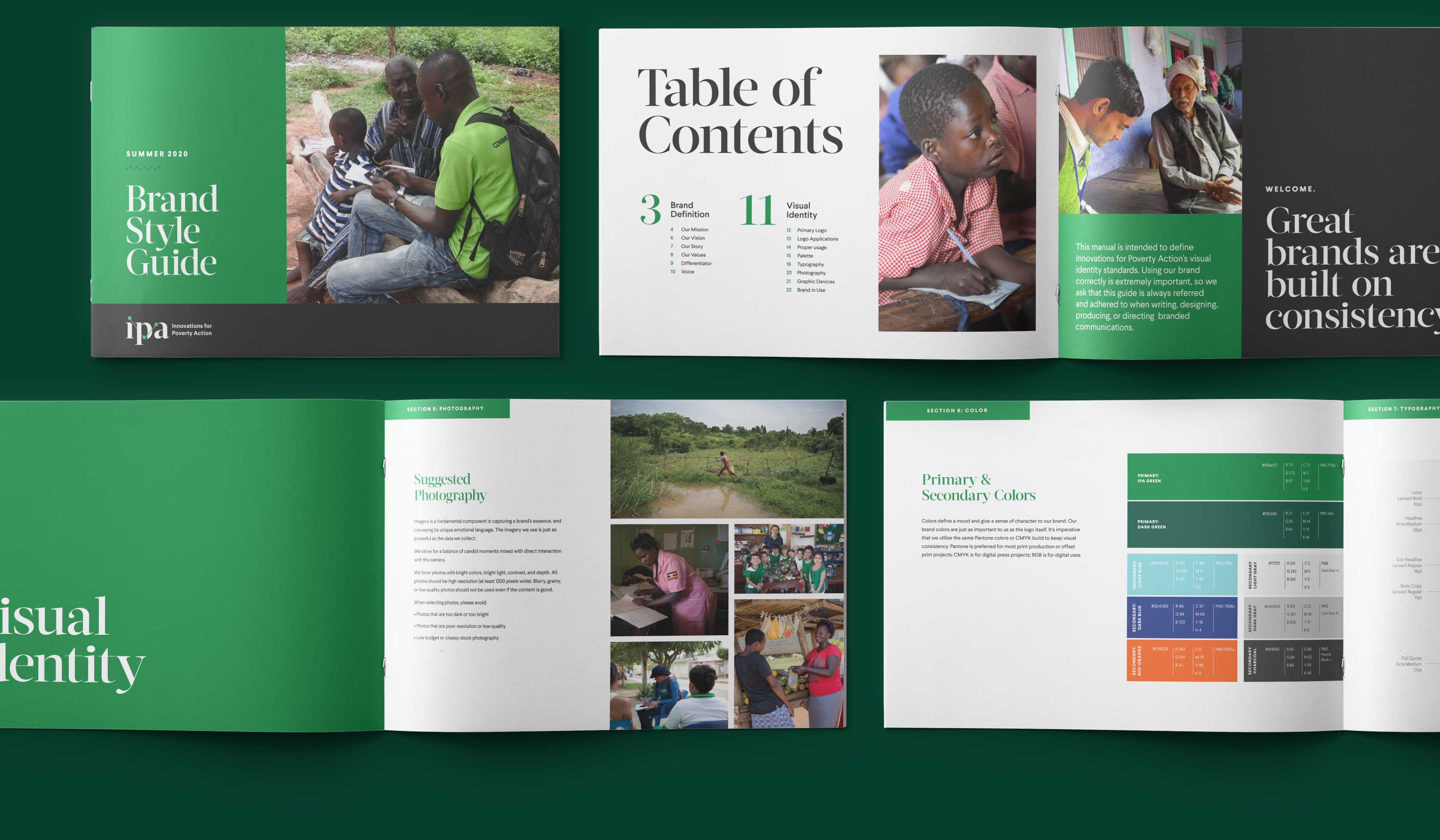
Bringing it All Together
When used together, the new IPA brand styles form a bold and cohesive visual style that graphically unites communications. We created a detailed style guide that allows global team members to faithfully uphold the new brand standards.
03
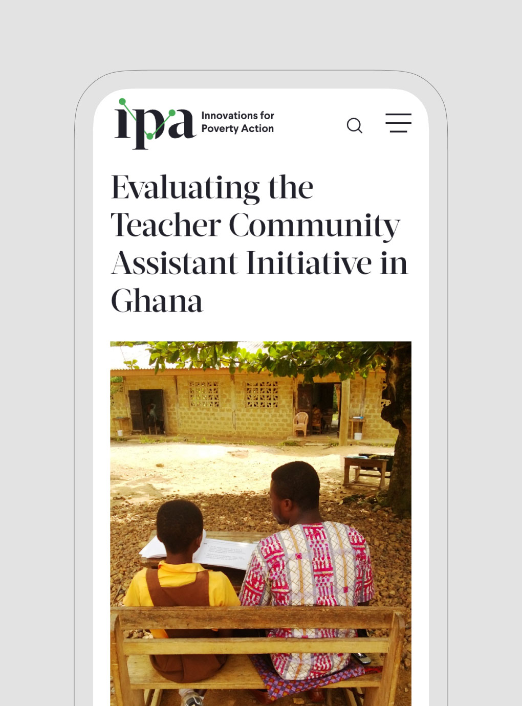
A New Digital Design
With the brand in place, we turned our attention to the website. We took inventory of existing content and technical features and then planned and designed a robust new user interface. We crafted clear user journeys for a range of audiences, including researchers searching for funding for specific projects, policymakers seeking to inform their work, and donors tracking down impact stories.

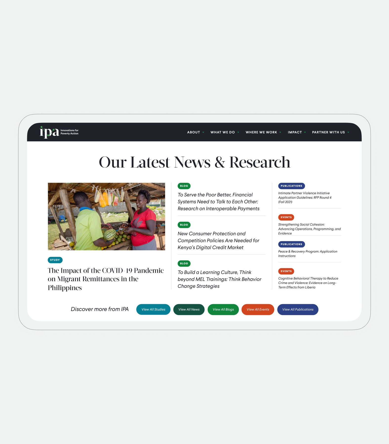
A Powerful Publishing Tool
A deep publishing arm is key to ensuring that IPA’s evidence is making the most impact on lives around the world. We built archives of studies, publications, news, events, and more that can be dynamically featured throughout the site using a system of tags.
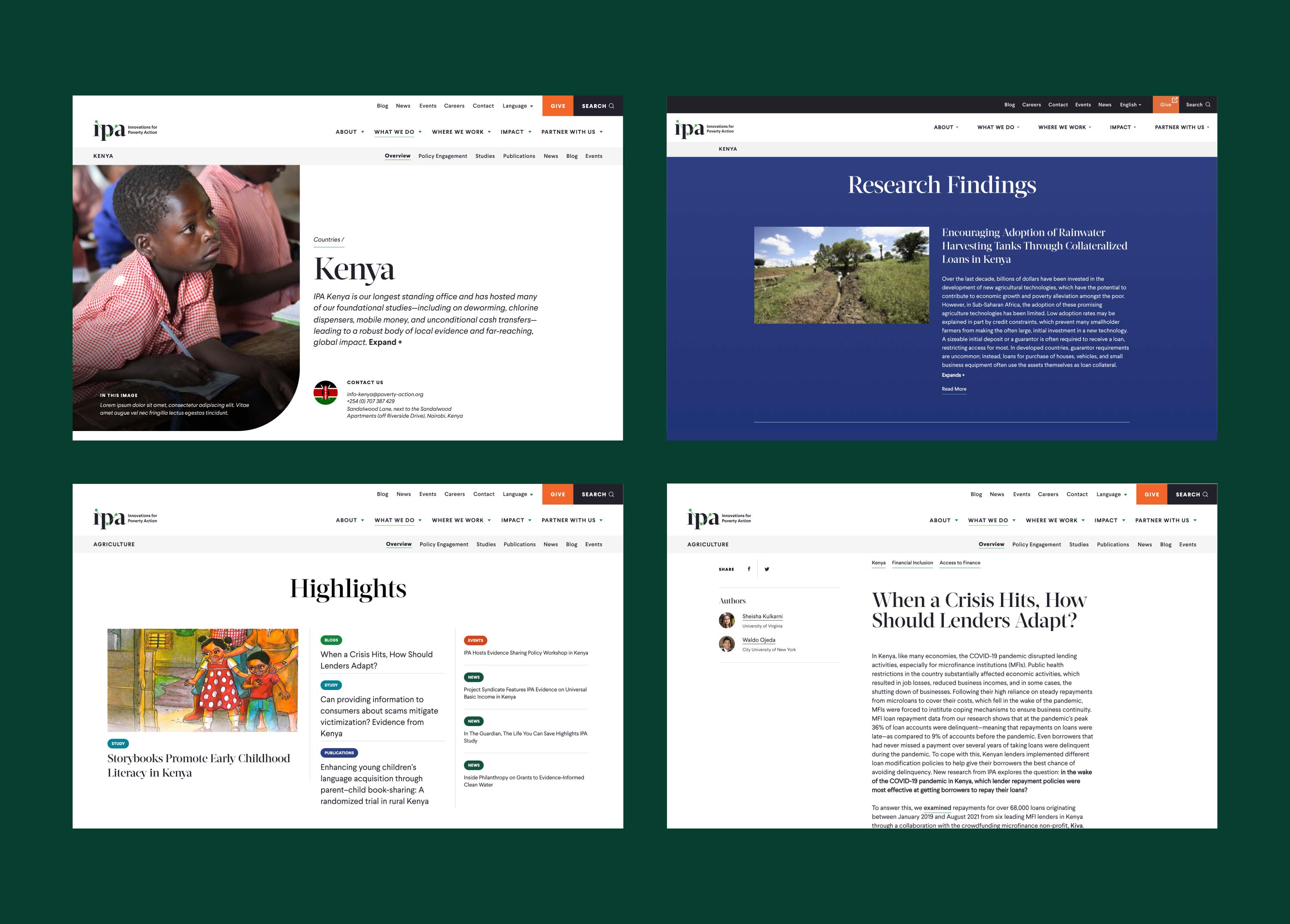
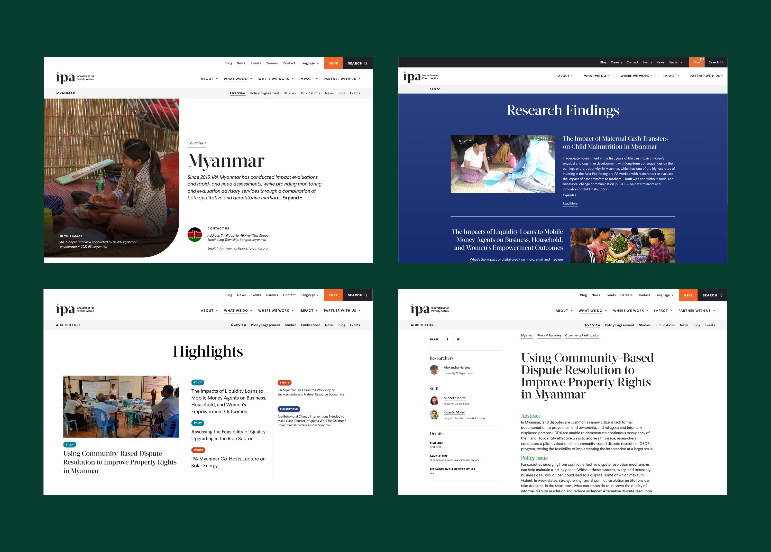
Supporting Country Offices Around the Globe
We created landing pages for each country and sector that organize IPA’s key findings and research highlights, alongside key contacts and relevant news.
A Custom Interactive Map
To show impact around the world, we built a custom interactive map that displays IPA’s country offices and the organization’s work in specific regions and sectors. The map data and design is easy to manage long-term using Mapbox and the backend of Drupal.
Robust Mega Menus
To ensure that content is easy to find for IPA’s various audiences, we created custom mega menus. The menus use images and a clear system of labels to guide the visitor’s eye to key pieces of information.
Modern Motion
On the homepage, content for key audience groups is displayed via a circle-based infographic. This type of lightweight scroll animation is used throughout the site to add interest and highlight key information.
Creating a contemporary brand and website for Innovations for Poverty Action was an exciting challenge, and I’m proud of the strong communication and collaborative mindset that our team maintained along the way.
Push10
Jess Smith, Lead Project Manager
VISIT THE WEBSITEView Related Work
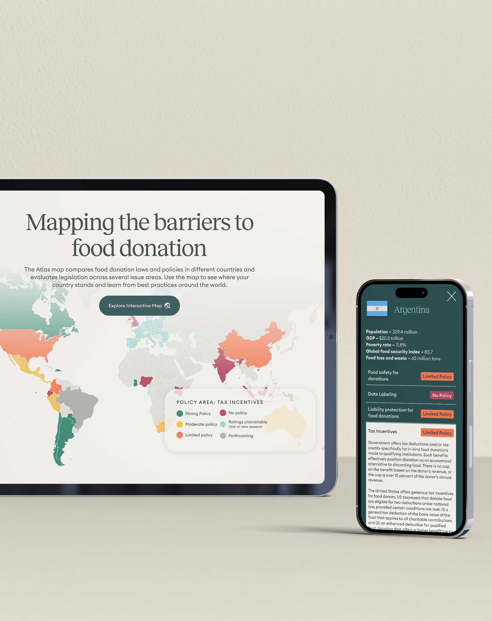
The Global Food Donation Policy Atlas
Together with Harvard and the Global Foodbanking Network, we created a digital Policy Atlas that outlines donation and food waste prevention laws and policies across the globe.