Start with a Sketch
Before diving into design, we drafted low-fidelity wireframes, optimizing audience journeys and providing the necessary content strategy to satisfy users’ goals.

Our client, a privately held wealth management firm with decades of experience and over $10 billion in assets under advisement, recognized their need for an updated, modern online presence. We locked arms to reimagine their web design and address the real business challenge of shifting client expectations. The future of their firm doesn’t start “tomorrow;” it starts right now.
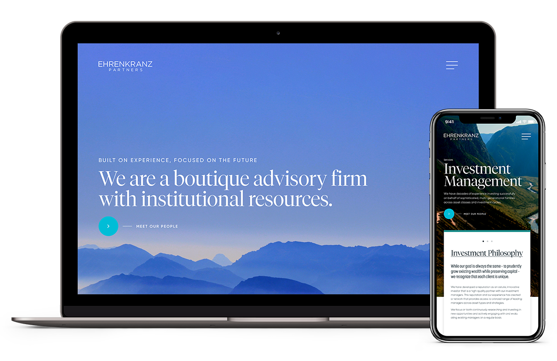
We designed an impressive website to communicate a depth of experience and recognized expertise in wealth management.
We created a current, yet timeless identity, designed to appeal to a wide variety of clients spanning multiple generations.
We used limited content for maximum impact by distilling the brand identity and messaging to its most salient, captivating core.
Before diving into design, we drafted low-fidelity wireframes, optimizing audience journeys and providing the necessary content strategy to satisfy users’ goals.
Trust. Safety. Security. Three words that investors look for in a wealth management firm, and three words that formed the backbone of our strategic UX design decisions.
A smart combination of serif and sans serif typefaces was selected to bridge the gap between older and younger users. Simultaneously modern and timeless, this pairing, plus the sophisticated color palette, were conscious choices in addressing our client’s brand strategy and business goals.

A premier wealth management firm deserves a premier, elegant typeface to showcase its headlines. This modern serif augments this firm’s prestigious brand.

We employed a bolder weight of Tiempos to boost the website’s subheads, creating a clear information hierarchy while still achieving a cohesive design.

Gilroy is a modern, readable counterbalance to the classic forms of the Tiempos family. It reflects that our client is as much committed to the future as the present.
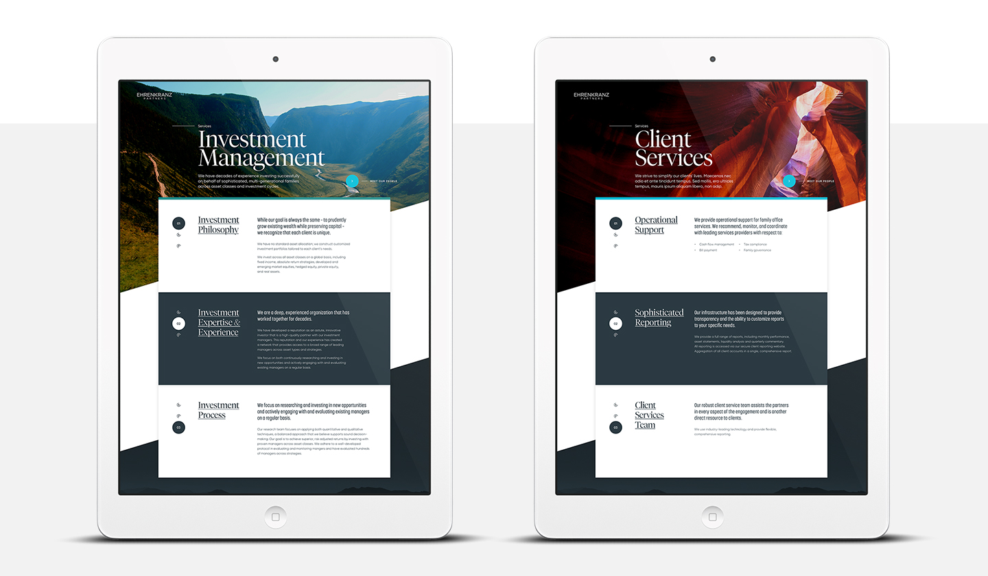
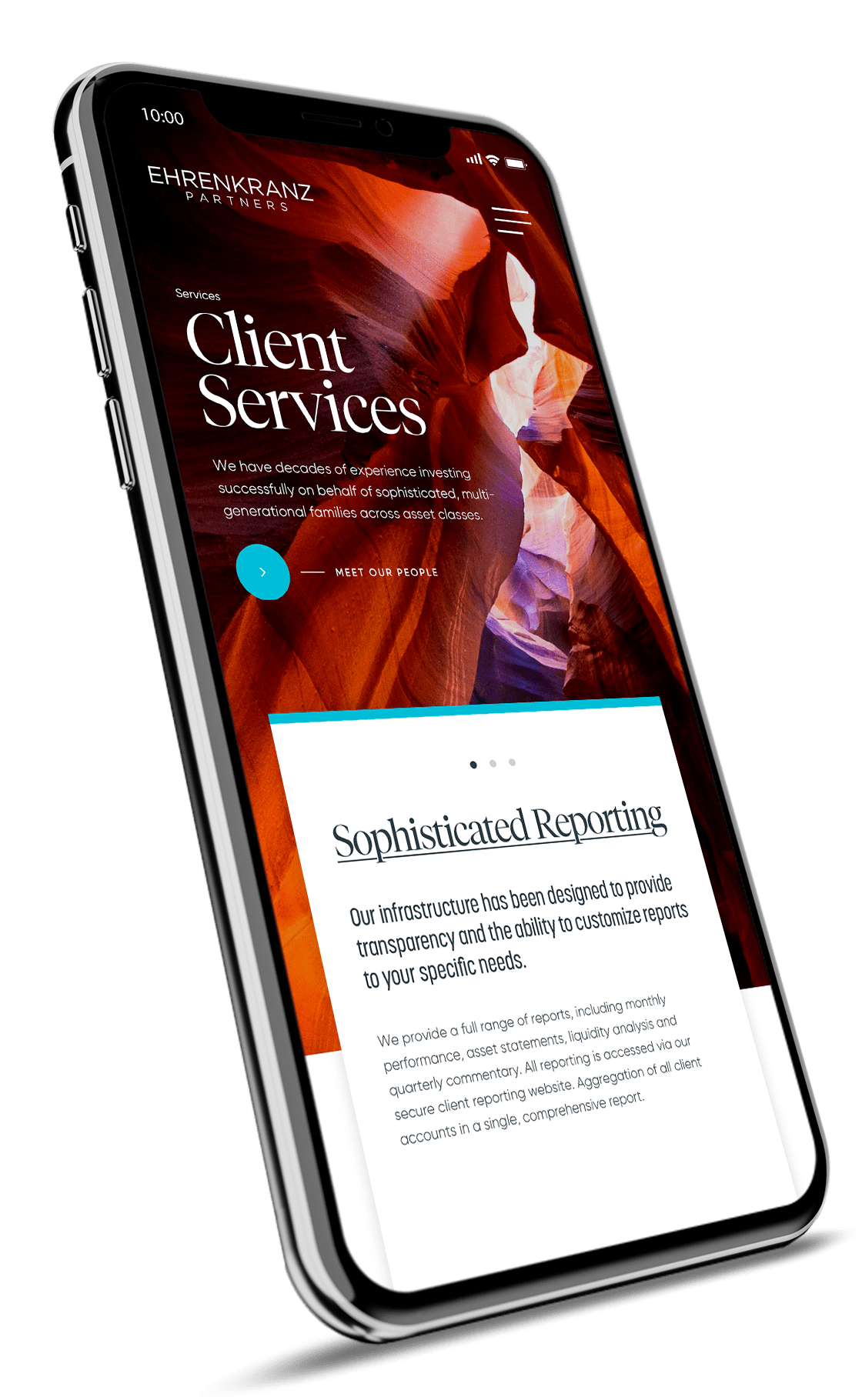
The new site displays core service offerings front & center, communicating information in a manner that’s easy to digest and comprehend, whether you’re new to investment management or a seasoned investor.

Micro-interactions are more than a trend. Each subtle animation incorporated into the site increases user engagement while adding professionalism and panache to the interface. These animations reflect this firm’s active and modern approach to wealth management.
Standard website navigation is for standard businesses. This wealth management firm is nothing of the sort. So, we built a custom smooth-state menu animation that feels surprising, yet consistent with the site’s interior pages.

