May 15, 2018
Top 8 Financial Web Designs: Spring 2018 Roundup
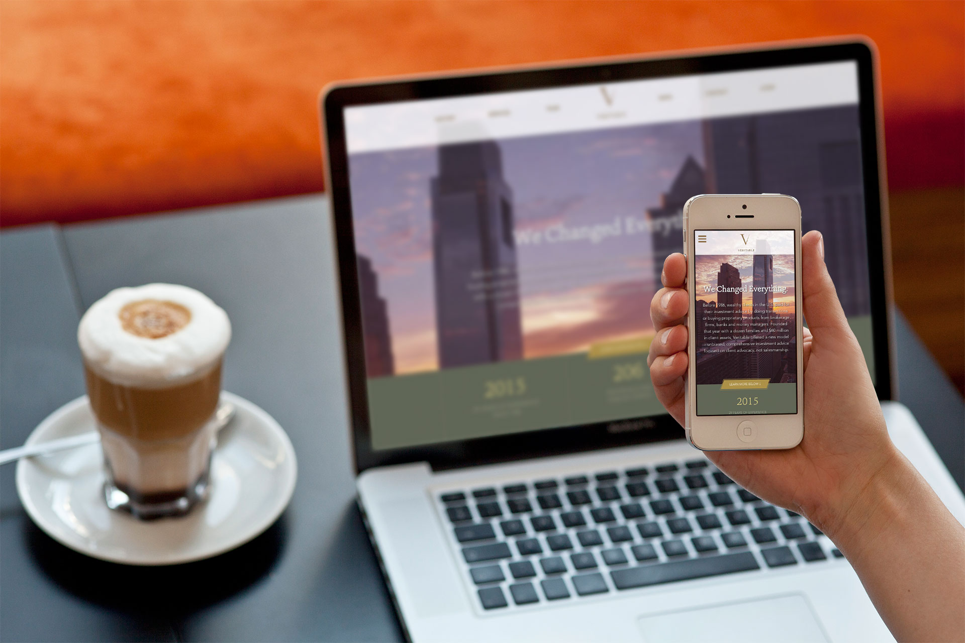
When beginning each new wealth management and financial services web design project we always start by performing a competitive review to spot the latest finance industry trends. This has lead to an impressive list of website designs that stand head and shoulders above the rest.
The examples below have successfully deployed great design, accepted usability standards, and thoughtful content to make the top of our list this spring.
1. Pearl Capital

Pearl Capital leads with illustration and pairs this custom imagery with a very simple layout and clear calls to action. Each content block is broken up using a color shift and illustration, yet the site is kept cohesive with a strongly branded color palette. Overall, the site is simple, visually interesting, and very well branded.
Visit Site »
2. Veritable LP
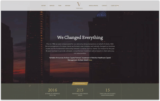
The Veritable site employs modern long-scroll pages filled with high-end photography to showcase the firm’s culture and environment. A distinct color palette lends a sense of warmth and feels approachable, while subtle animations and bold messaging are eye catching and instructive. In the end, it’s clear that every detail has been well-considered, and the experience feels polished and professional throughout. [Designed by Push10] Visit Site »
3. Chrome
 Chrome Federal Credit Union employs an extremely clean and simple web design with a consistent brand color palette. The user interface is easy to navigate with plenty of white space and a bright orange button style. The homepage uses subtle and modern animations while the interiors are more content based, which is completely justified given the objective of the site. Visit Site »
4. Resource Real Estate
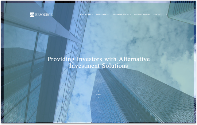 Resource Real Estate increases brand authority by pairing a strong visual style with modern animations. The subtle vertical elements and arrows throughout the site have a clear purpose – to seamlessly move users from one section to the next for a more fluid experience. As the user navigates deeper into the site, it becomes clear that all secondary content has been considered with the same exacting detail as the Homepage – a hallmark of a truly exceptional site. [Designed by Push10] Visit Site »
5. Copenhagen Economics
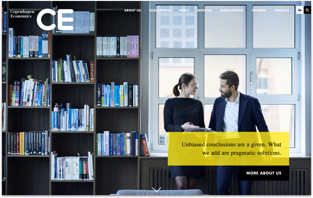 Copenhagen Economics uses a large bold font, unique color palette, and relatable lifestyle imagery featuring real employees. Together these brand elements portray a sense of authenticity. The site also does a great job of clearly organizing information and quickly conveying the firm’s expertise in the field. Visit Site »
6. Ehrenkranz Partners
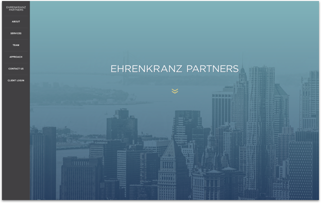 The Ehrenkranz site uses large visuals, bold colors and ample white space to create a clean, modern interface design. The side navigation is somewhat unique for this industry and allows for a seamless transition to mobile browsing. The modern and elegant typefaces used throughout the site work very well and give the brand a certain air of modern sophistication. [Designed by Push10] Visit Site »
7. SJF Ventures
 The SJF site brings it back to the basics with large hero images and strong calls to action. Simple touches like the modern time-lapse video in the homepage banner and the high quality themed imagery leave this site feeling very modern, yet straight to the point. The organized blocks of content with imagery and/or color overlays that take up the rest of the pages help to clearly organize information for quick consumption. Visit Site »
8. American Advisors
 The American Advisors took a very simple approach to their website by only offering up key information in a one-page long scroll site. The design is very clean and to the point, with subtle parallax scrolling and obvious calls to action and button styles. The brand style and user interface is very consistent throughout the page. Visit Site »
That’s All For Now!
At Push10, we’ve built award-winning websites for a wide range of clients in the Financial Services and Wealth Management industries. We’d be happy to schedule a free consultation to review your site and discuss areas for improvement.

