01
Research & Strategy
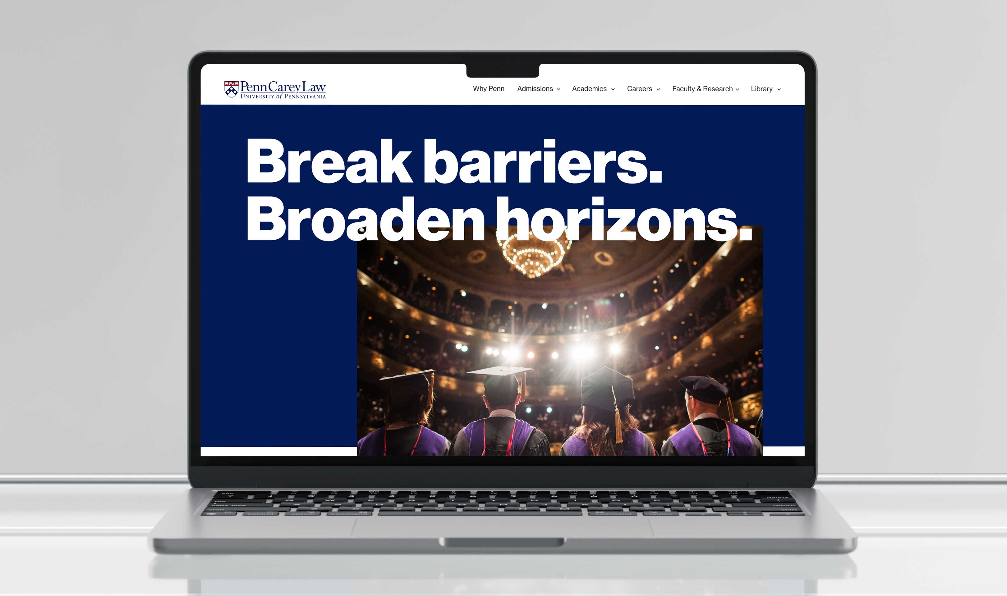
Almost by default, big educational institutions need big websites. The Law School’s site was no exception. With a long list of people the site needed to serve, and an even longer list of world-class programs, centers, and faculty to show off, this web design was an exercise in focus and simplification. So we asked, what is at the center of the Law School experience? From that question, we designed a research plan that yielded a sound strategy to bring the University of Pennsylvania Carey Law’s new website to life.
A View From the Inside
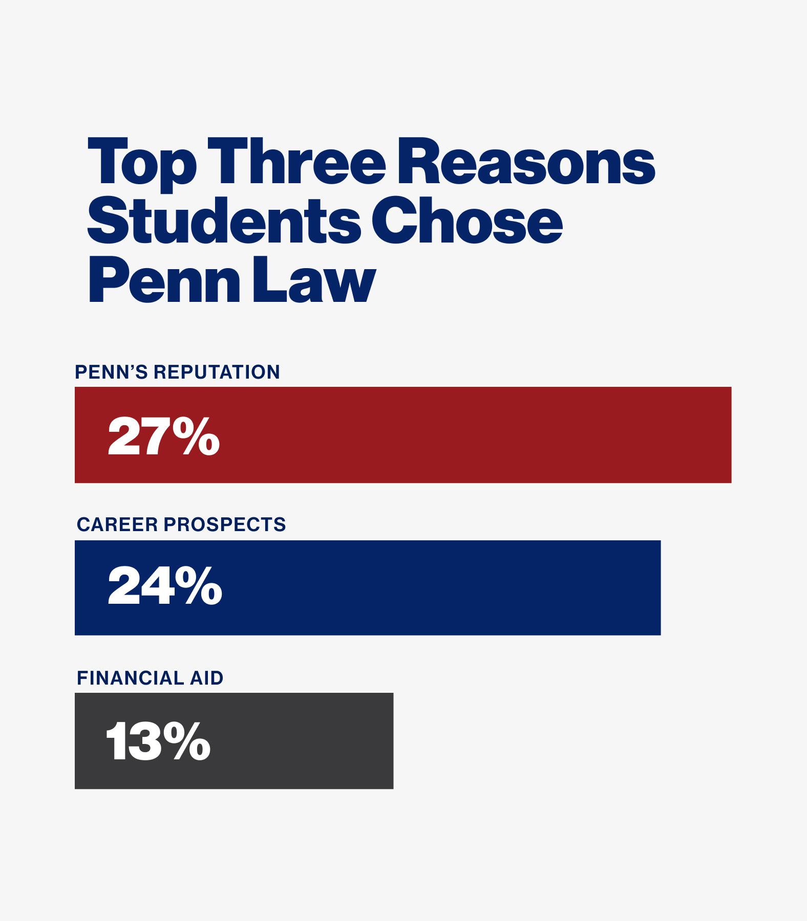
Nobody knows what it’s like to attend the Law School better than active students and staff. We talked to these audiences to create a foundation for our strategy. By conducting stakeholder interviews, workshops, and surveys we were able to hear from as many voices as possible.

A View From the Outside
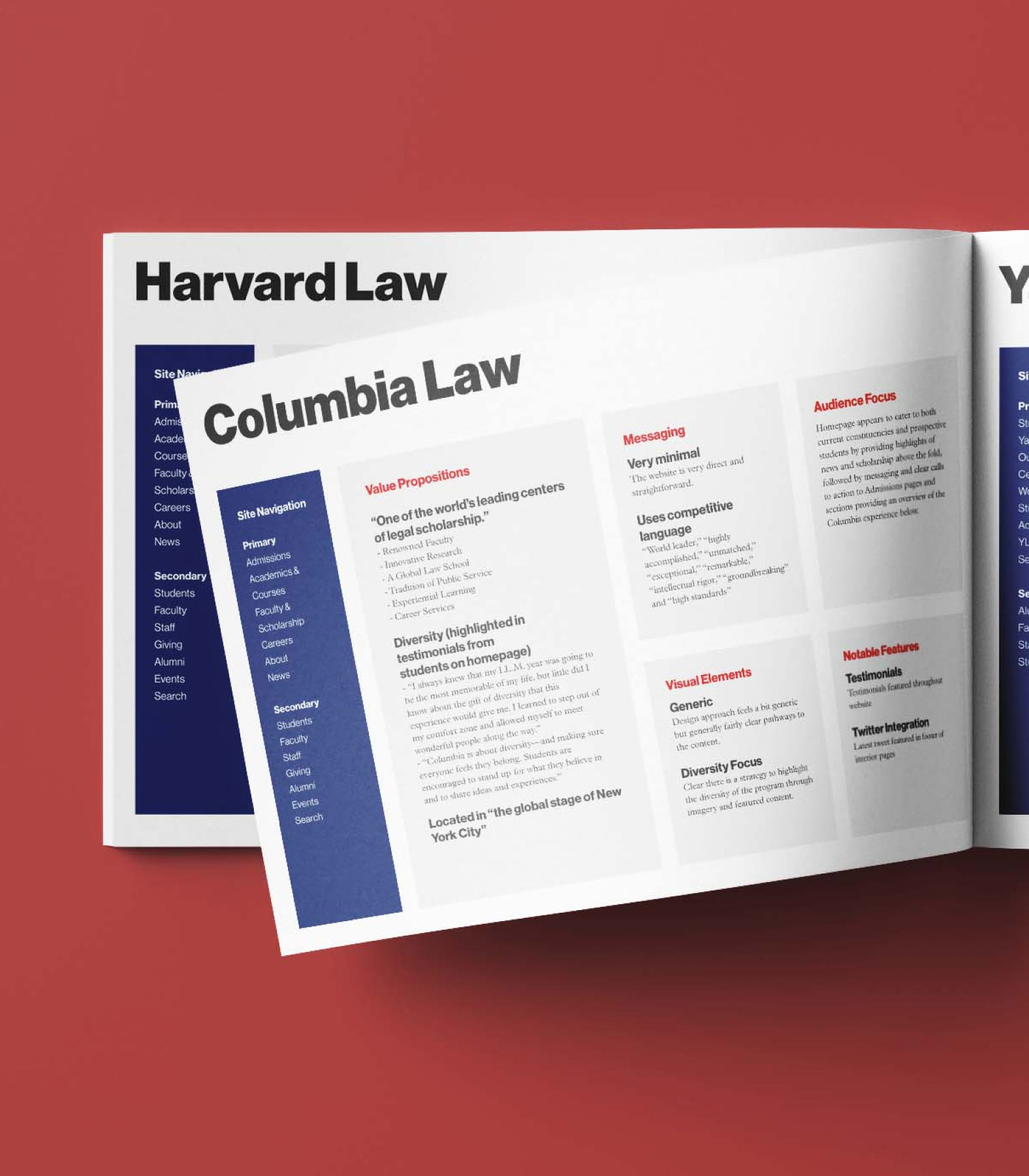
The Law School competes for students against some of the world’s most prestigious institutions, so taking inventory of these competitors’ websites was an important step for us to create a differentiated experience. A competitive analysis is less about throwing stones at the “other guys,” and more about finding opportunities for significant differentiation.

Who is Using the Site, Anyway?
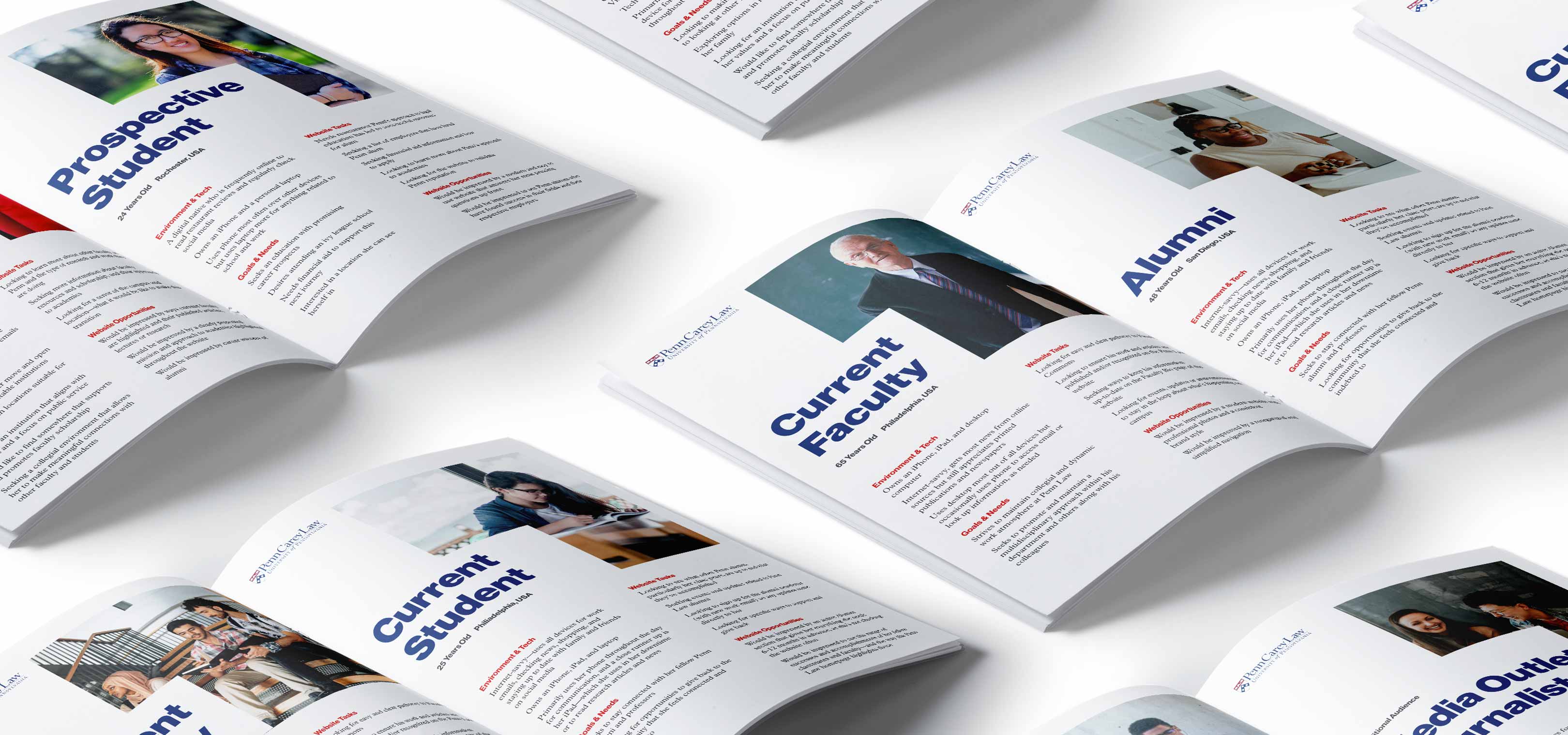
Creating user personas is a necessary step to bring order to a large site that could otherwise become disorganized and unruly. By establishing and recording researched profiles for the site’s target audiences, we were able to prioritize content. The most important audience—prospective students—could feel like the site was truly customized for their needs.
02
Site Architecture
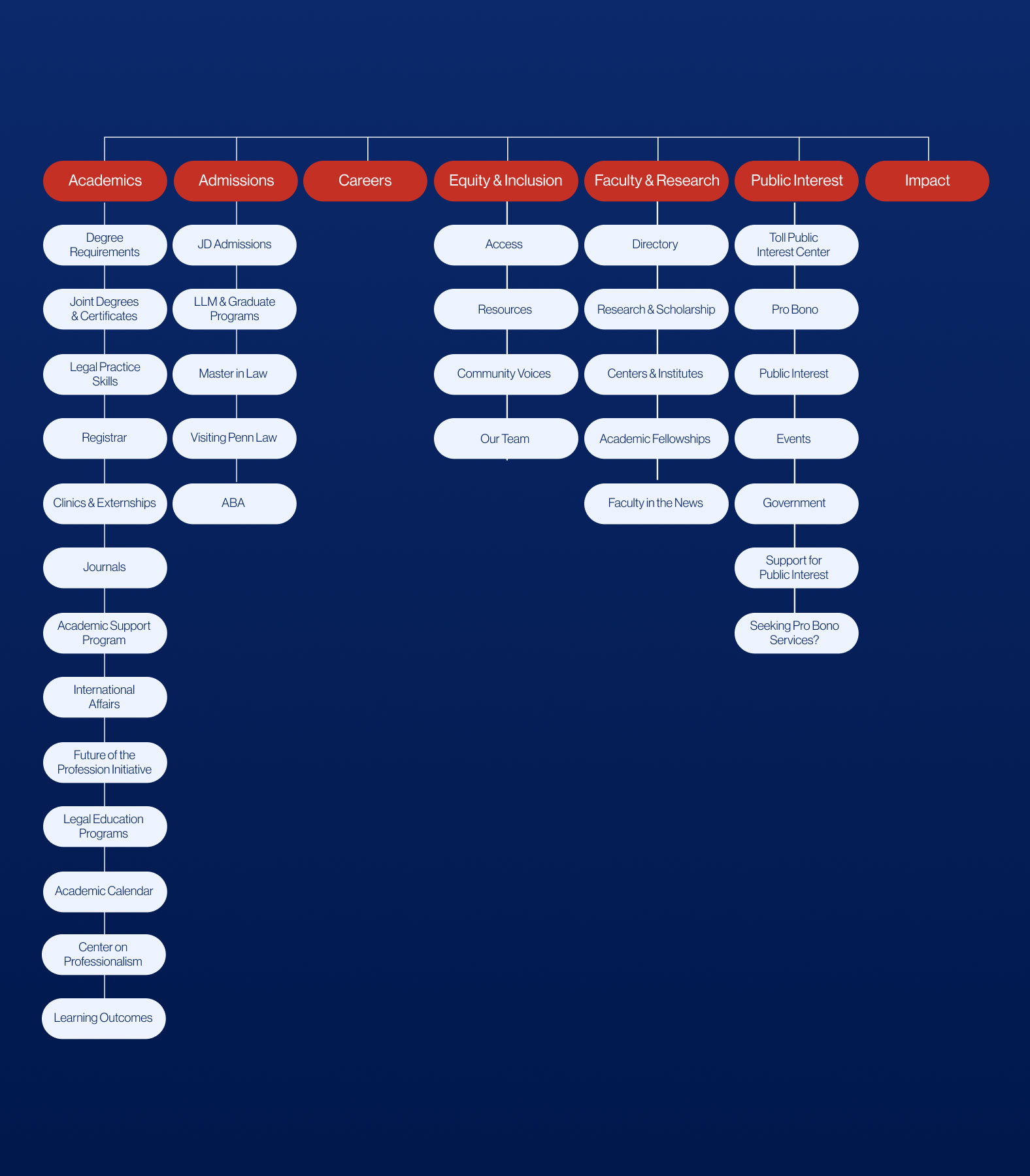
Like a house, a website needs good bones. The sitemap and wireframes we made for the Law School’s website redesign employed the user personas as a proverbial blueprint. By rooting our decisions in the audiences’ needs, we ensured that the final design looked less like a superficial facelift and more like a big, strategic step forward for the institution.
A Page-by-Page Approach
We started the site architecture phase by auditing existing content. This step allowed us to think critically about what content should stay, what should go, and what should take a different shape. The resulting sitemap became tighter and more strategic as a result.


Framing the Experience Through Interactive Prototypes
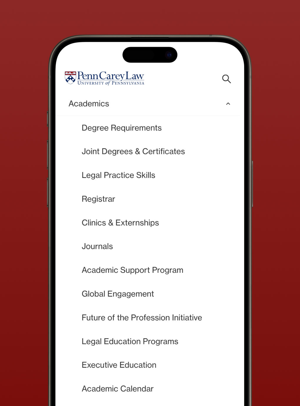
The intermediate step between sitemap and designs is vital to the overall success of the project. Creating interactive wireframe prototypes illustrated our strategic thinking in action, enabling key stakeholders to visualize the overall structure of the site. It also gave us the space to test, experiment, and validate our UX approach before reaching the design phase, at which point structural revisions become more difficult to make.

03
Copywriting & Website Design
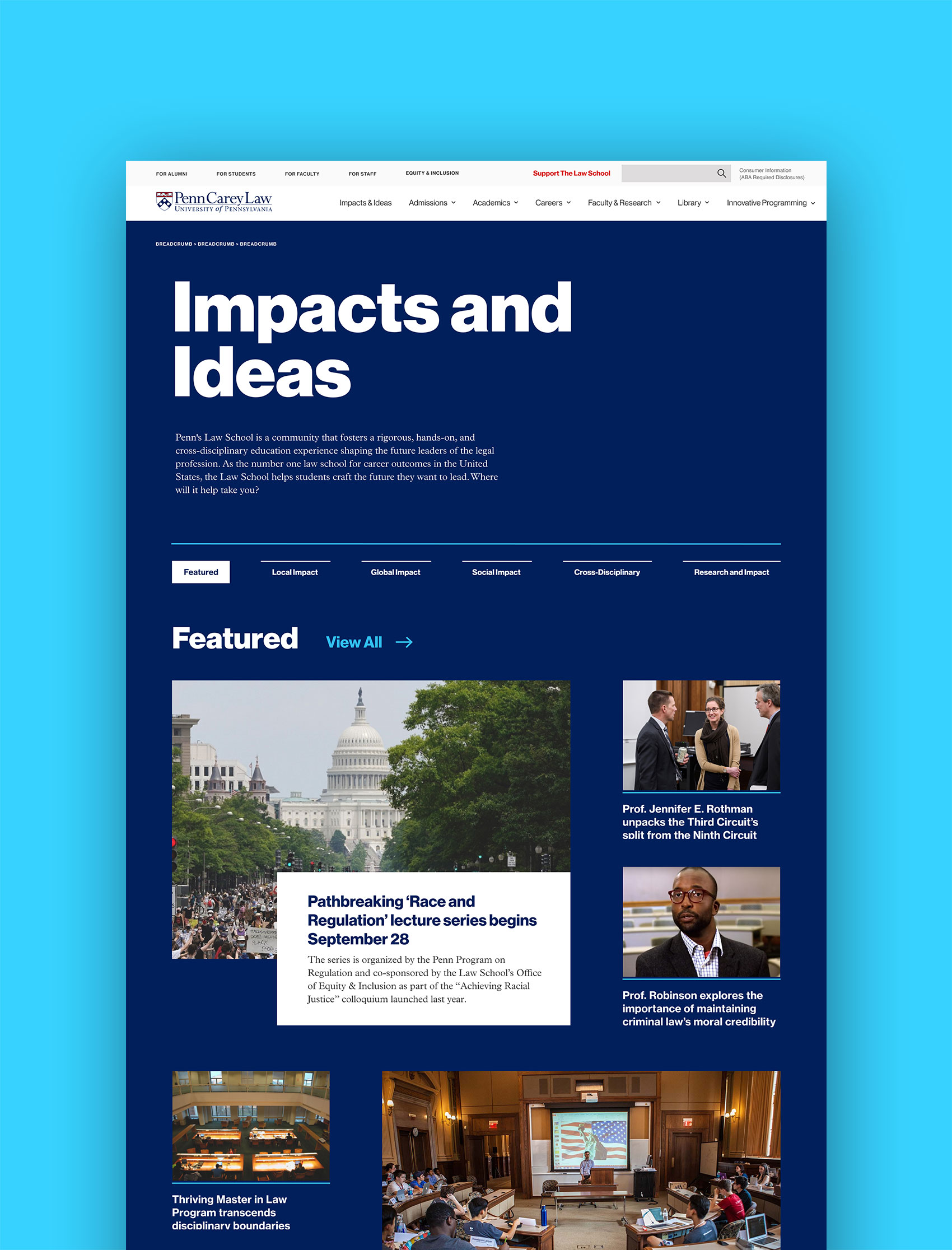
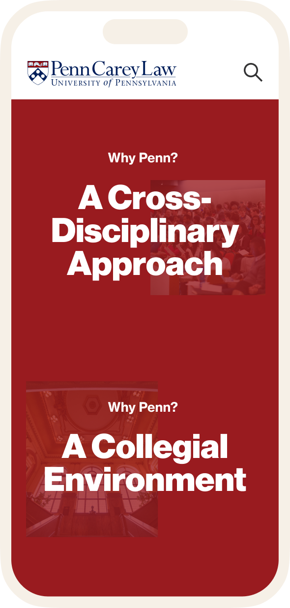
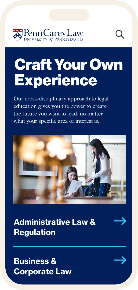
From good strategy comes great creative. Our research provided a framework from which to approach the design phase of the project. As a bold, multi-disciplinary institution, the Carey Law School needed creative assets to reflect their values. The copy and design came together to communicate the brand story to the site’s various audiences, especially for the prospective students eager to change the world.

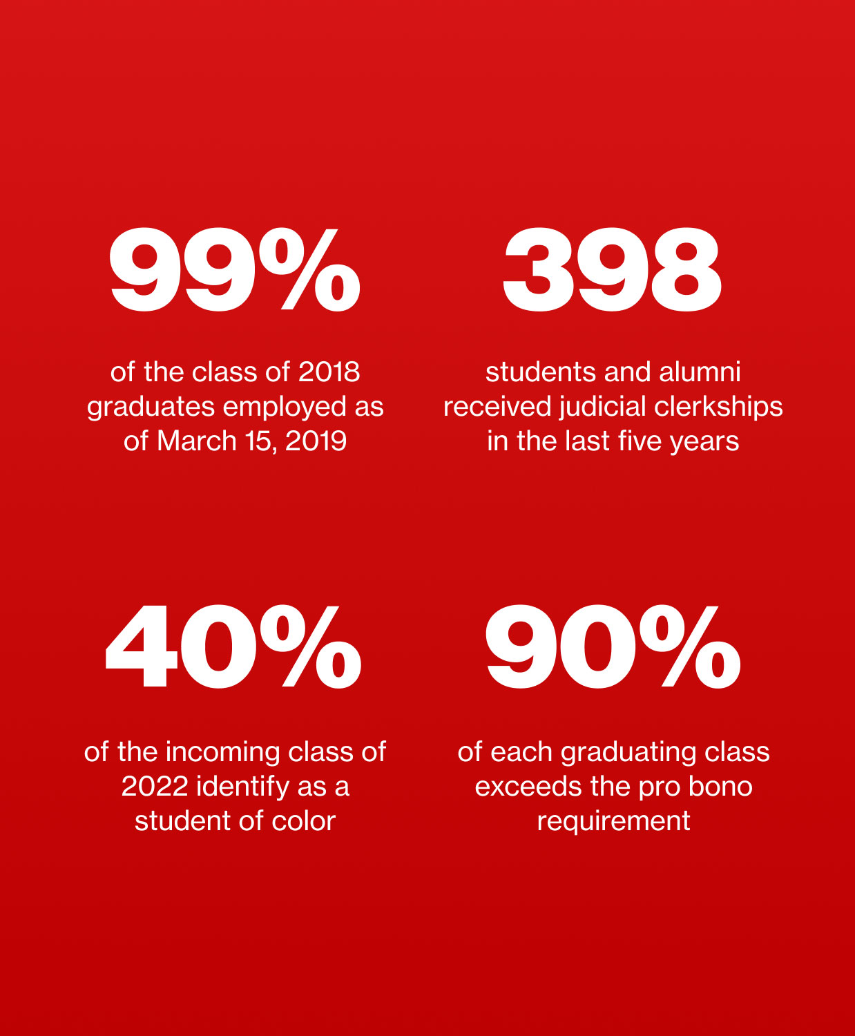
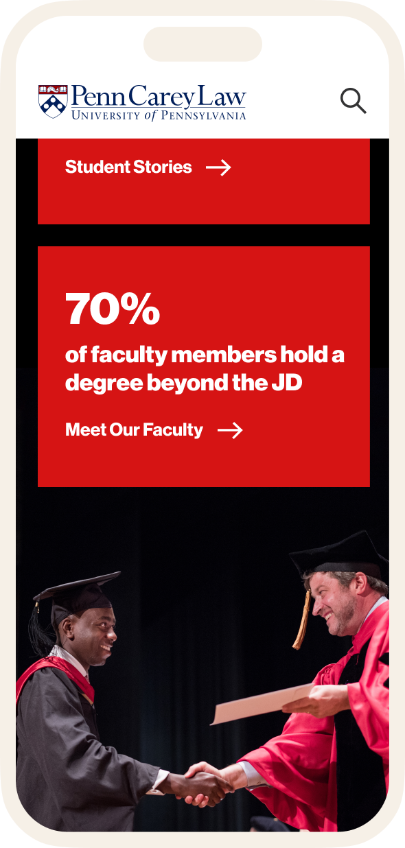
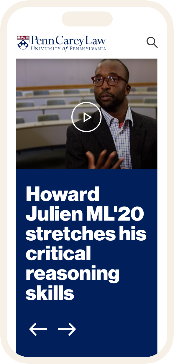
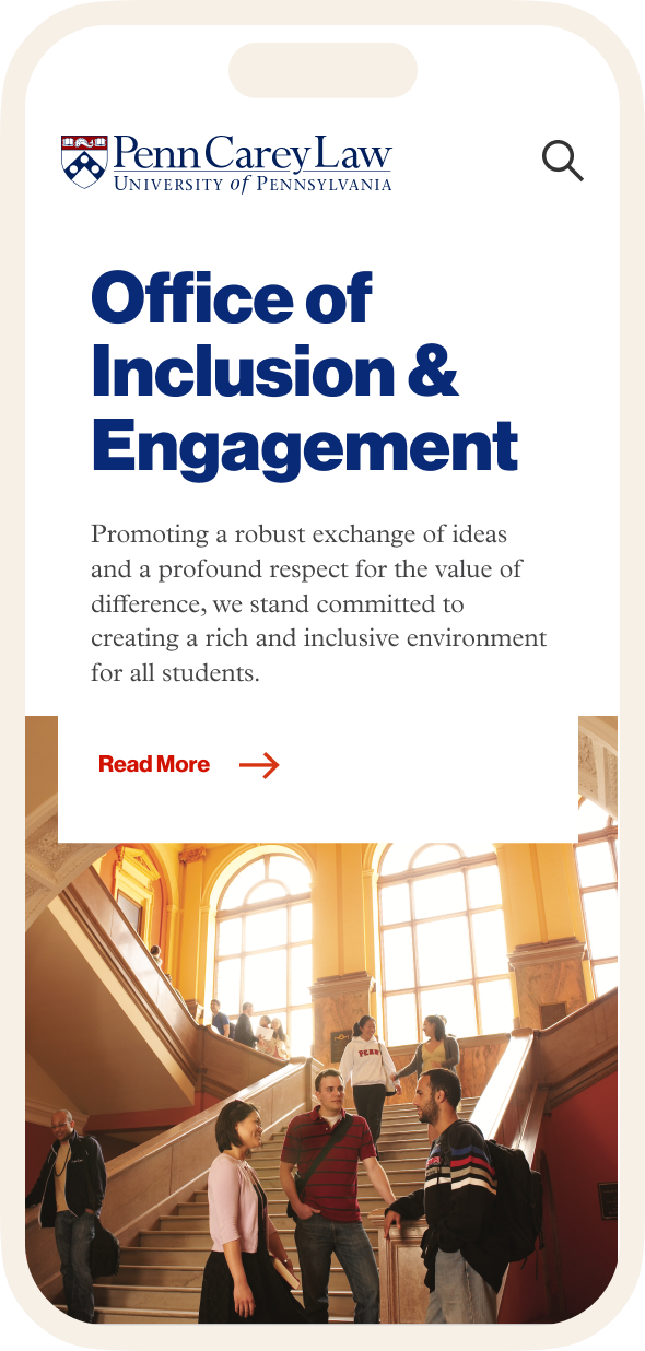


Unique Iconography for a Notable Institution
Everything about the Law School’s experience is one-of-a-kind. Each design decision we made reinforces that unique quality of Penn Law, down to the custom iconography we created throughout the site.
One Voice for the Future of Law
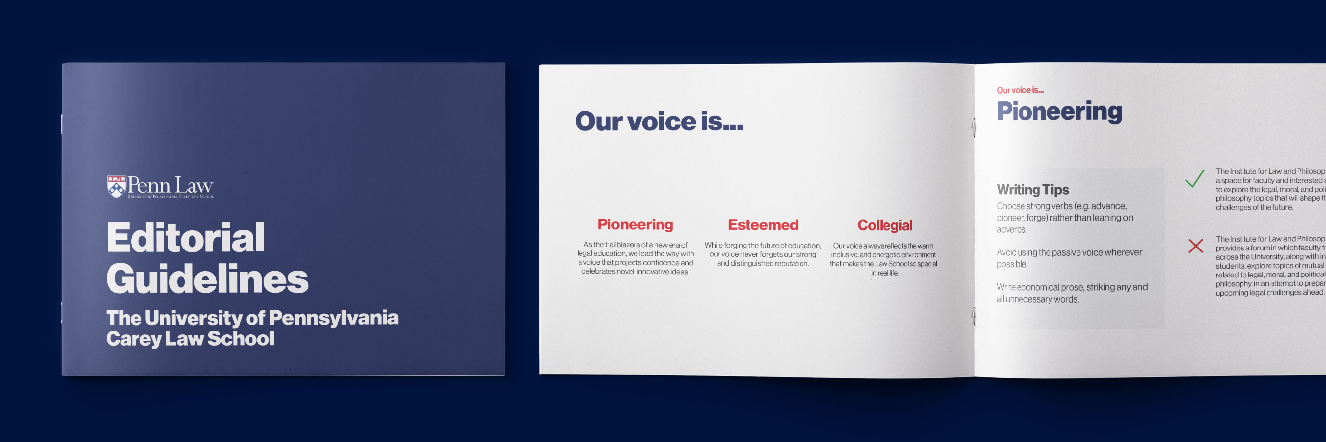
We developed a writing guide to capture the voice & tone of the Law School, while providing contributing writers and editors an easy-to-use tool, ensuring the site’s copy remains on-brand. Covering web copywriting basics, SEO guidelines, and tone-of-voice pointers, this guide prevents the brand from veering off course and makes certain all site visitors, no matter what content they’re reading, leave with a cohesive impression of the School’s values.
04
Developing the Site
As much as designing a large and dynamic university site can be challenging, the web development phase presents its own share of hurdles. Working on sites of a similar scale had taught us what to expect, so our in-house developers and designers collaborated early and often with the Law School’s website development team to create a flexible content management system that enables the site to evolve over time.
Building the Developer’s Toolkit
To translate the design system for the Law School’s development team, we created a custom UI kit, defining styles, animations, and more. This front-end development kit helped the project stay on track while setting the Law School up for future success, as the development team can refer to the kit when adding new pages and/or sections.

ADA Requirements
The Law School is an inclusive environment with an inclusive, ADA compliant website. Achieving ADA Compliance can sometimes hinder both creative and technical freedom. However, because we planned the site with ADA Compliance in mind from the outset, we were able to overcome these hurdles to deliver a site that excludes no one, and excites everyone.

“Thanks again for delivering an outstanding design, team. I’m definitely looking forward celebrating this launch!”
University of Pennsylvania Carey Law School
Marin Smith , Sr. Digital Communications Specialist
VISIT THE WEBSITE