Candler School of Theology
A Big Change for Change Makers
Candler School of Theology is a pillar of Emory University, and is renowned for the quality of education they provide. They partnered with us to create a distinctive brand and enhanced web experience that would reposition Candler as the change agent behind the brightest minds in theology.
01
research & strategy
To build a great brand, you have to truly understand how it exists off the page. Our research took us far and wide: from reviewing the competition’s messaging, to conducting focus groups with current students, to surveying a diverse cross-section of alumni – and even visiting campus to experience Candler through the eyes of a student.
At the end of the research phase we had an incredible picture of Candler. We just had to find the right words to describe what made that picture so special.
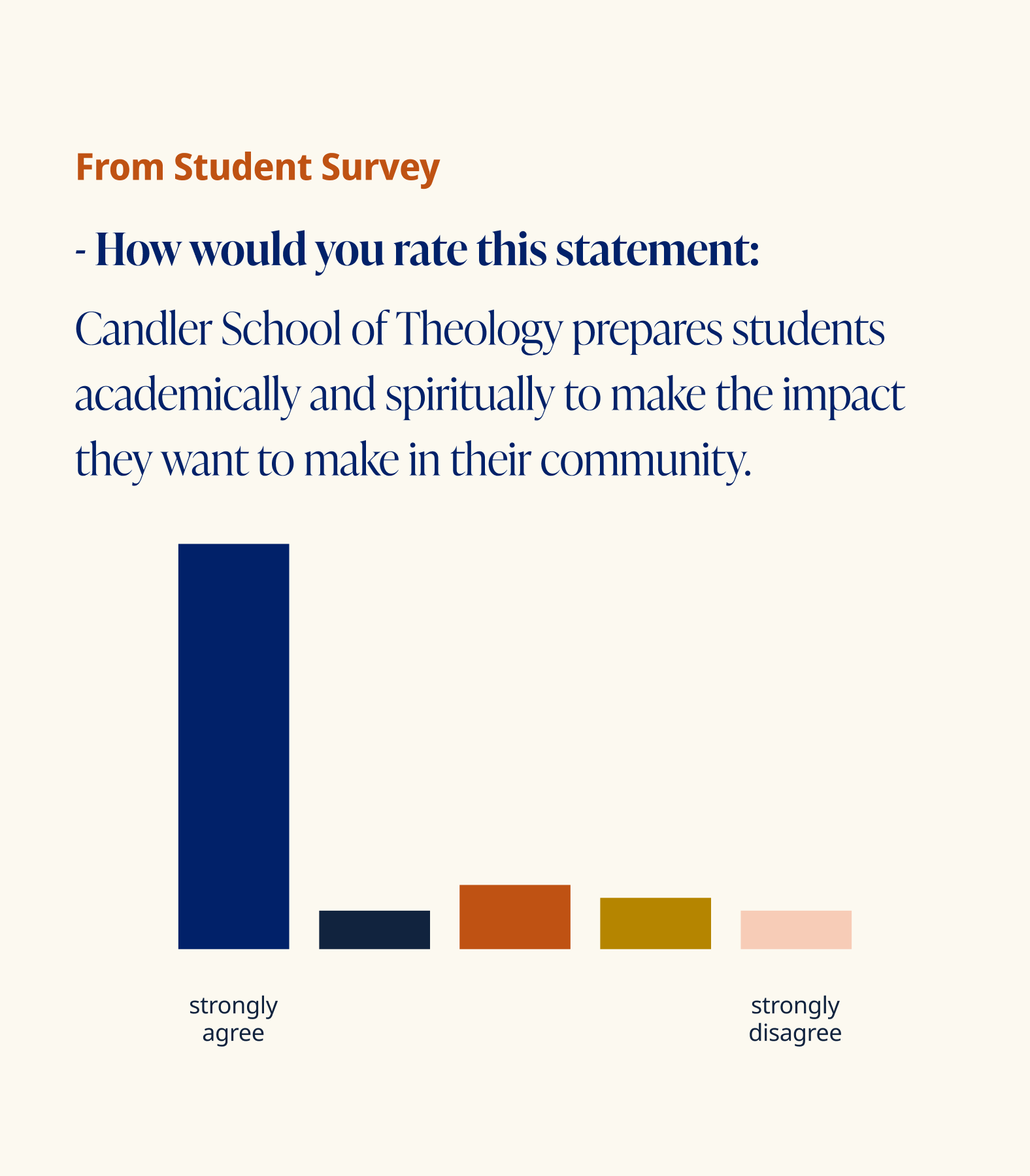
Understanding What Students Want
Our goal was to identify what made Candler stand out to students. We understood that the best way to discover why a student would choose Candler was to speak to those students, themselves. Here’s what we heard.
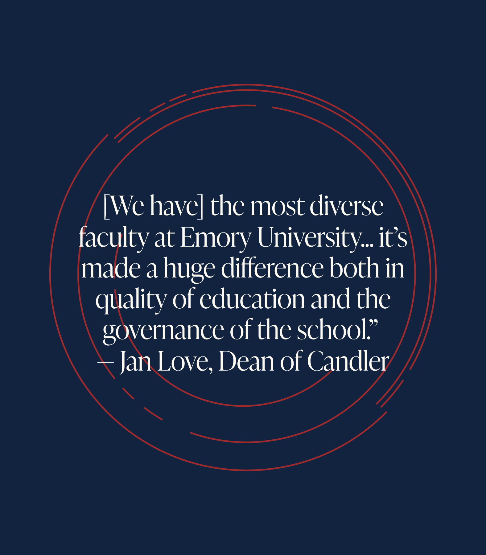
An Intentionally Diverse Audience
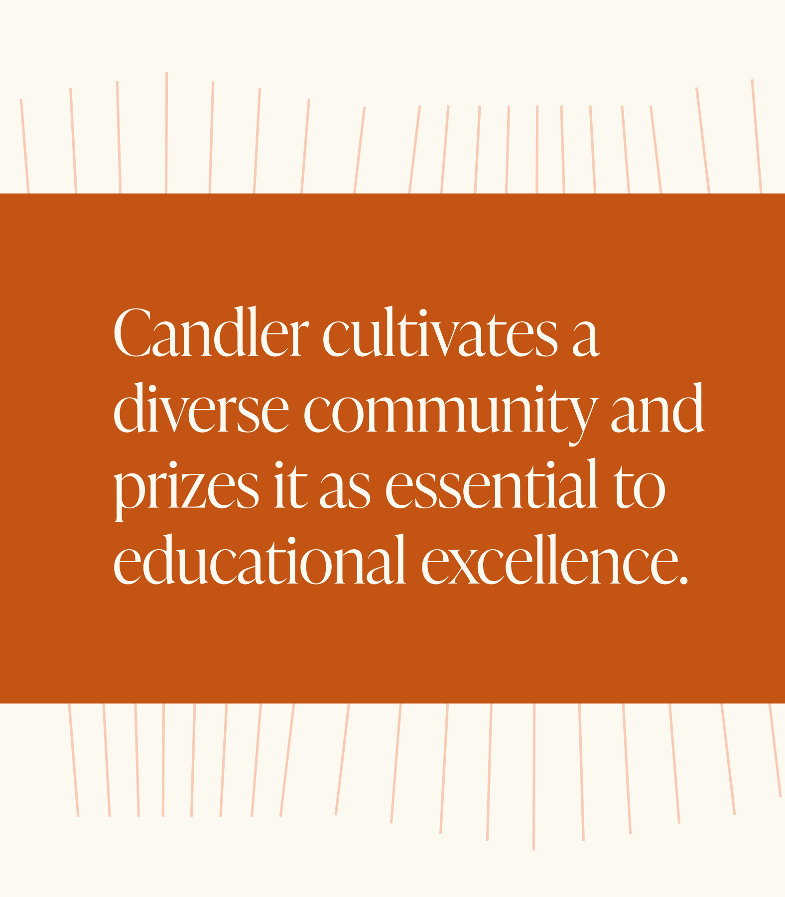
We heard repeatedly that one of Candler’s great strengths was the diversity of its community – a diversity that the institution had intentionally cultivated. Audiences with very different backgrounds can be a messaging pain point, but we determined it was best to embrace diversity as a core messaging pillar.
Out of the Ivory Tower
Another key element that makes Candler feel so unique is the way students are encouraged to bring their own personal experiences into the classroom as valuable context for their academic studies. Then, students are asked to take the big ideas they study in the classroom out into the real world, and apply them to new contexts.
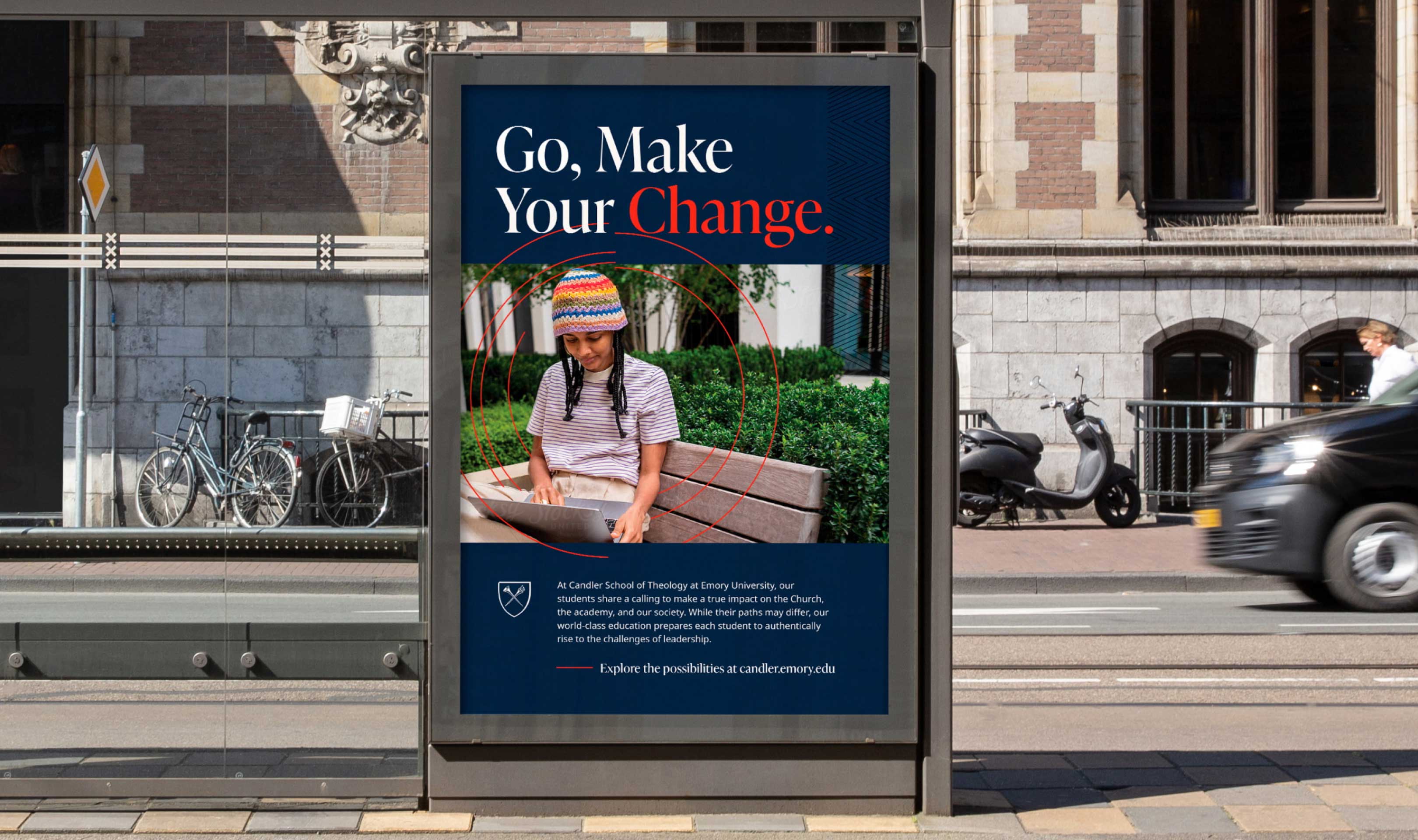
A Position Built On Change
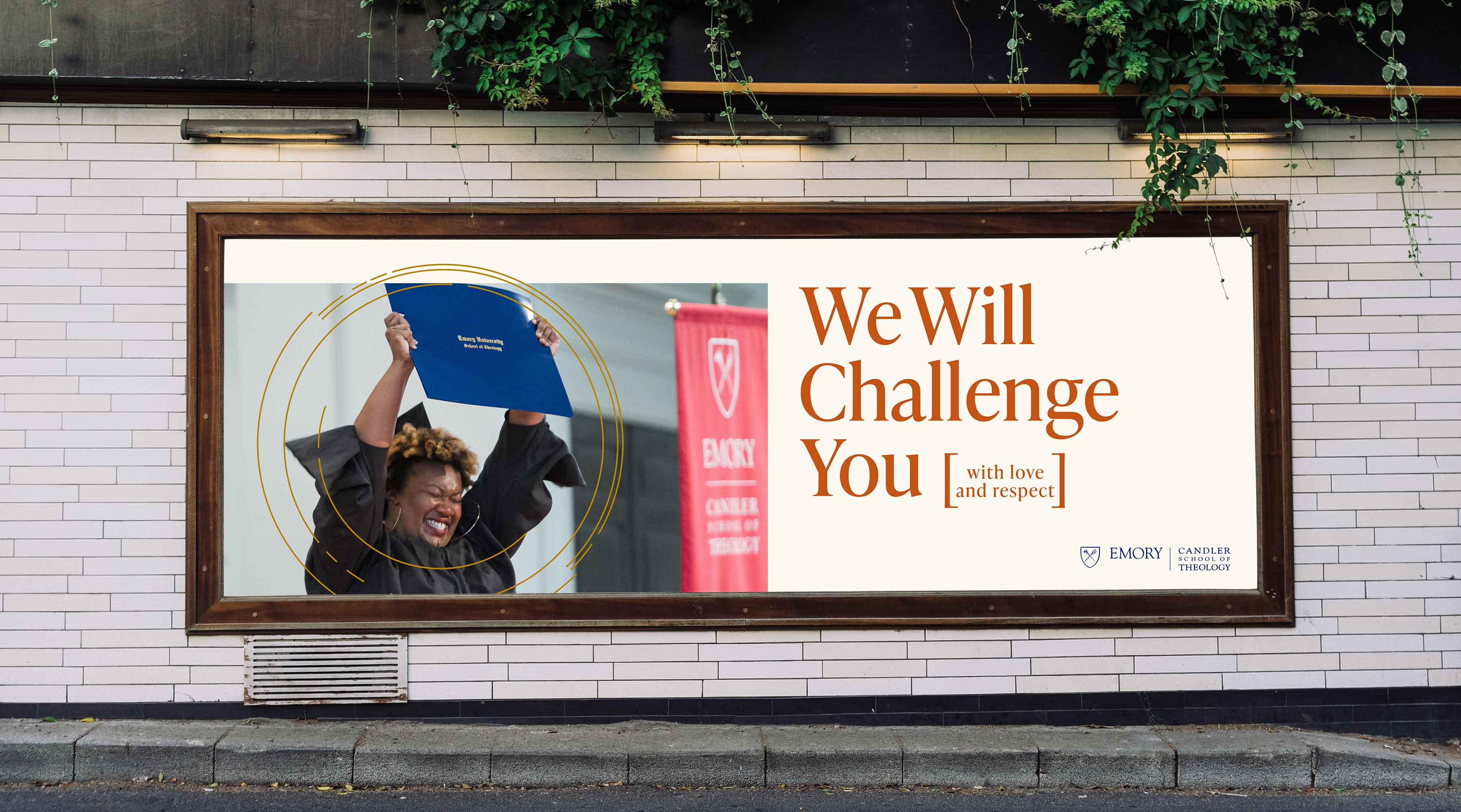
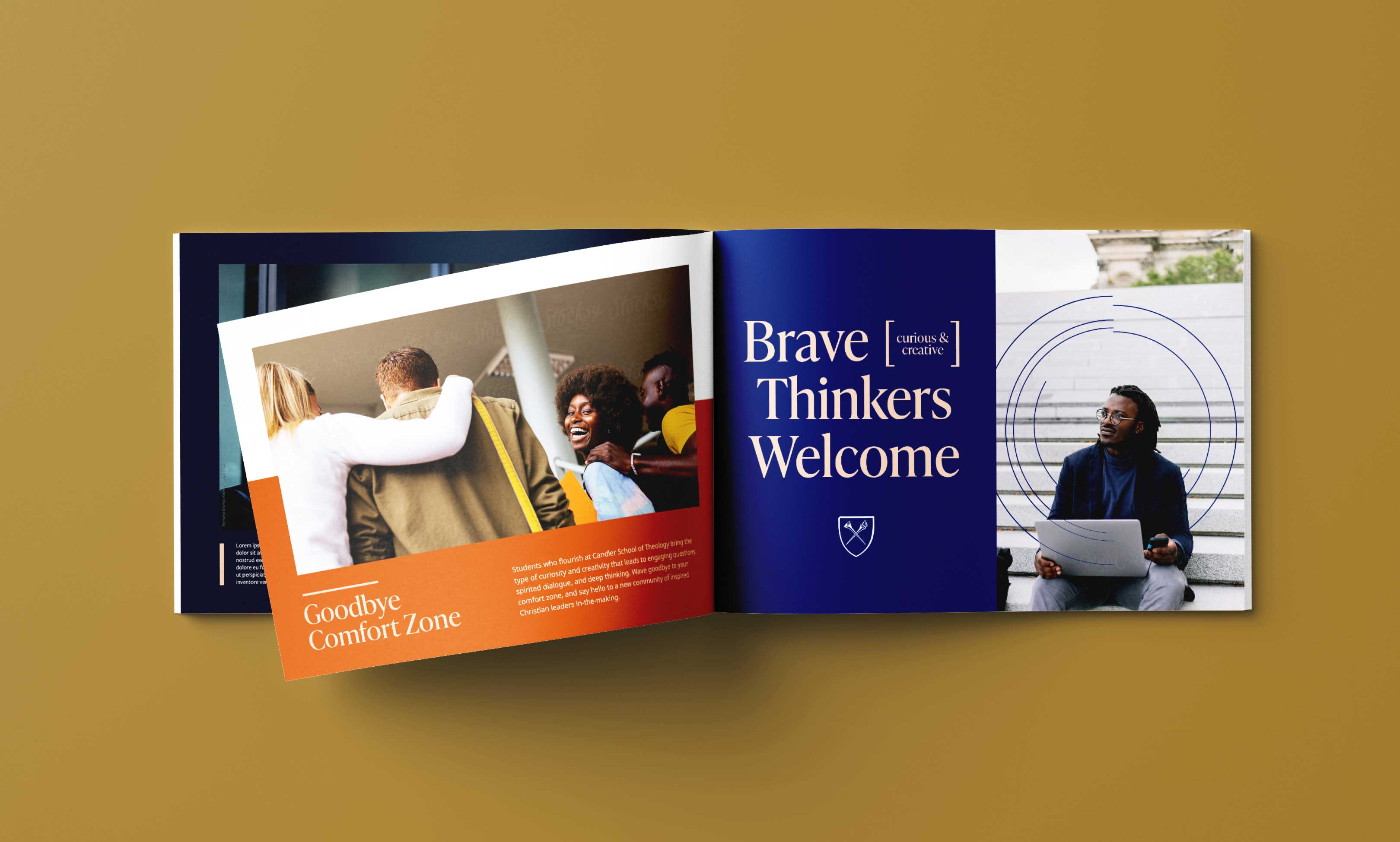
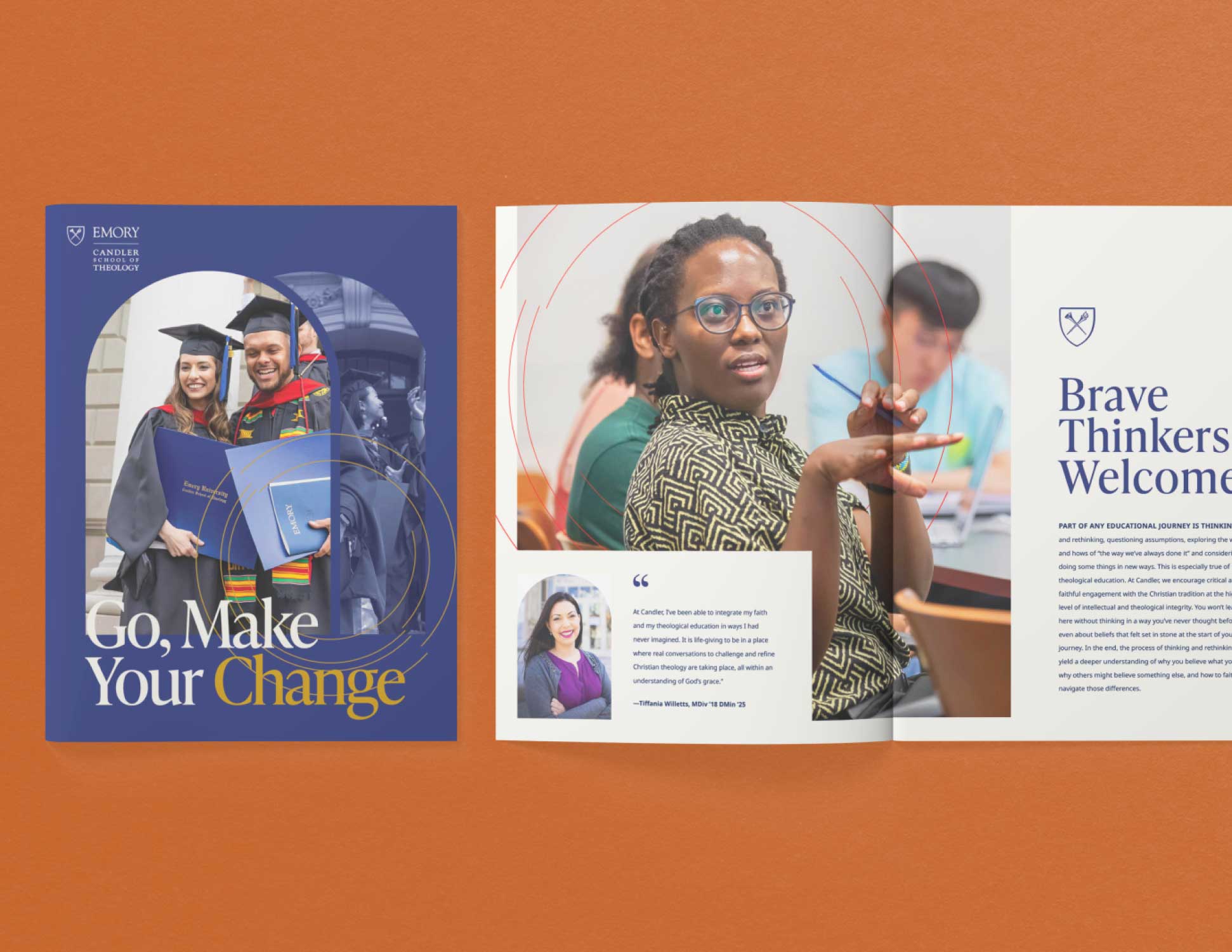
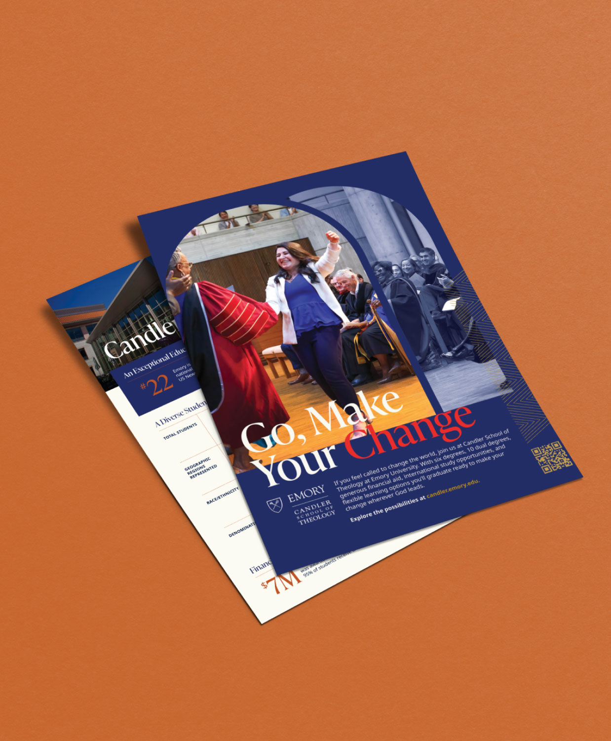
We wanted to position the new brand around the key elements of Candler that excited students, faculty and staff the most. In the end, we found that student's infectious optimism and passion for making an impact was a uniting and powerful theme. With our new rallying cry of “Go, Make Your Change,” we refined the brand platform and laid the foundation for an exciting new visual identity.

Making the Message Stick
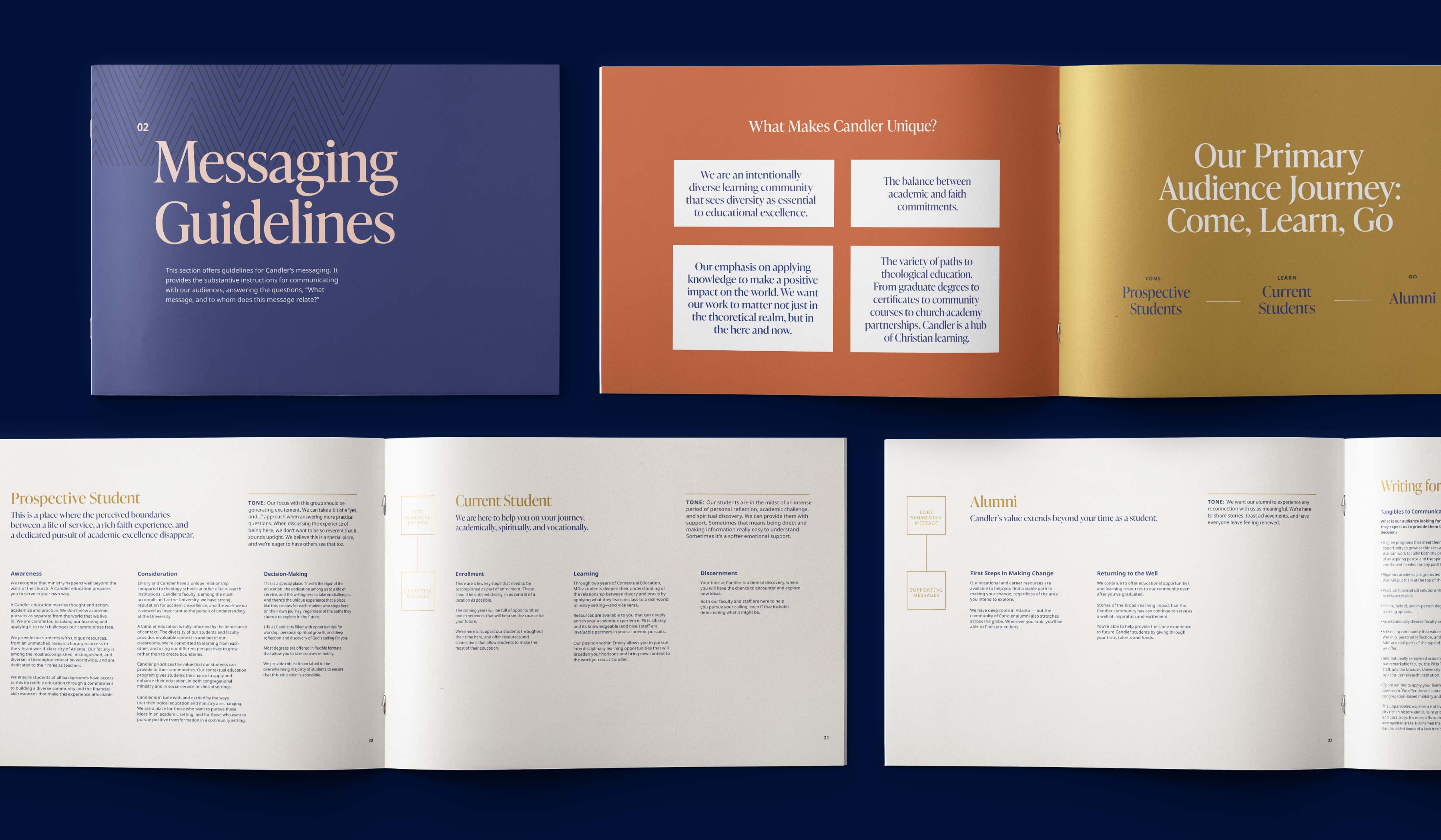
We had a strong new central message that was authentic to Candler. But with so many audiences, and so many touchpoints, we had to ensure that the messaging translated to each distinct audience segment.
02
Visual Identity
With the new positioning as our guide, we began working to further distinguish the visual brand from the competition. The new identity needed to balance a serious academic focus with the warmth of the Candler community, and bring the idea of “Making Change” to life.
Discovering Candler’s Core Value
We had learned a lot about Candler through research and strategy, but to land on an impactful visual concept we focused on three core truths.
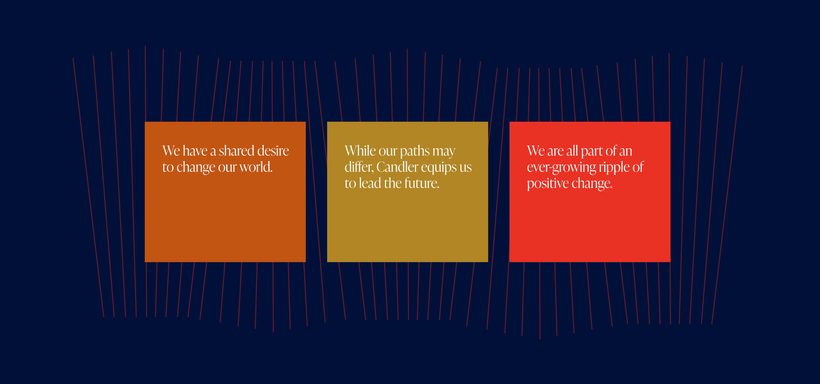
The Ripple Effect
The resulting visual concept centered on the people who make up the Candler community, and the positive change that they create around them. We wanted to take the idea of the ripple, which could have felt cliche, and give it enough of a modern spin that it felt like a true expression of Candler's value.
Translating the Campus Experience
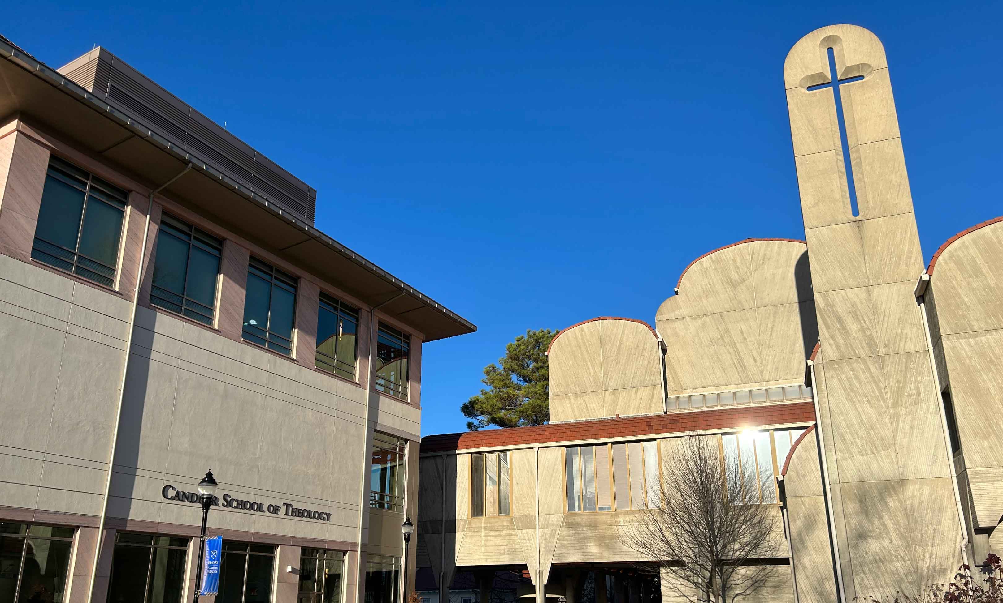
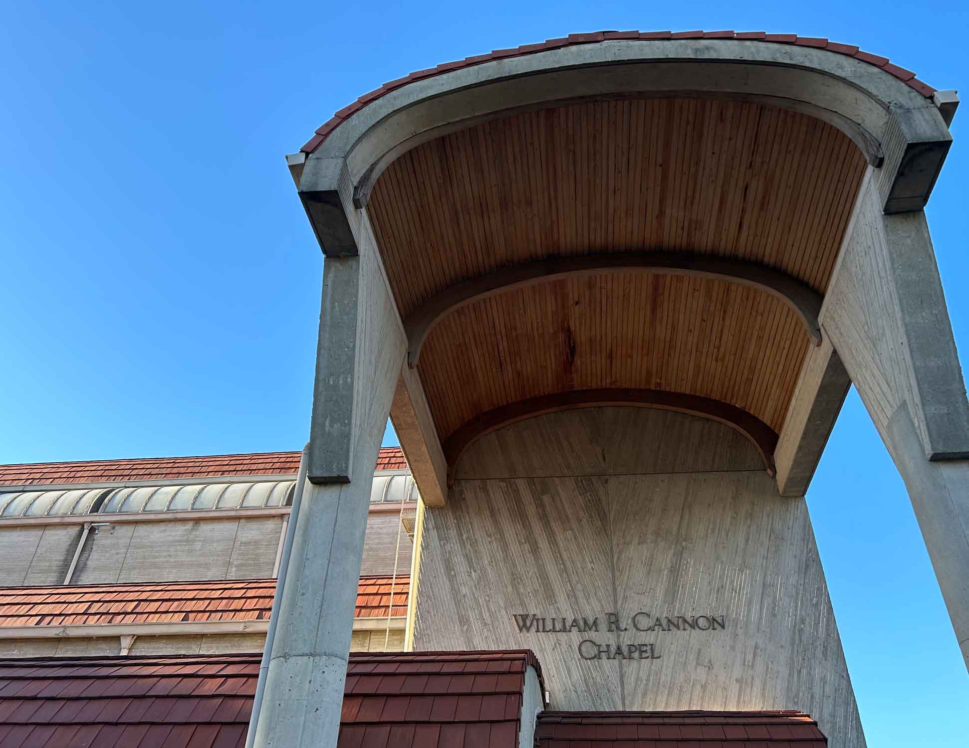
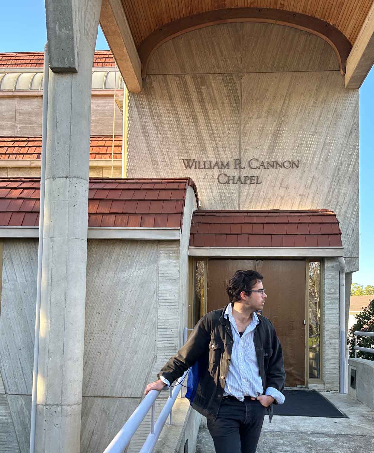
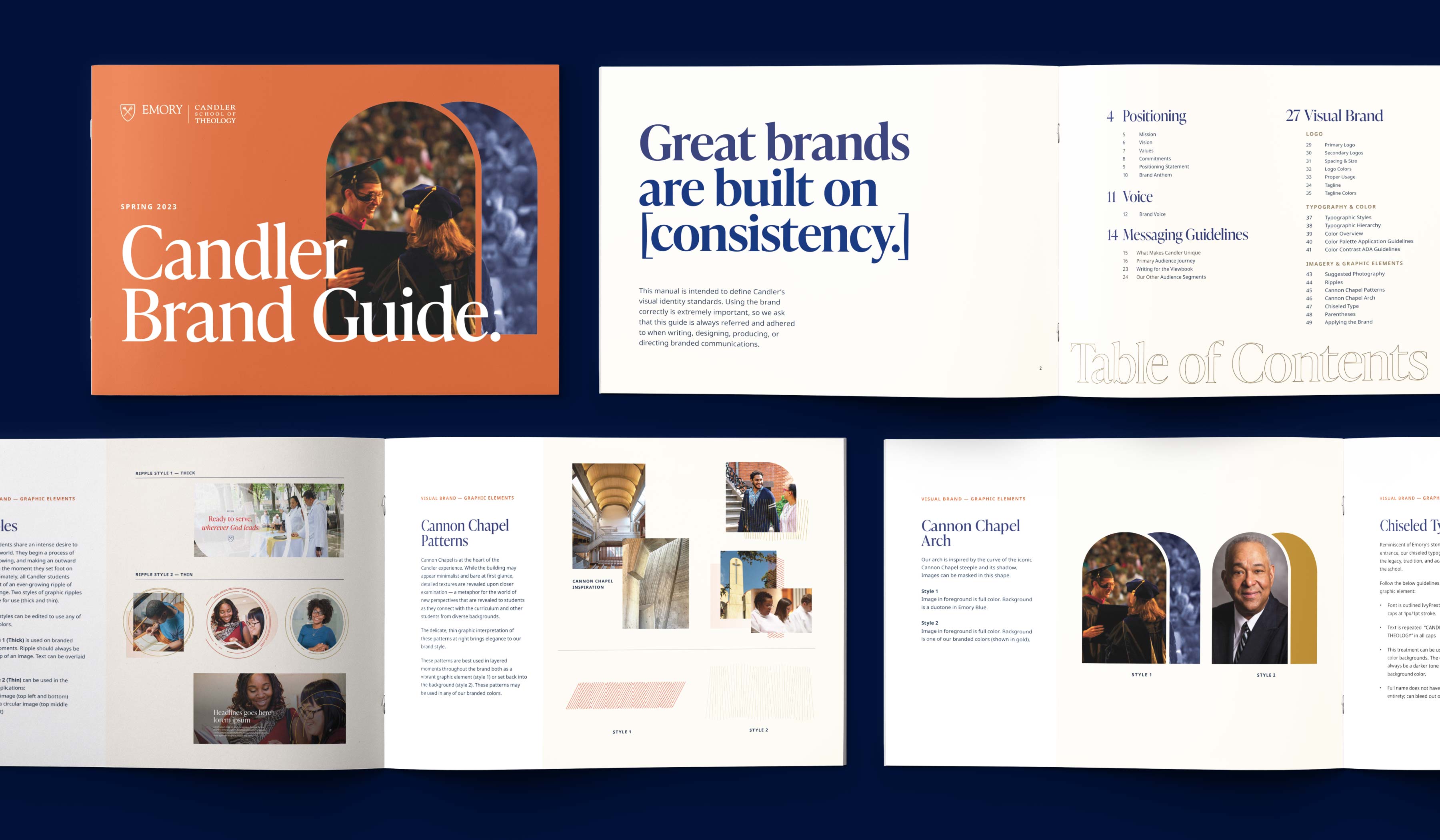
When we visited campus, we discovered certain architectural details that felt uniquely Candler. Cannon Chapel, for example, serves as a central meeting place for every student at Candler. We brought the shape and texture of the chapel into the new brand to add depth to specific layouts, and as a nod to those who know and love Candler.
Refining the Building Blocks
In order to stay connected to Emory University’s brand, the primary color palette was kept intact. Instead of a drastic overhaul, we bolstered the palette with several warm accent colors that gave the system more flexibility, warmth and and a modern feel. From there, we focused on identifying type styles that would feel academic but not stuffy. We selected styles that are favored by book publishers for their editorial warmth and legibility.


Establishing Brand Guidelines
With the deep and carefully crafted brand work in place, we turned to creating a comprehensive style guide that would feel useful for the whole Candler team. We didn’t want it to collect dust — so we worked with them to outline exactly which guidelines would be most useful and where their team would benefit from the most instruction.
03
Website Design
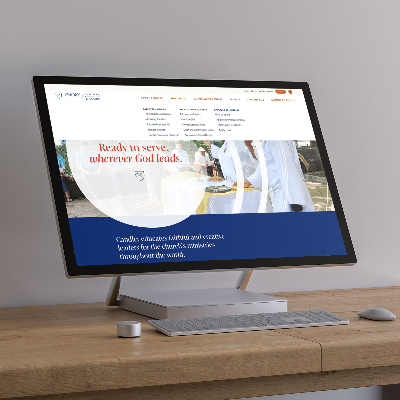
While we were tackling the breadth of the brand project, we were also working on bringing that new brand to life on a website that was built to both engage and serve a number of audiences.
Bringing The Story to Life
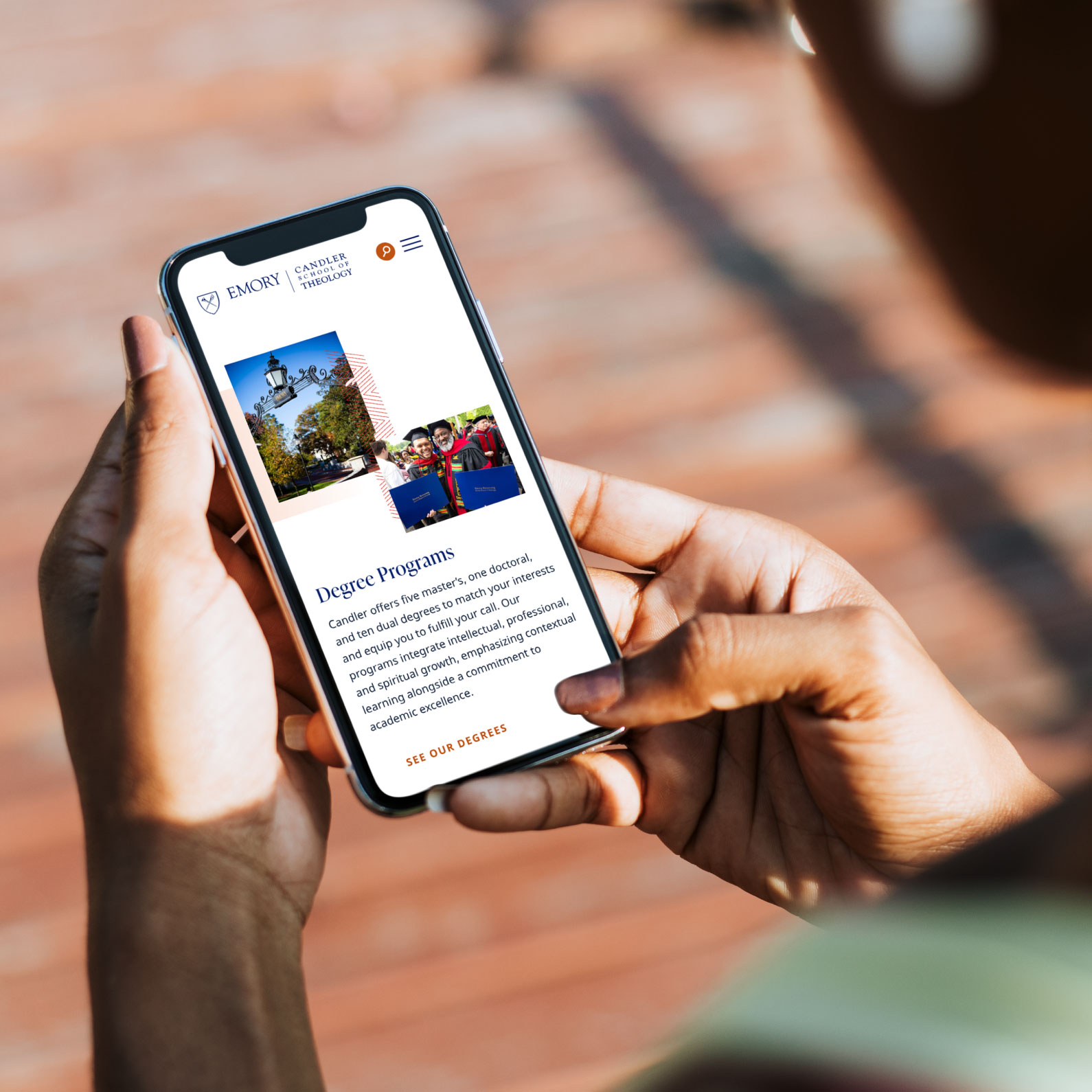
The Candler experience is so rich, we knew that words alone wouldn’t do it justice. When we outlined the page titled The Candler Experience, a key landing page in the Admissions section of the site, we planned for an immersive visual moment that would play perfectly alongside the strong messaging we’d developed.
Incorporating Candler’s Voices
Our findings during strategy showed the vibrancy of the people that make up the Candler community. We wanted their voices to be featured across the full website, sharing their unique experiences in their own words.
Connecting Students to their New Mentors
We also found that prospective students (and potential faculty members) found a lot of value in the Candler faculty. As these are some of the best theological scholars in the country, we wanted to create a highly functional directory that felt like more than a list of contact info.
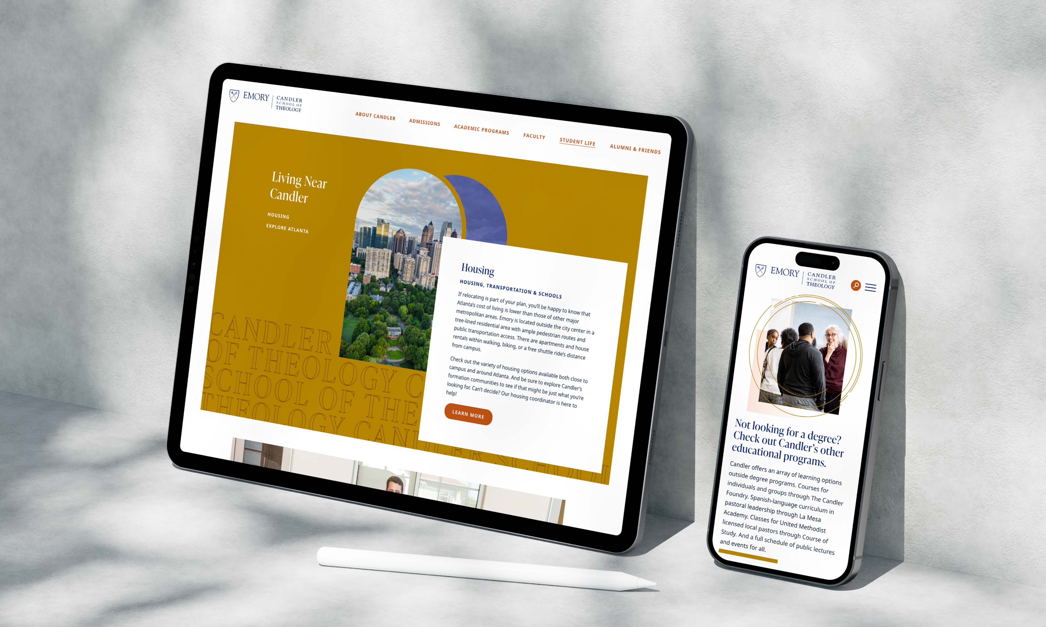
A Path For Anyone
Candler prides itself on leaving room for its students to forge unique paths for themselves. We found in our research that no matter how unique their path, each Candler student’s goal ultimately was to make an impact. While that became the core of our messaging, we created content throughout the website that showed just how flexible a Candler education could be. Ultimately, we made it easy for students to envision both the tangible and intangible experience of being at Candler, while making the site painless to navigate.
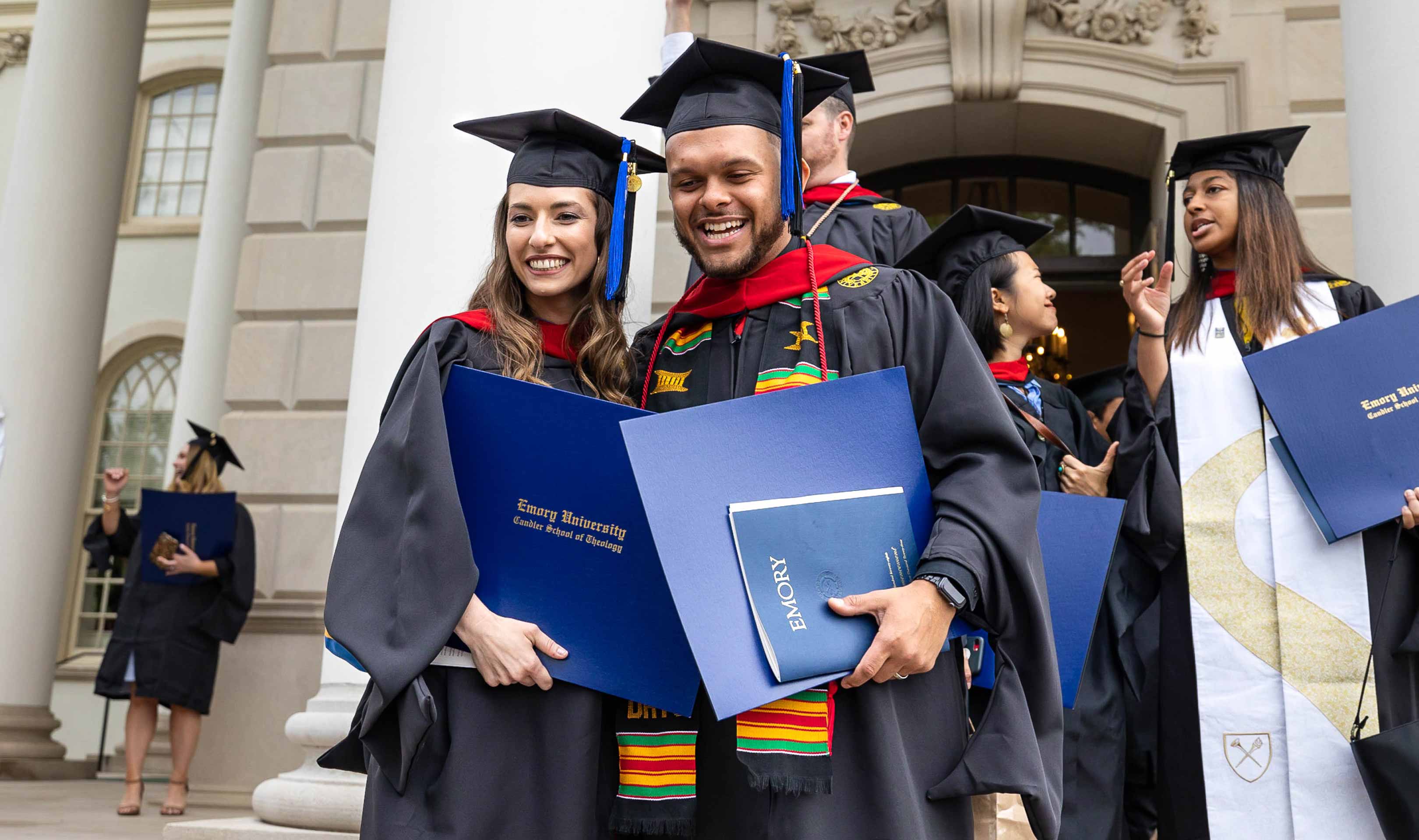
Working with the Candler team was an incredibly rewarding experience. They really saw the value in getting a better understanding of their brand, of pushing themselves creatively, and of creating a website that was easy for everyone to use. The level of strategic collaboration we were able to have was a dream — and the work shows that level of care.
Push10
Chandler Robertson, Strategist
VISIT THE WEBSITEView Related Work
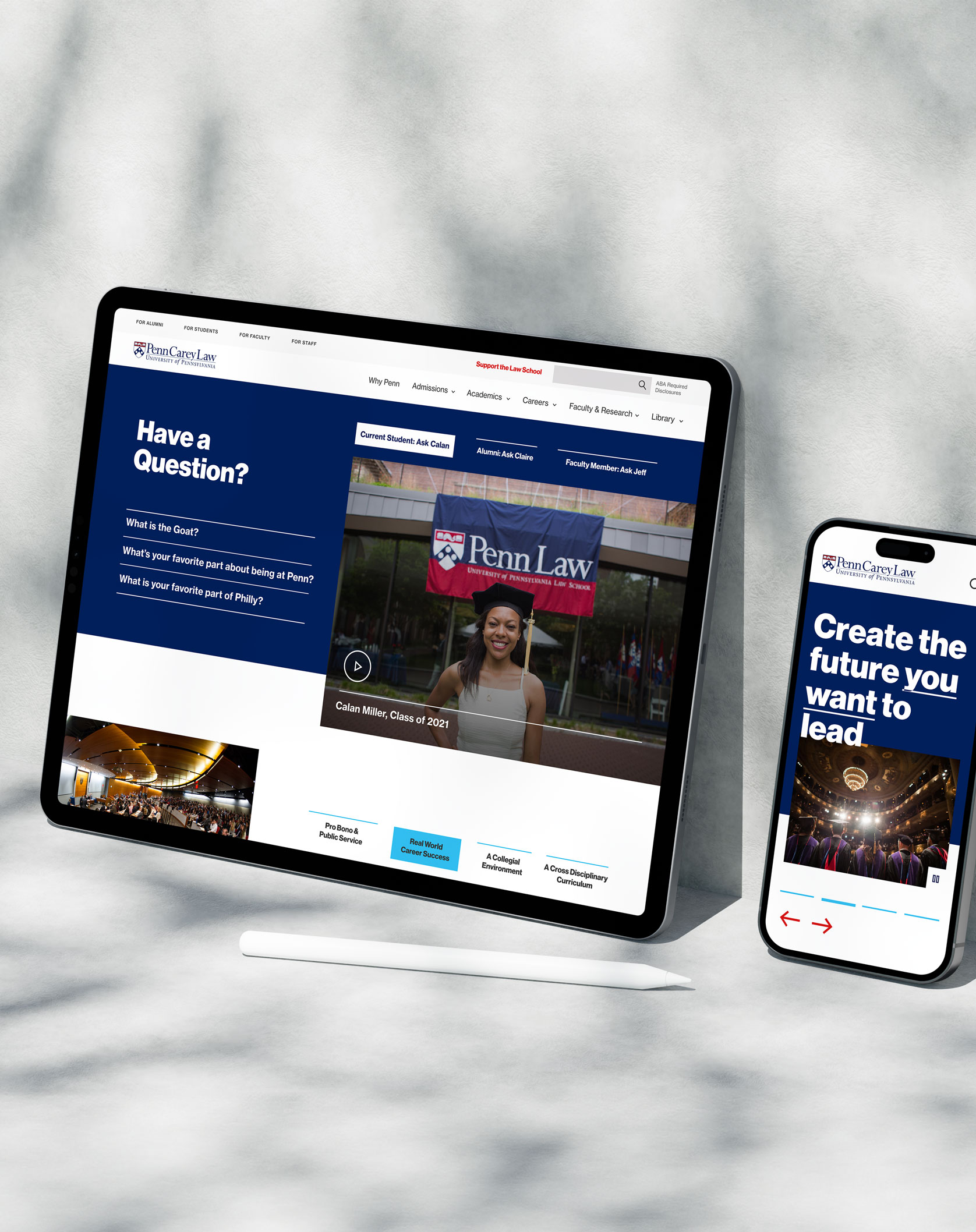
University of Pennsylvania Carey Law School
When the Law School came to us with the goal of redesigning their website, we understood the challenge and adopted it as our own.