A Story Worth Telling
Deliverables
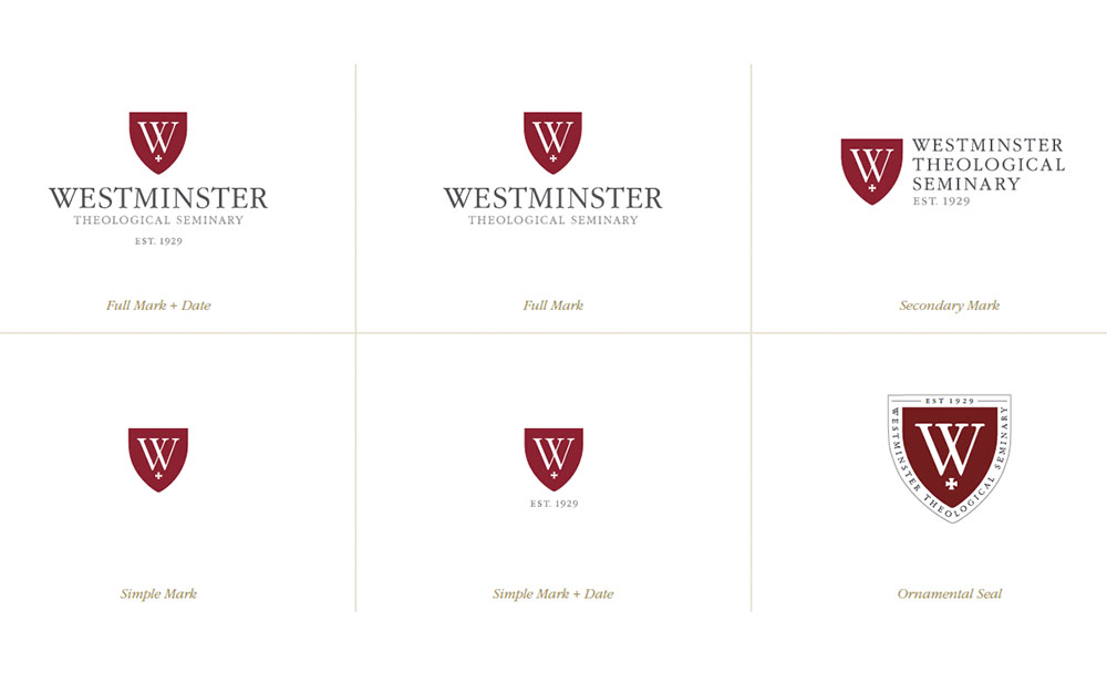
Brand StrategyLogo DesignWebsite StrategyWebsite DesignWebsite DevelopmentPrint DesignWestminster Theological Seminary trains students to serve in the global church in the 21st century. With roots in the Protestant Reformation of the 16th century, WTS has a 500-year legacy that no other seminary can claim in quite the same way. To modernize the Seminary yet honor its distinguished history, Push10 developed a brand language that derives its basic elements from the original historical seal of the 1930s.
Adaptable and Modern
From the initial logo mark, six responsive variations were born. These alternate versions allow the primary mark to adapt to a host of modern usage situations, both in print and on screen.

Branded Collateral
After the launch of the primary brand, Push10 worked with WTS to implement the new style across a wide range of collateral and campaigns. From printed materials to promotional websites, our team further refined the brand language. Today, we continue to ensure tight, consistent execution as trusted brand stewards.
Building the Brand Architecture
The primary Seminary brand sits at the heart of all WTS communications. Extending from the core, Westminster Seminary Press built upon the primary brand’s language. The Press required branding that was unique, yet associated with the look and feel of the primary brand. Much like the Seminary logo, the Press logos were designed to adapt to small spaces and scale gracefully across various applications.
Increasing Impact
Push10 continues to develop seasonal appeals with the WTS Communications and Advancement teams. Along with direct mail promotions, we’ve designed and developed high-end microsites to push these campaigns into the digital space. With flexible, customizable modules, the microsites are an ever-changing asset in the Seminary’s marketing efforts.
Rethinking the Web
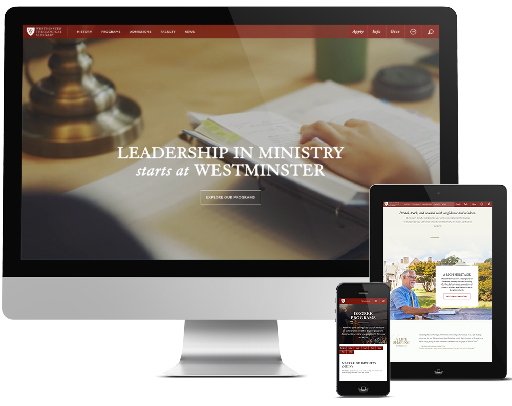
Along with multiple promotional campaigns, our team also re-envisioned the primary Seminary website. After years of organic growth and change initiatives, the site became overwhelming and confusing. We began with a comprehensive audit, strong user flow goals, and an architecture overhaul. After our focused efforts, the new website is immersive and impressive. Highlights include high-end video integration, subtle animation, unique storytelling panels, an interactive financial aid calculator, and intuitive degree program summaries. The Seminary website continues to grow and evolve, as the Push10 team tackles additional phases building out the content library and adopting new functionality.
The navigation menu gracefully responds to various screen sizes, ensuring an optimal experience on every device
Custom photographs highlight the Seminary’s architecture, faculty personalities, and student experiences throughout the site
Video content brings the site to life and helps engage busy audience members

Working with the team at Westminster Theological Seminary has been a collaborative experience from day one. The Communications team understands the value in solid messaging and we are constantly working together to build the brand.
Sabrina Pfautz, Partner & Creative Director, Push10


