01
Research & Brand Strategy
Before diving into any design work, we knew we needed to fully understand the Community Foundation’s audience and the local philanthropic landscape. Our discovery phase was all about gathering insights—through workshops, analytics, and market research—to build a solid foundation for everything that would follow.


Workshops & Audits
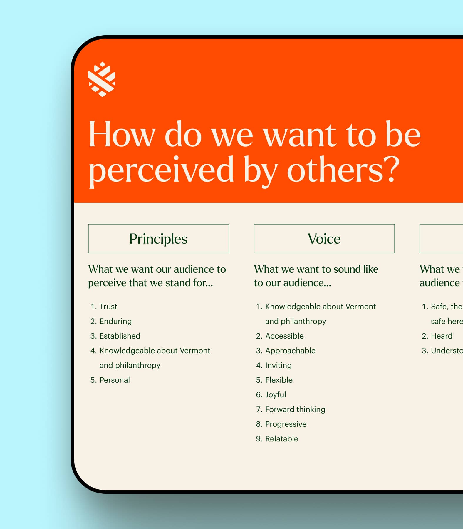
We started by getting to know VCF through workshops and a thorough review of their website analytics. We also looked at what similar organizations were doing and dug into the financial and philanthropic habits of their target audience.


Key Insights
We learned that Vermont’s philanthropic donors are down-to-earth and value personal, impactful giving experiences. This understanding shaped our approach to the brand and website redesign.


Strategic Direction
Our goal was to create a brand and web presence that reflected Vermont’s unique character—authentic, community-focused, and genuinely caring.


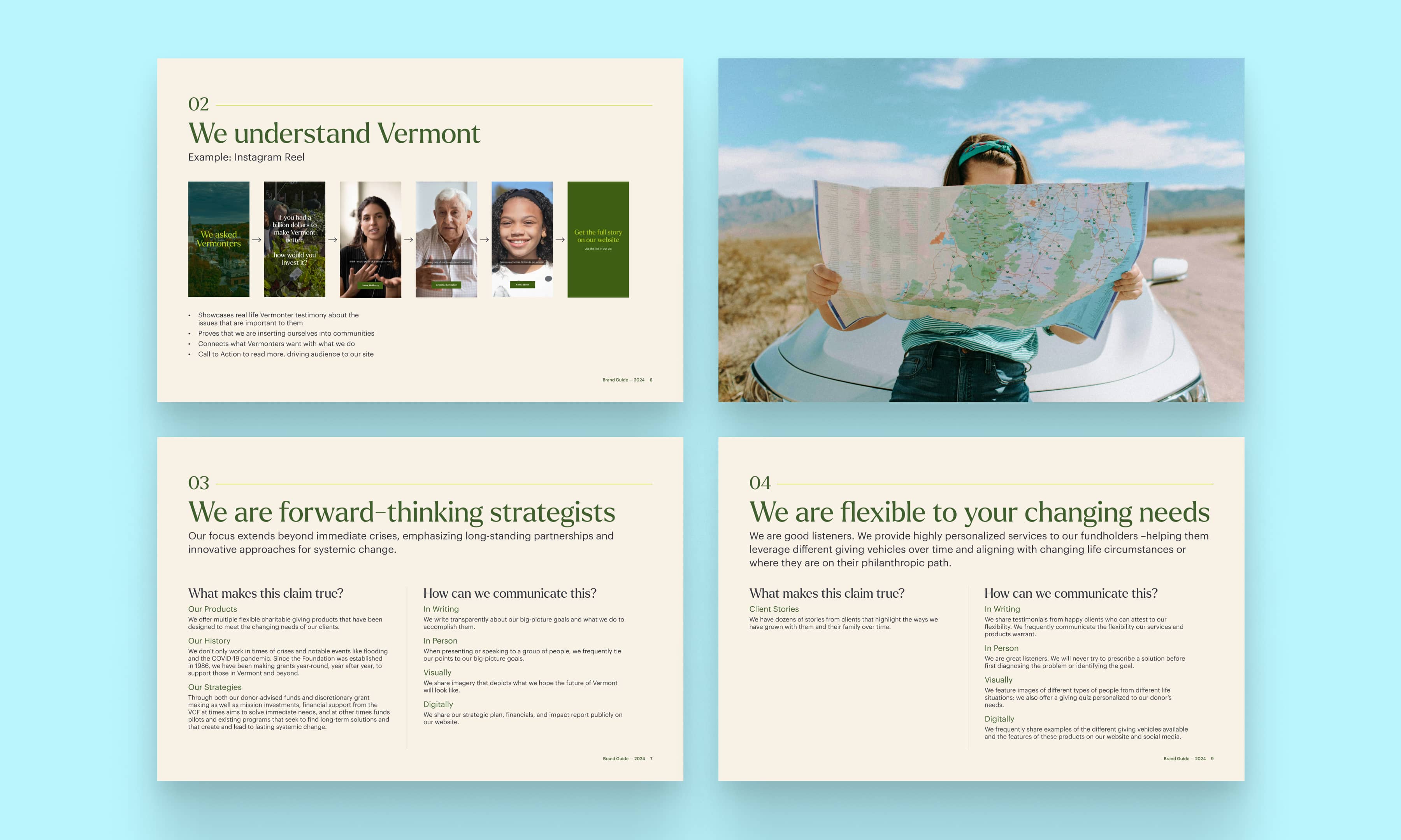
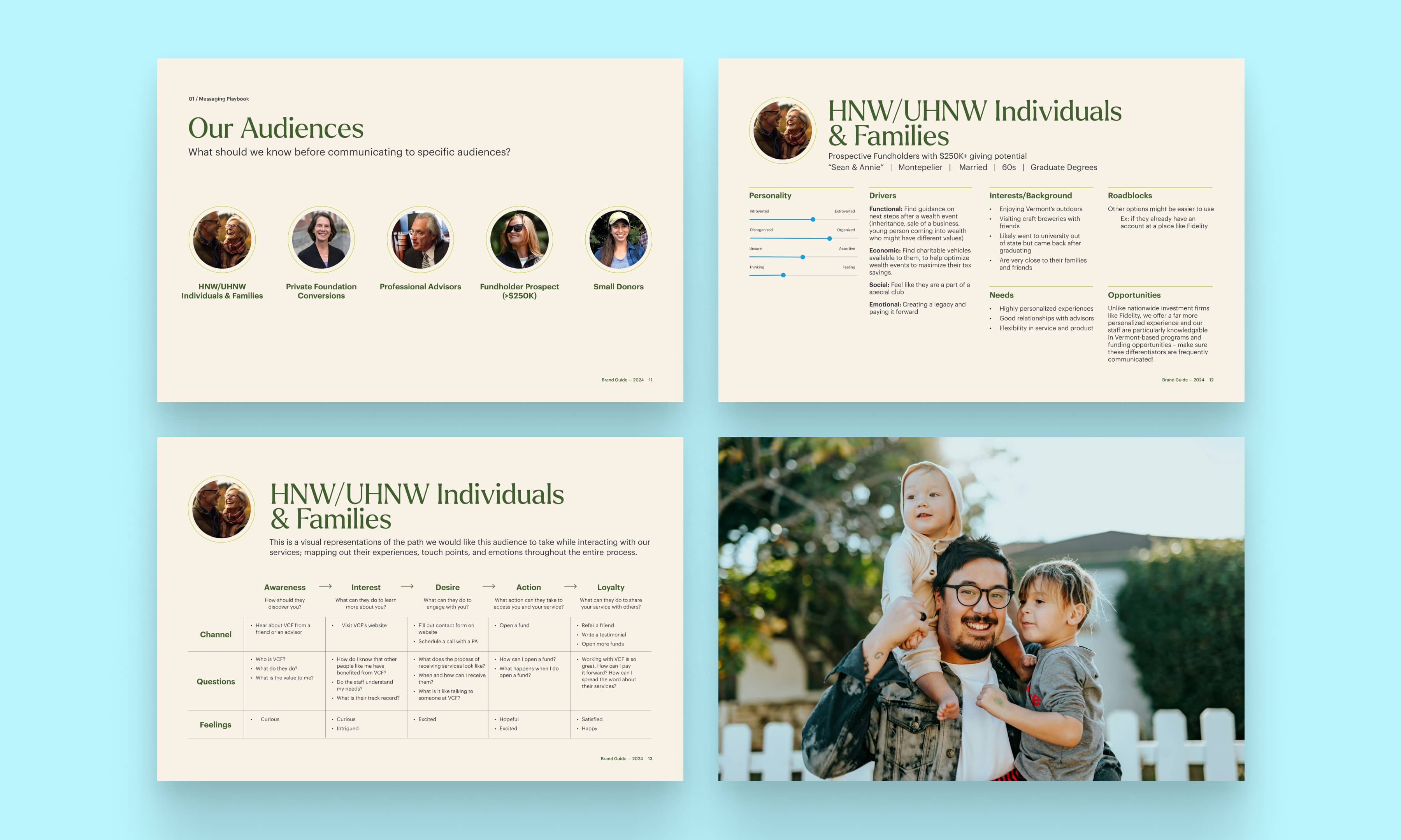
Messaging Playbook
We made sure VCF’s messaging was clear and consistent, whether they’re speaking to fundholders, advisors, nonprofits, or the wider community.
Defining the Tagline
The tagline, “Give Where Your Heart Lives,” was crafted to capture the deep emotional connection that fundholders have with Vermont. It serves as a powerful reminder that their generosity has the greatest impact when it supports the place they love most. This simple yet meaningful phrase became a key element of the VCF brand, resonating with both local donors and those with ties to the state, and reinforcing the foundation’s commitment to nurturing Vermont’s communities.

02
Brand Identity Design
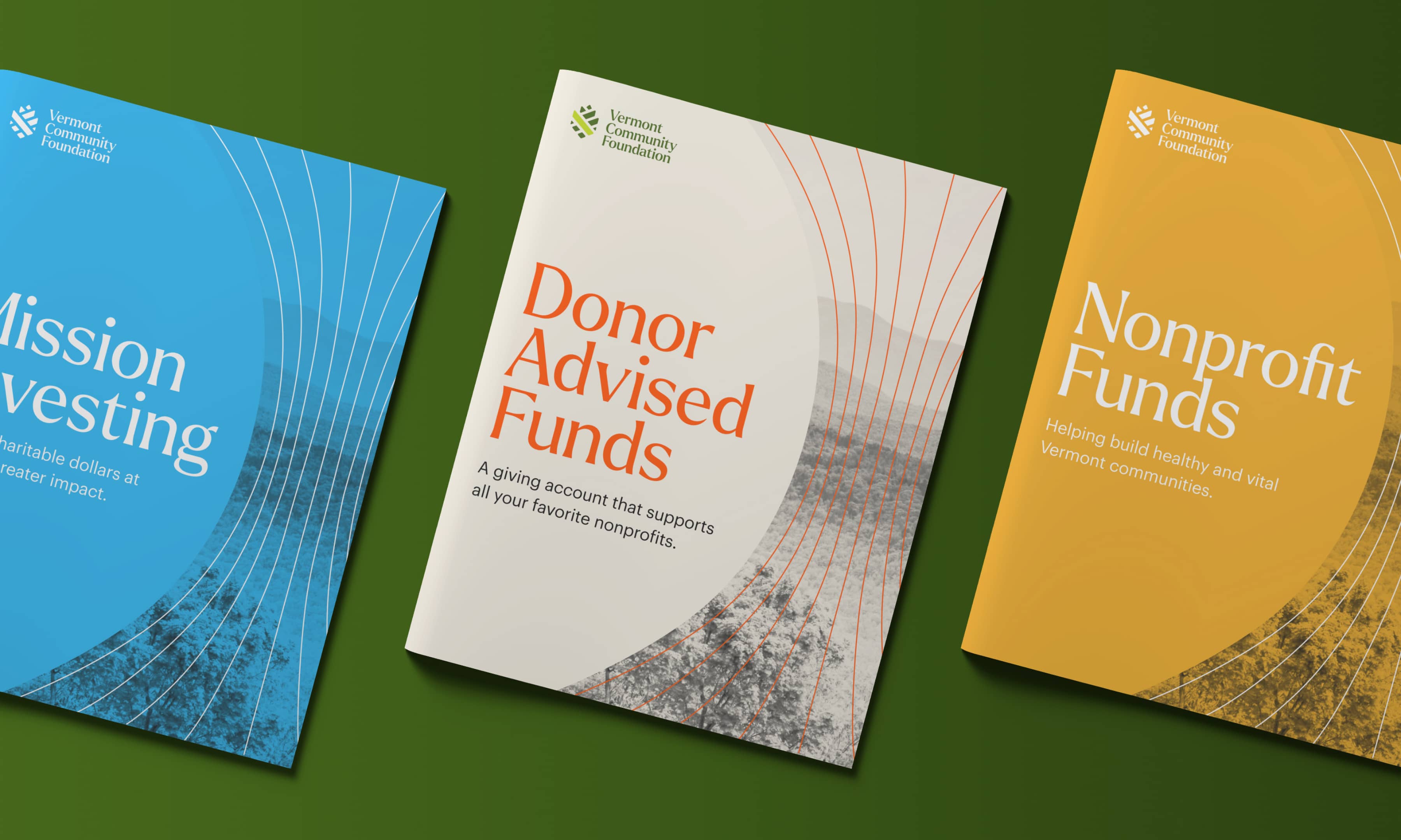
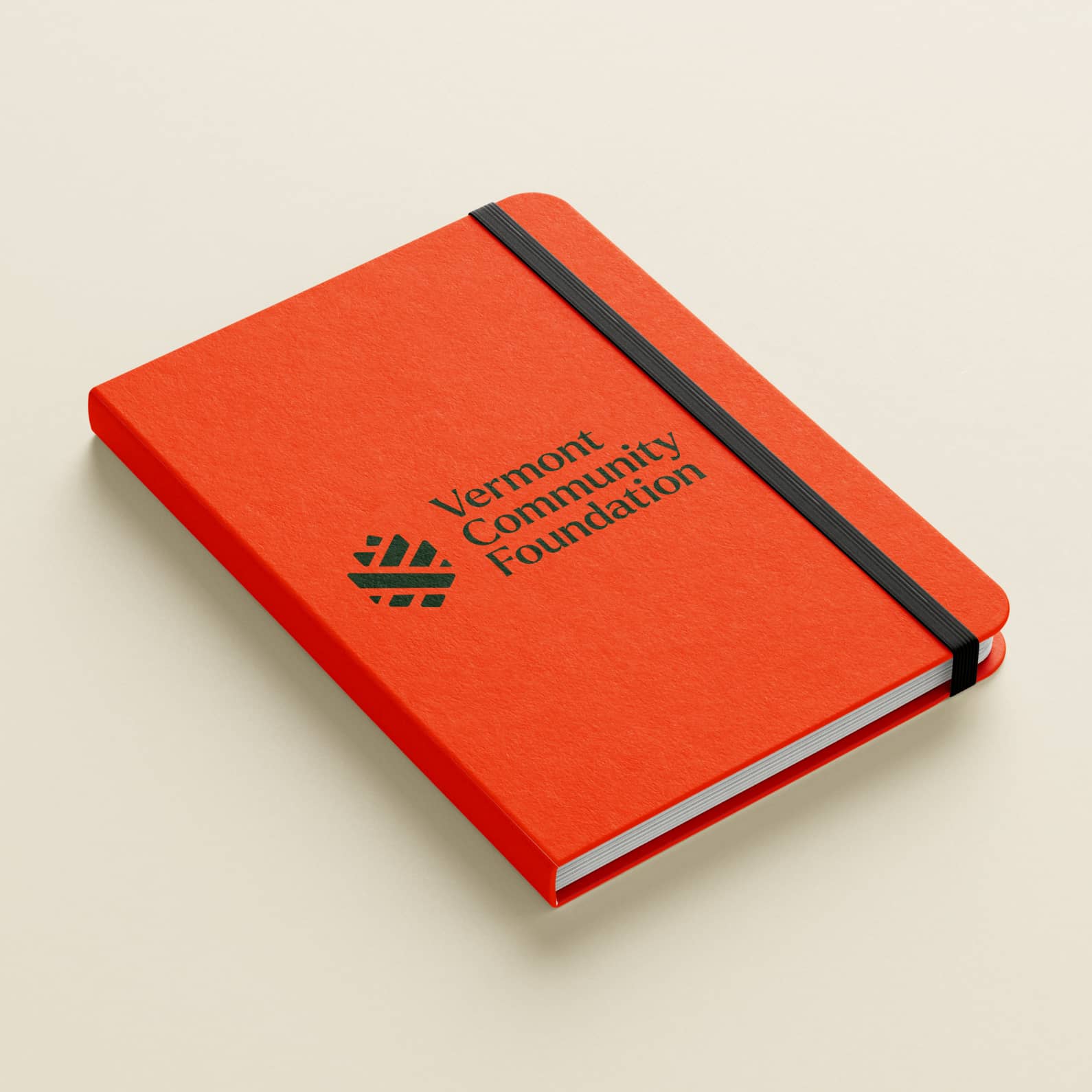
With a wealth of insights in hand, we moved on to designing a brand identity that would truly resonate with VCF’s audience. This phase was about more than just visuals; it included crafting clear and consistent messaging that reflected VCF’s values. Every element, from the pinecone logo to the brand’s voice, was carefully developed to ensure the identity felt authentic and meaningful.


A Symbolic, Timeless Logo
A pinecone made perfect sense for the logo, as it keeps seeds safe and allows for generational growth. The pinecone’s scales will open when conditions are just right — so seeds can disperse in the wind using their winglike attachments. This reflects the donor’s desire to use their wealth to give back, and the grantee’s goal to grow a beautiful future for Vermont. After we established the logo, we composed a supporting visual identity that's inspired by Vermont’s natural landscape, giving the brand a look that’s both fresh and familiar.


“A re-brand is not an easy process. I have seen so many go badly. This is an example of the exact opposite. This new identity fits so well with our values, and is such a beautiful modern aesthetic.”
Vermont Community Foundation
Felipe Rivera, Vice President for Strategy & Communications
03
Website Design
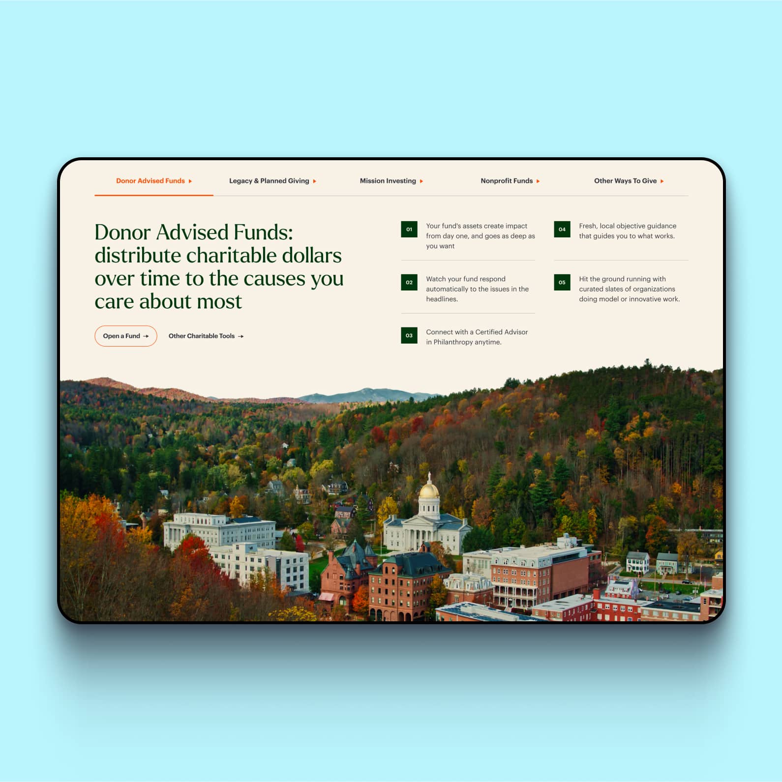
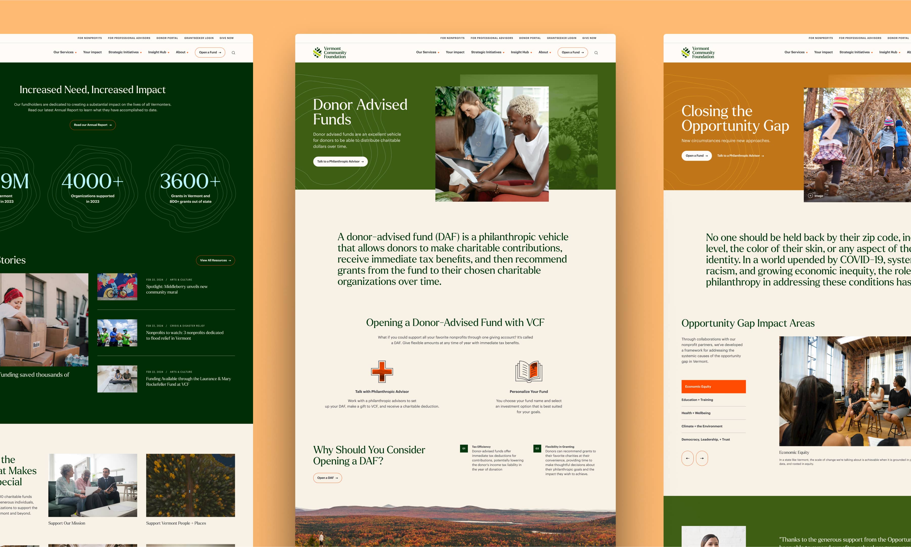
With the brand identity clearly defined, our next step was to translate that vision into a seamless online experience. The web design phase was focused on creating a site that not only reflected the new brand but also enhanced usability for VCF’s diverse audience. We aimed to build a website that was intuitive, engaging, and visually compelling, making it easier for visitors to connect with VCF’s mission and navigate their giving options.


A Dynamic Impact Report
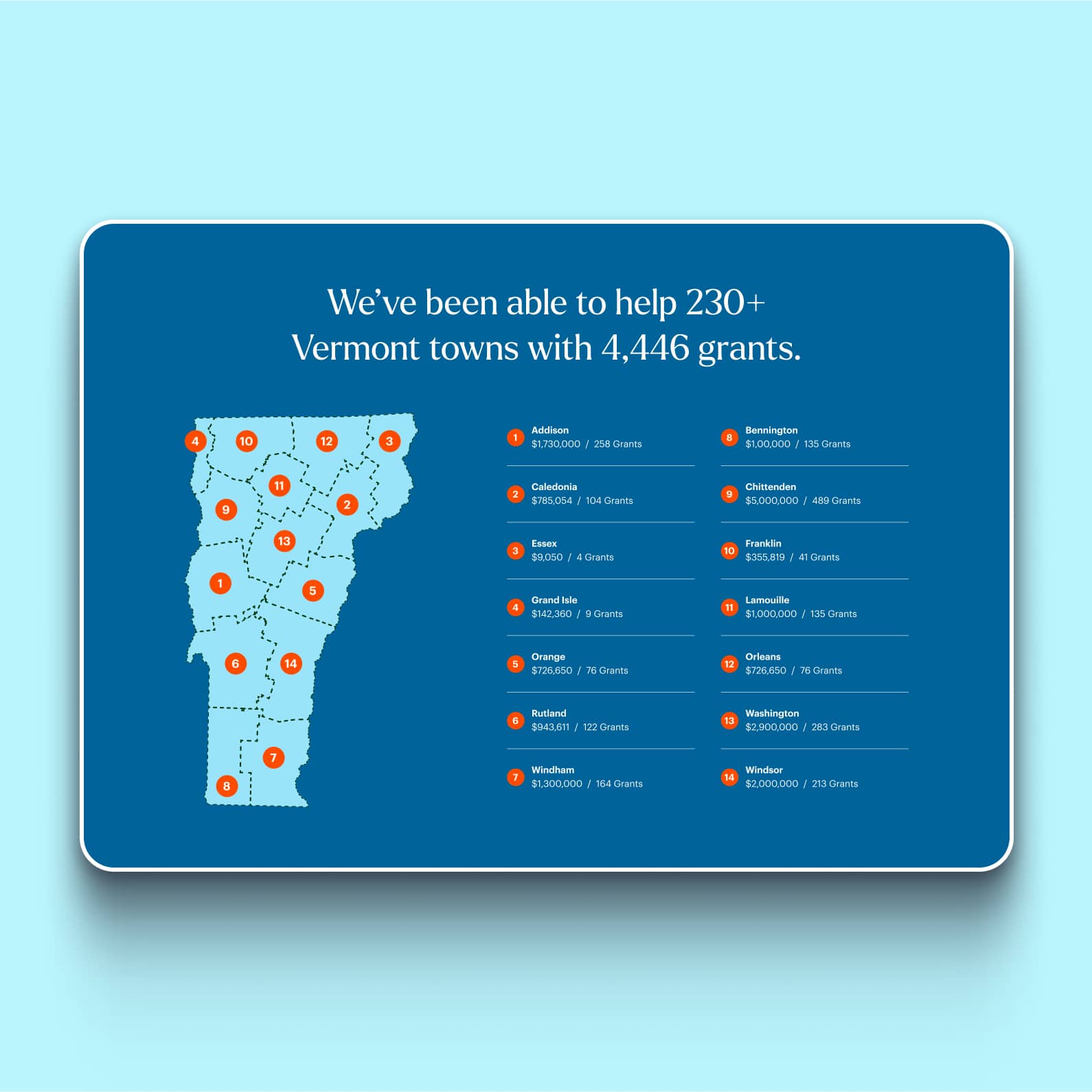
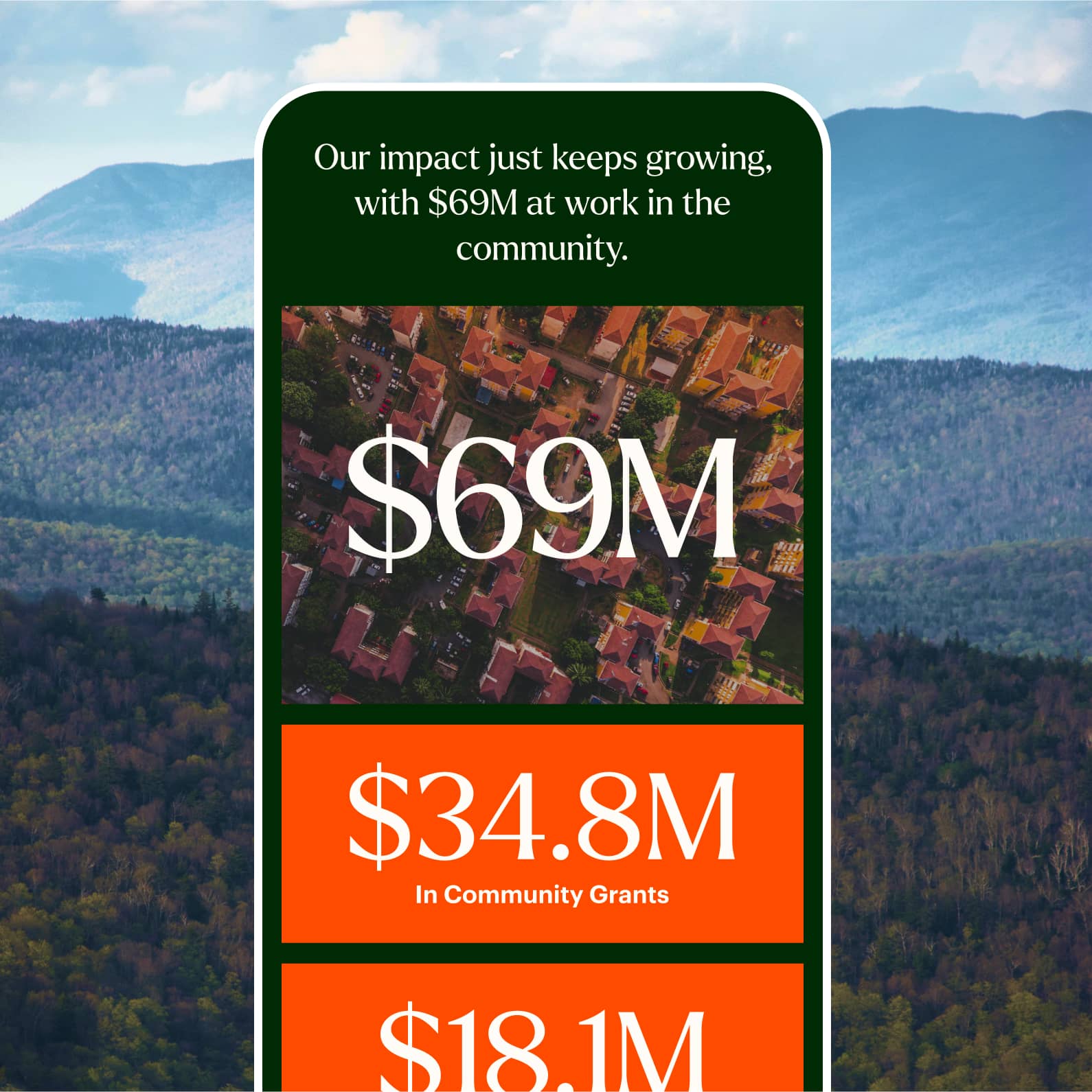
We transformed VCF’s impact report into a dynamic, living document that vividly showcases the foundation’s work. By incorporating interactive maps, charts, and storytelling elements, we brought the contributions of fundholders to life, making the data both engaging and accessible. This approach highlights the real-world effects of giving, making the impact of each donation tangible and inspiring further generosity.

Simplified Navigation
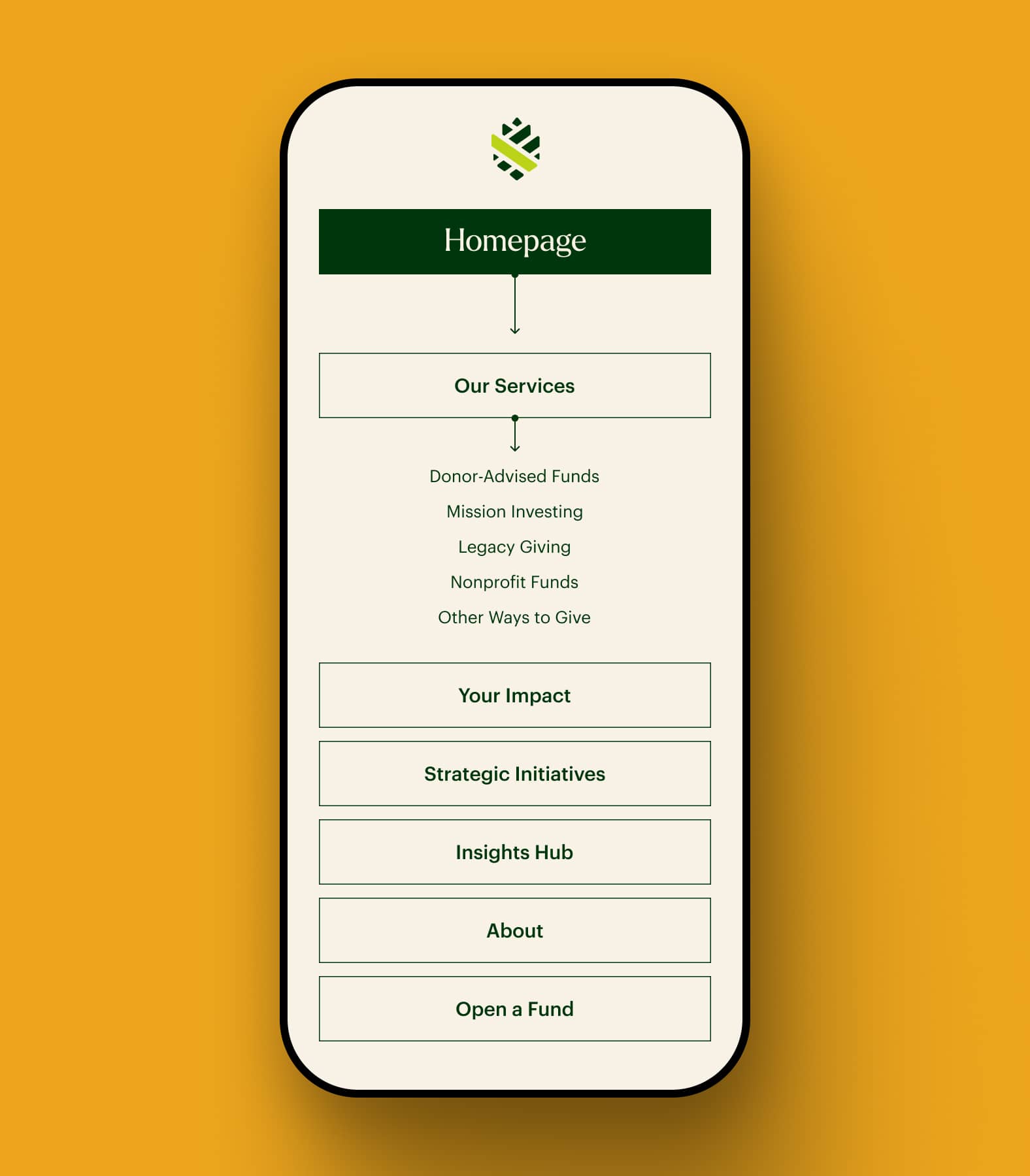
We restructured the website’s architecture to create a more intuitive user journey. By simplifying the navigation and organizing content into clear, concise categories, we made it easier for visitors to find the information they need, whether they’re new donors or long-time supporters. This streamlined approach ensures that users can quickly connect with the content that matters most to them.

A Personalized Giving Quiz
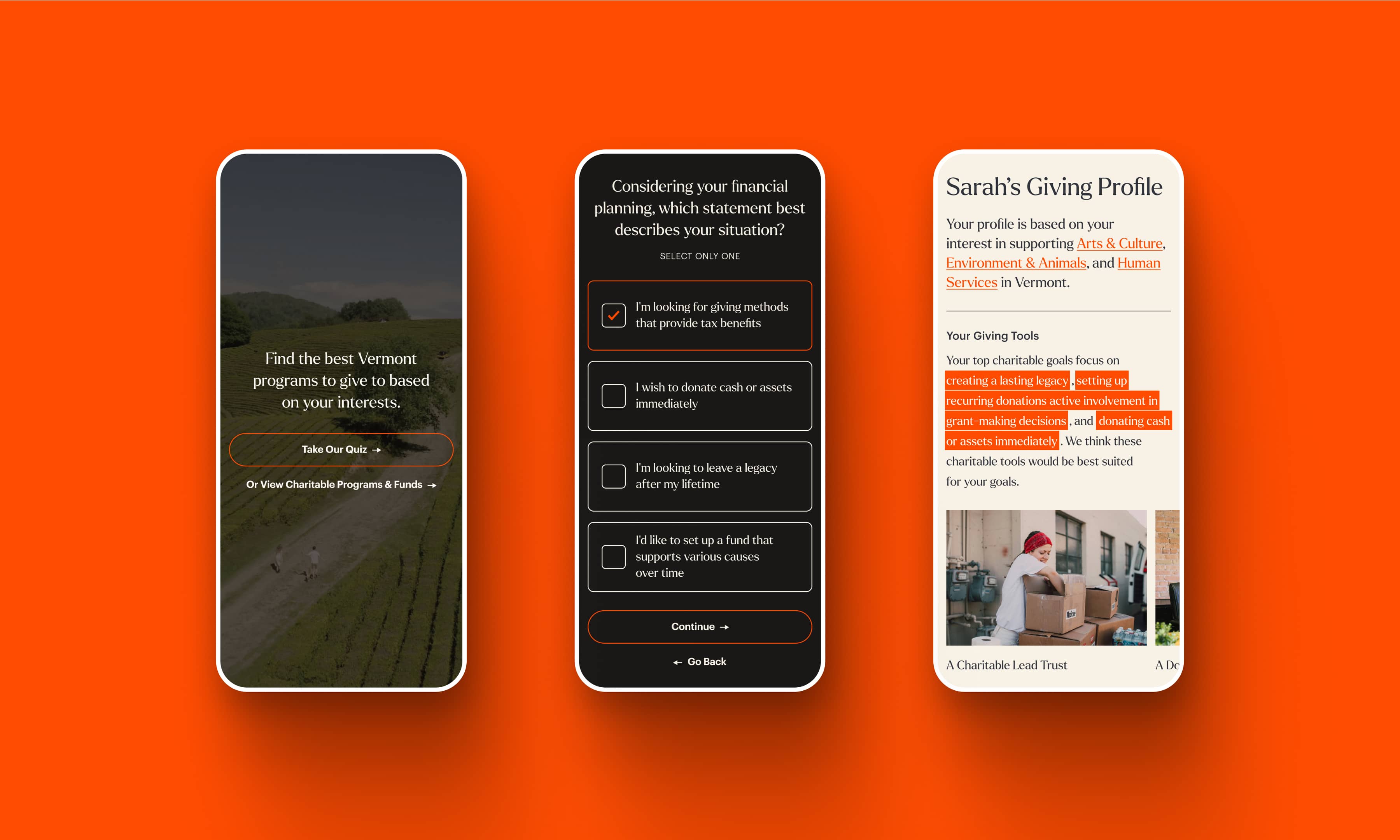
To enhance donor engagement, we developed an interactive “giving style” quiz. This personalized tool helps visitors discover the giving options that align best with their values and interests, guiding them towards funds and programs that resonate with their personal philanthropic goals. The quiz not only enriches the user experience but also deepens their connection with VCF’s mission.
04
Development & Launch
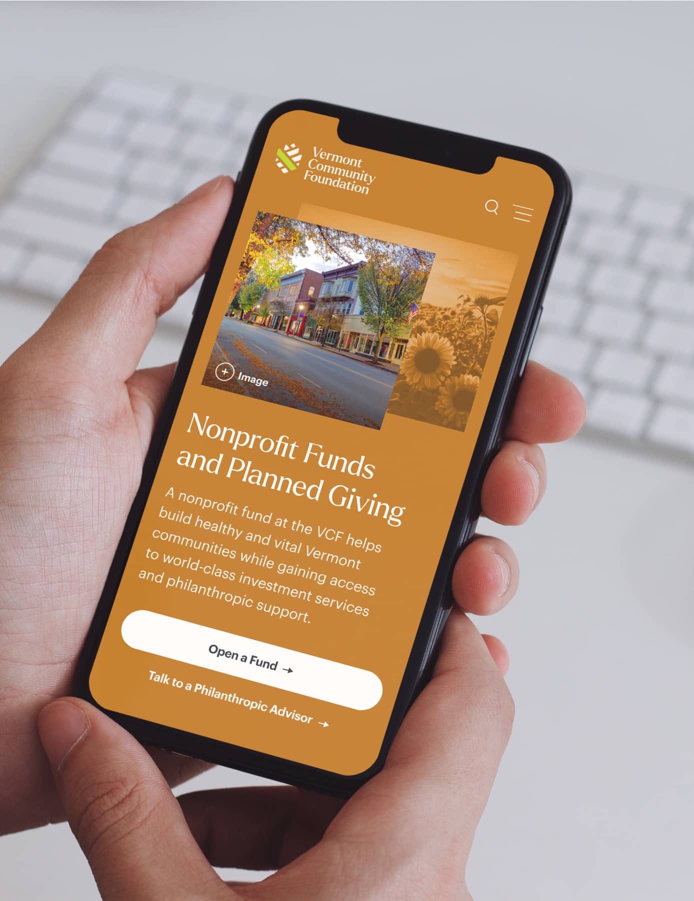
We ensured the site was not only visually aligned with the new brand but also optimized for a smooth user experience across all devices. Push10 played a hands-on role in helping VCF populate their new pages, working closely with their team to transfer content, refine messaging, and ensure every page met the new standards. The result was a fully functional, brand-aligned website launched on time, ready to support VCF’s mission and engage its audience in meaningful ways.


I cannot believe how far we’ve come. The new site represents exactly what we aspired to in the beginning and you and the team were simply instrumental in getting us there. I hope the site becomes a wonderful storefront for the Push10 brand and web experience. We’re so pleased. Also, much love to Evan. He’s been such a rock.
Vermont Community Foundation
Dawn Archambault-Perry, Brand & Marketing Officer
VISIT THE WEBSITEView Related Work

HeadsUp
We designed and launched a new brand and website aimed at changing conversations, stigmas, and outcomes for those experiencing psychosis.

