December 6, 2023
Unveiling Design Insights from First Round Toronto 2023
What does your ideal conference look like? Is it full of inspiring speakers who make you want to get back to work with renewed energy?
Is it practical, overflowing with the kind of ideas for how to do better work that have you constantly scribbling notes? Is it all about connecting with people who share your passion for a certain topic and learning about the way they approach the challenges we all face? Or is it more about getting to catch up with your coworkers who you usually see exclusively on the Tiny Zoom Box?
Our creative team got it all at this year’s First Round, plus an international trip to Toronto, Ontario to see how doing outstanding design work happens in the Great White North. Brand New’s twice-annual gathering of design and strategy obsessives is always circled on our calendar and this year did not disappoint.
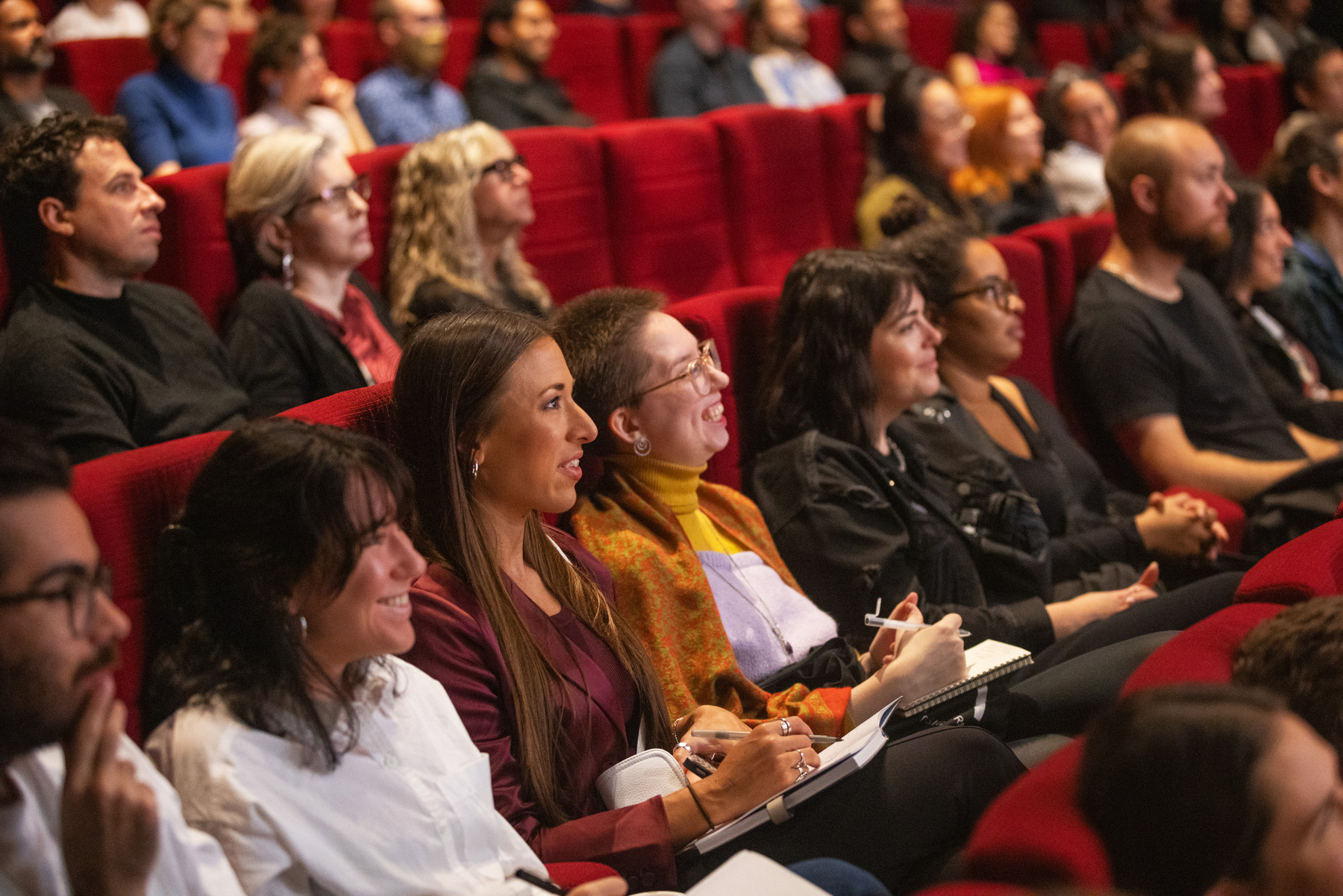
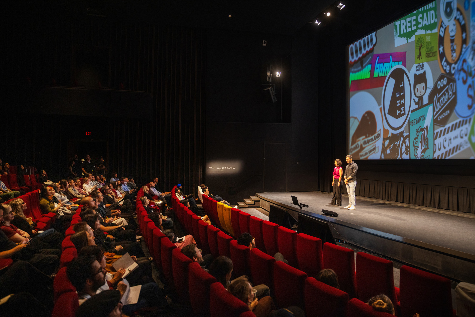
Photo by Shane Parent Photography
As its name implies, First Round gives agencies from the host city a chance to present the work that for myriad reasons, ultimately didn’t see the light of day. More accurately, it gives them a chance to talk about how they got from their First Round, the initial idea, to the finished product that made its way out into the world. And for those of us in the audience, it’s a chance to laugh, learn and commiserate — we’ve all had an idea that we loved that just didn’t quite make the cut, after all.
Here were a few of the big things we learned this year.
Don’t be afraid to sketch
Every design starts with a rough idea. At Push10, we’ve all seen each others “Scratch” or “Sandbox” or “Graveyard” (so ominous!) pages at this point. The process of arriving at a design that makes a big impact and delivers on the strategy we’ve set is not exactly linear. It requires sketching out ideas and then playing with those sketches until we can get them just right.
But one thing that struck us this year was how open a lot of agency presenters were about the sketching part of the process. One event went as far as to present only hand drawn concepts in the first round to their client — no computer was opened in the initial making of this design. That’s certainly a more extreme approach, but the idea felt really powerful. Be more comfortable not having something perfect. Get everyone bought in on the idea before you worry about getting everyone bought in on each pixel.

Photo by Shane Parent Photography
Give your brand some character
I’m a strategist. This is most definitely a design conference. It’s a huge chance to learn and to think about how we as a strategy and design team can work together more effectively — but when it comes to practical applications, most of these presentations are loaded for designers, and lighter for strategists.
So you can imagine that my ears perked up every time a presenter started talking about the brief they received, or the strategy work their team did to arrive at an idea. In particular, it was exciting to see how design teams took things like brand attributes that I work with every day and interpreted them to create a design. It was even more exciting to see several people take the idea of brand attributes and stretch it further into an even more practical application.
A lot of times, brand attributes end up being a list of entirely separate words. The brand is this, and it is also this, and it is also this third thing. But they don’t directly relate to each other. We noticed several presenters take this list of attributes and create something fuller out of them — more of a character. It makes perfect sense. We all have attributes as people, but it’s their sum that creates our character, our actual essence. As a list, they aren’t nearly as telling as they can be when you think about what that all means together.
And the designs that resulted had more character to them as well. They felt special and specific to the brand, and like clear articulations of the character.
Repetition does a lot for a presentation
It can feel a little silly when you’re putting together a presentation to show a new logo or a new design system applied to twenty different mockups for tote bags that probably won’t get made or outdoor ads that probably won’t run. But time and again, we heard from presenters that they always make sure to include a lot of simple mockups that show a new logo or visual identity out in the real world. It’s not about the application; it’s about seeing the thing over and over.
It gives the client (who hasn’t been staring very closely at the design for a week or more in the process of putting together the presentation) the chance to digest. Process what we’re saying, with a visual aid to keep them anchored in what could come next. Some presenters went all out, showing the new visual ID in wild scenarios like on neon colored t-shirts. Others went simpler with some signage. Very few, if any, showed anything resembling real corporate collateral that would get made, like a business card or letterhead — too distracting to bring in something that feels like a proposed execution when the point is just to see a hypothetical application. Most of them made sure to show all the same mockups for whatever number of ideas or concepts they presented. Don’t play favorites, just repeat, repeat, repeat.
It’s nice to see your co-workers
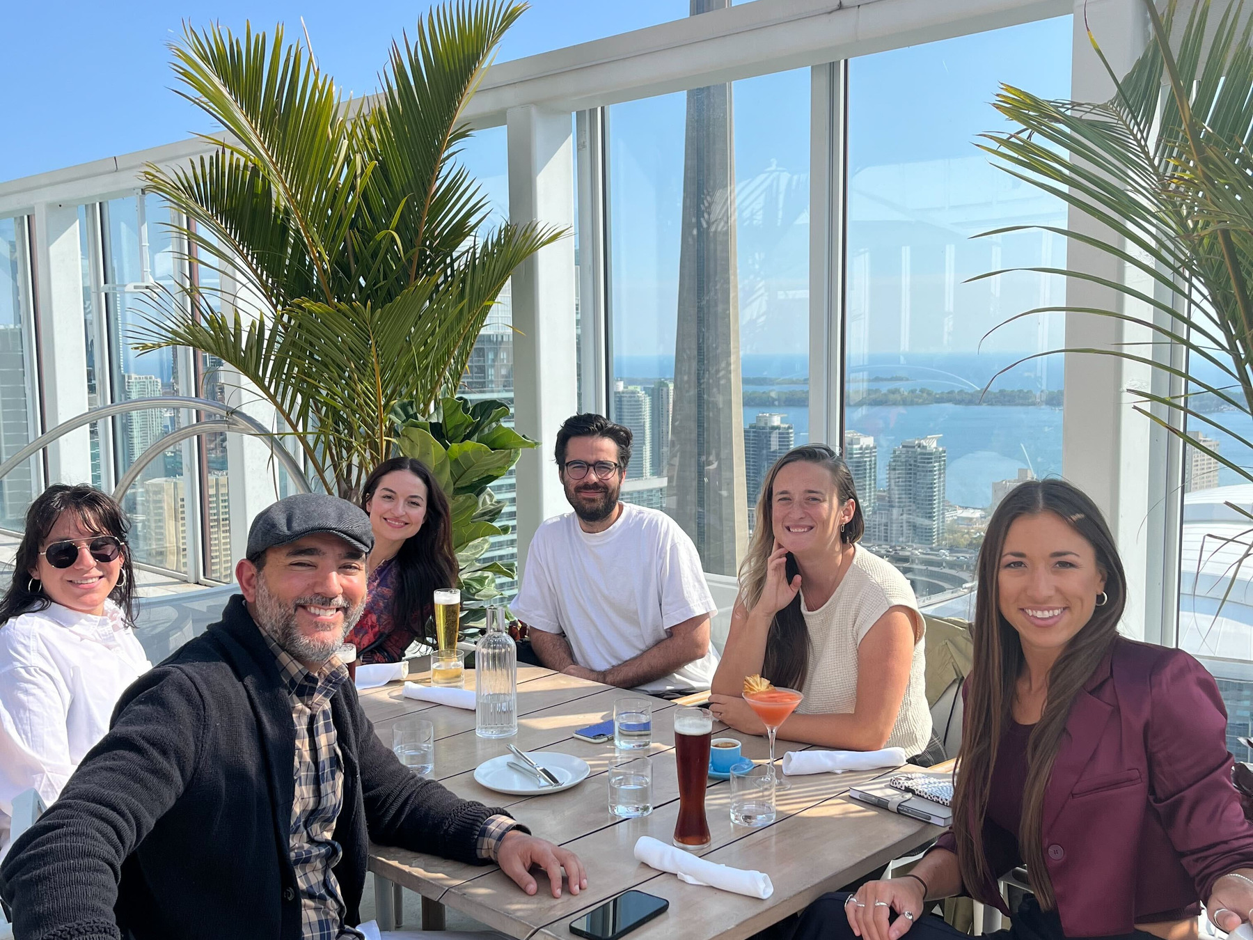
First Round was incredible as always, but one of the highlights was getting to catch up as a team. We talked projects, process, and big design ideas — but just as importantly we talked about Not That Stuff. We love the team at Brand New for putting this together every year — we learned a ton and had fun doing it.


