Uniting Engineers for a Sustainable Future
Deliverables
Brand StrategyBrand Positioning & MessagingVisual Identity DesignThe way our society produces food, fiber, timber, and renewable resources is unsustainable. Now, more than ever, our world is facing a future where there are not enough resources for people and our planet to thrive. That’s where the American Society of Agricultural and Biological Engineers (ASABE) comes in: to bring engineers together across the world to provide engineering and technology solutions for sustainable resource production.
While ASABE is well-regarded by established engineers worldwide, they wanted to better connect with newly emerging engineers and potential partners. Our challenge was to bring the old and new generations of engineering together to evolve the ASABE brand to become more current, attractive and relevant in order to increase membership and partnership opportunities.
A strategic blueprint
We interviewed and surveyed members, gauged public opinion, and reviewed the websites of similar organizations. This research helped us create a strong strategy that’s all about making the ASABE brand engaging and relevant.
A clear statement of who we are
The foundation of every great brand is a clear statement of purpose. Using the insights from our research, we worked with the ASABE team to refine their Society and Foundation vision & mission statements and develop a compelling tagline.
Many industries, one goal
Agricultural and biological engineering is relevant to many industries, often with very different standards and goals. We developed the brand to speak to many types of potential partners, but we also created messaging tailored for each specific industry.
A logo for everyone
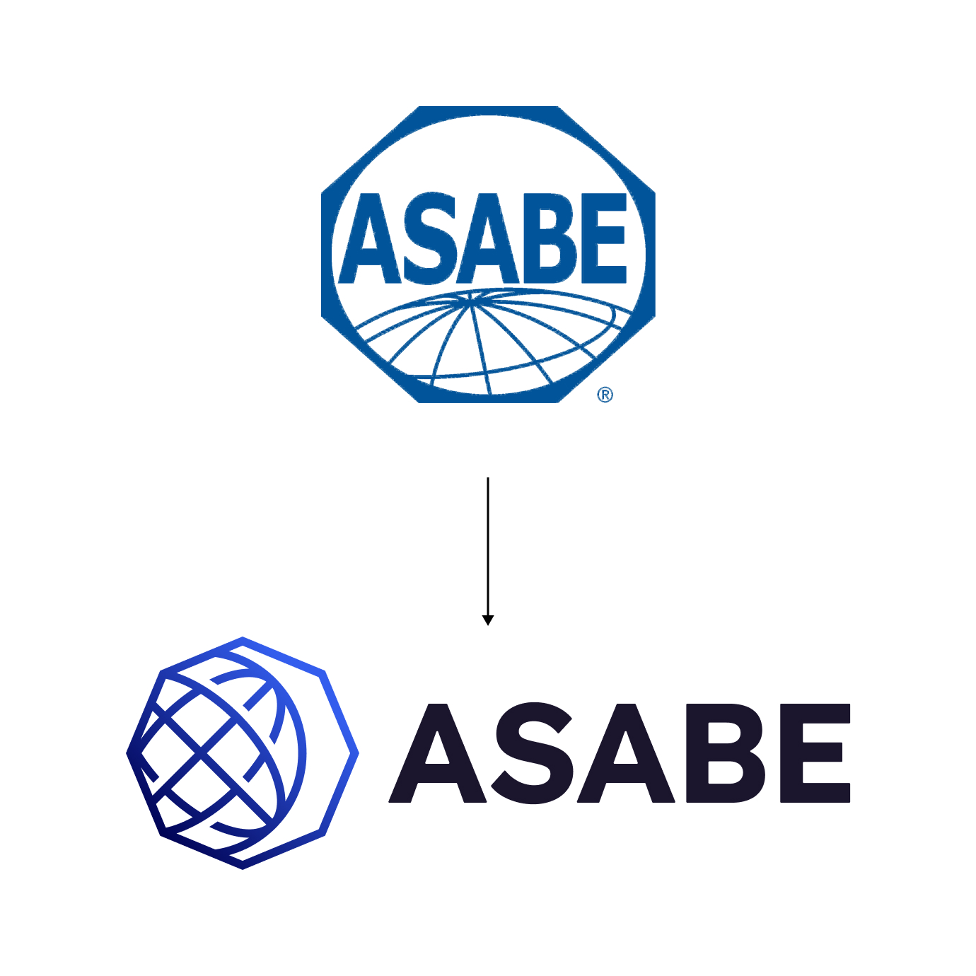
Our research showed that the existing logo had high equity among current members. In particular, the globe and polygon were recognizable. Outside of the membership base, however, the general public and the next generation perceived the logo as generic and dated. Push10 recommended keeping the most recognizable aspects of the logo (polygon and globe) to retain current member recognition while modernizing the design and incorporating a more descriptive tagline to appeal to those who are new to ASABE.

A fresh take
The new ASABE logo significantly modernizes characteristics of the previous logo. We’ve rotated the original mark’s octagonal shape to achieve a more satisfying visual tension and imply the forward progress underpinning ASABE’s initiatives. We’ve reimagined the original mark’s global iconography, again using rotation to suggest movement and progress. We’ve updated the original mark’s acronym with cleaner, more contemporary typography. Finally, we’ve retained blue as our principal brand color to suggest stability, wisdom, and a reverence for the natural world.
ASABE subbrands
As an international organization, ASABE has a wide array of regional groups, events, and initiatives. We created unique brand elements to be used as a sub-brands for these different branches.
Established, yet relevant
The new logo, colors, and fonts come together to position ASABE as an established organization while accounting for the tastes and needs of emerging engineers.