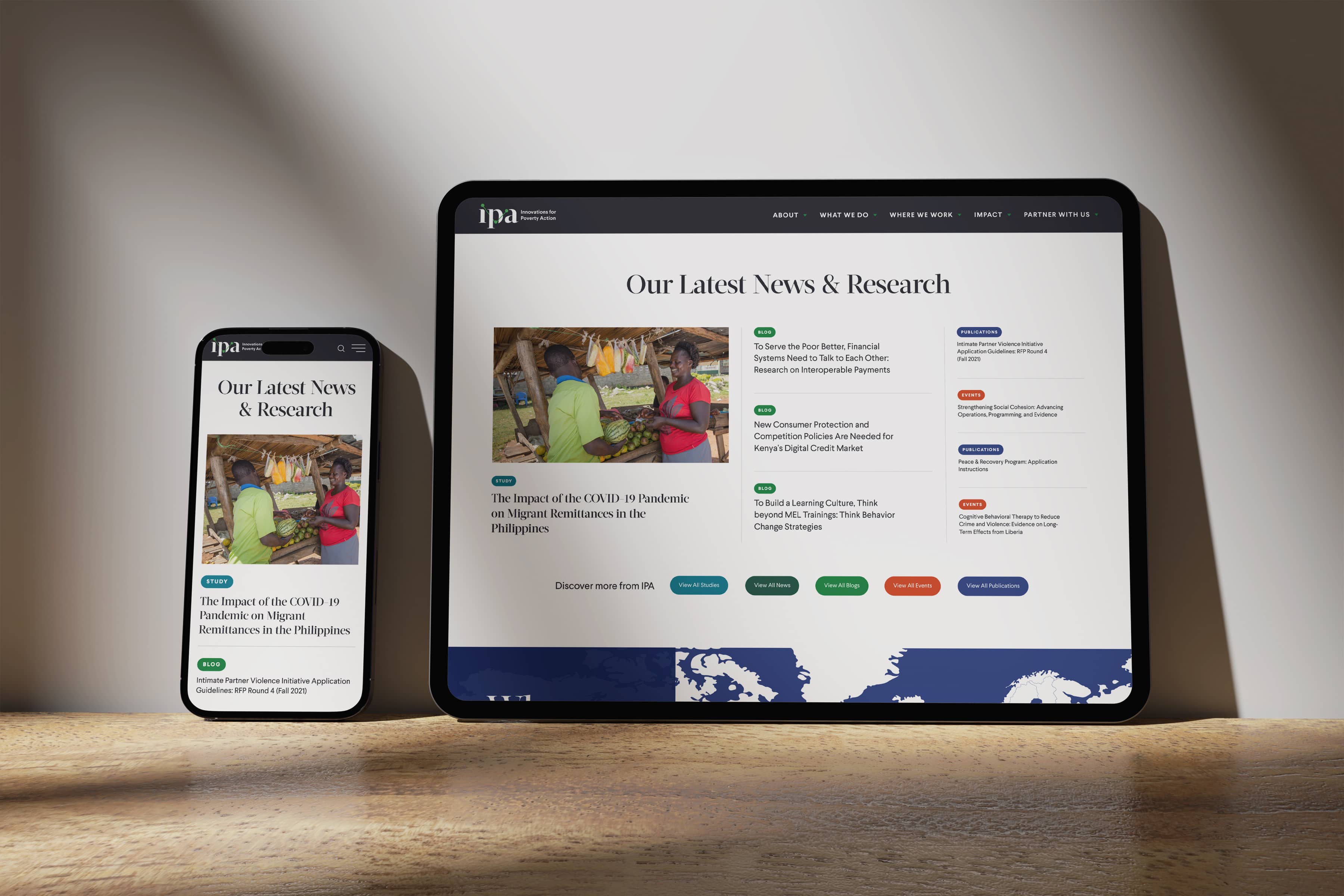
Creating New Connections
The former IPA logo was outdated and occasionally illegible, indistinguishable from competitive marks, and appeared to focus exclusively on Africa (which was misleading). In the new logo, we deconstructed a serif typeface, then isolated the ball terminals to create a connected line. While the mark obviously alludes to data and connection, it can also be interpreted as a strong “through line” showcasing IPA’s ability to create strong evidence, share evidence strategically, and ultimately equip decision makers to use that evidence.


