Helping Kids Get the Care They Need
Deliverables
Web StrategyWeb DesignWeb DevelopmentThe UnitedHealthcare Children’s Foundation changes lives by providing grants that help families across the country to cover medical expenses for their children that insurance doesn’t. But their ability to maximize their impact, and tell their story, was being muddied by outdated web design and suboptimal UX.
A Website Designed for Growth
The timeline to launch the new site was short, so we worked with the UHCCF team to identify the areas of the site that would have the highest impact on their goals. We focused on streamlining the grant application process and clarifying users’ paths to make donations.
Creating Balance
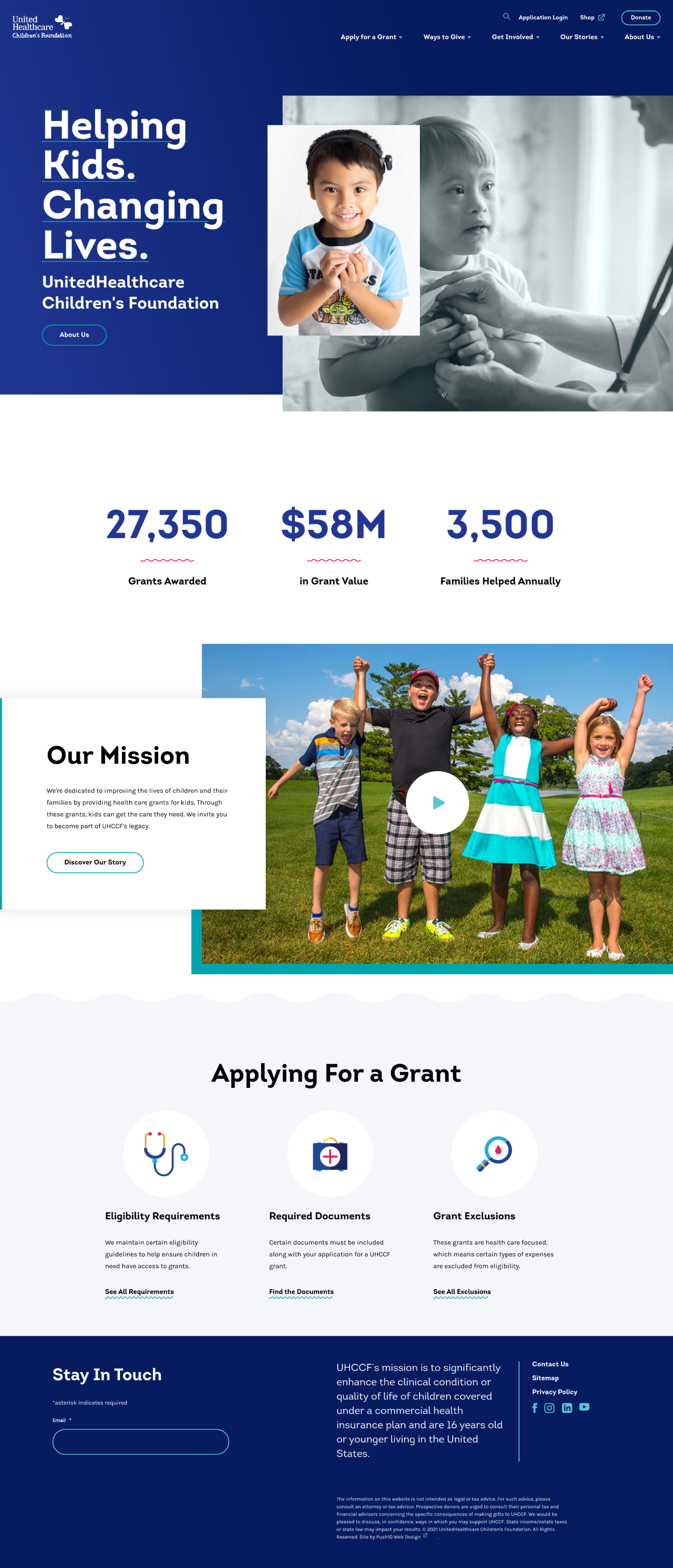
From a design perspective, the site needed to feel warm and family focused, without being too playful. It couldn’t be too childish, but it still had to convey a pervasive sense of hope and optimism to stay in line with the foundation’s established brand. We chose design styles that could strike the balanced tone that UHCCF needed.
Streamlined UX for Grant Applicants
Information about the grant application process needed to be clear and easy for families to understand. We restructured the Apply for a Grant pages to focus on key information, and to keep user journeys easy. The goal was to ensure that both the application itself and the critical information about eligibility held equal weight in the site’s architecture.
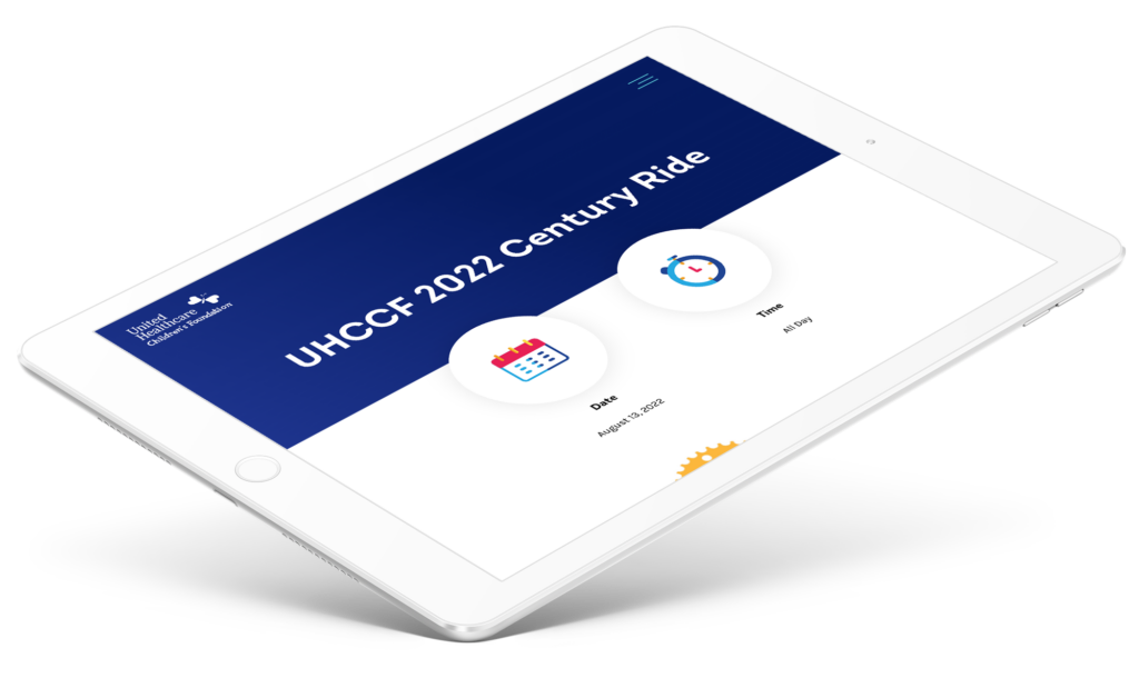
We looked for ways to highlight the families that UHCCF serves through imagery, and utilized photo treatments that added visual depth to the site.
Updating the way that key pieces of information are treated across the site vastly improved the UX, making content easier to digest quickly, and driving action more clearly.


