American Society of Agricultural and Biological Engineers
Uniting Engineers for a Sustainable Future
The American Society of Agricultural and Biological Engineers (ASABE) brings engineers together to solve one of the world’s biggest challenges: sustainably producing food, fiber, timber, and other resources.
01
A strategic blueprint
We interviewed and surveyed members, gauged public opinion, and reviewed the websites of similar organizations. This research helped us create a strong strategy that’s geared toward making the ASABE brand engaging and relevant.
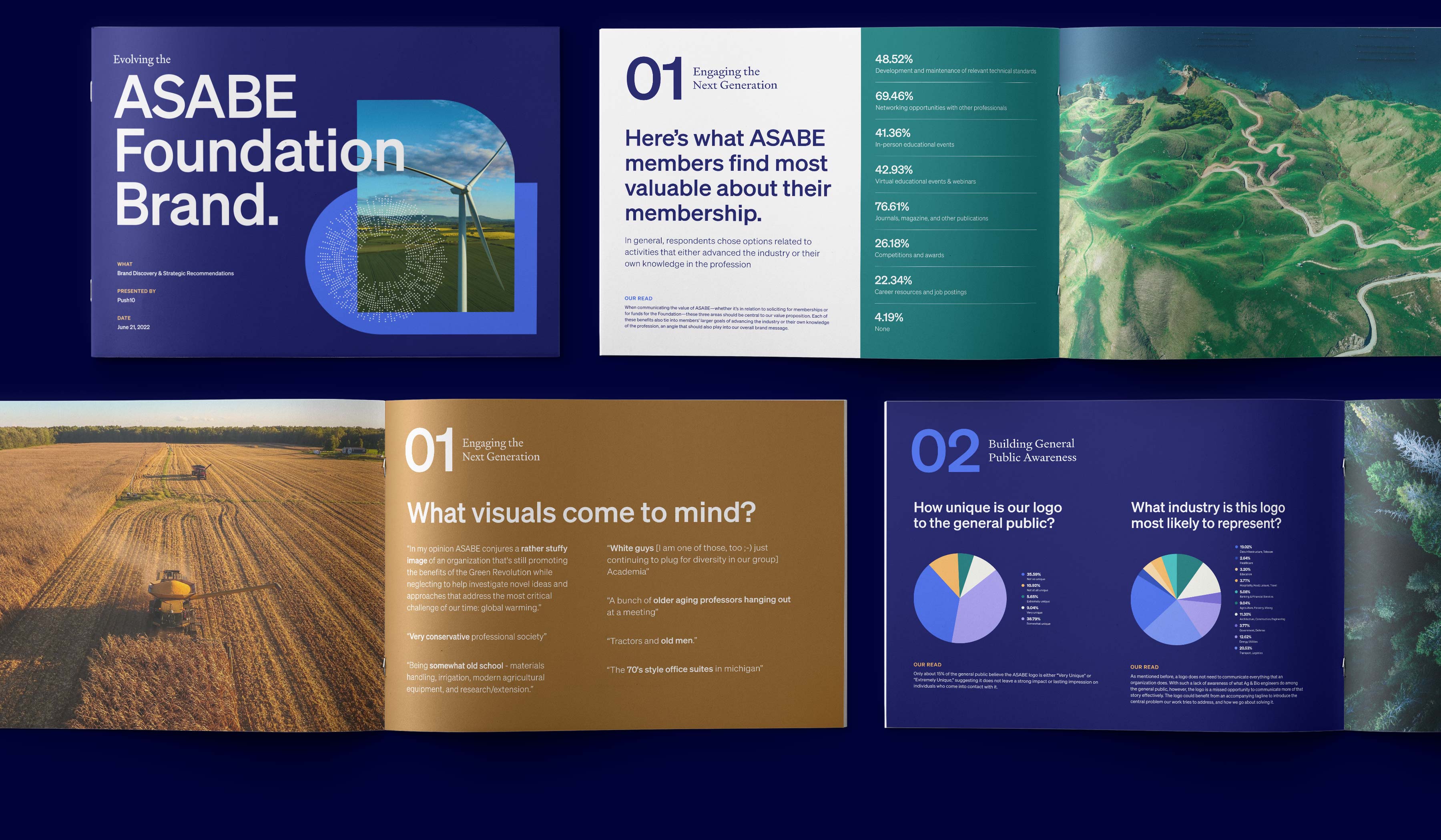
Insights
01
02
03
04
05
Who is ASABE, really?
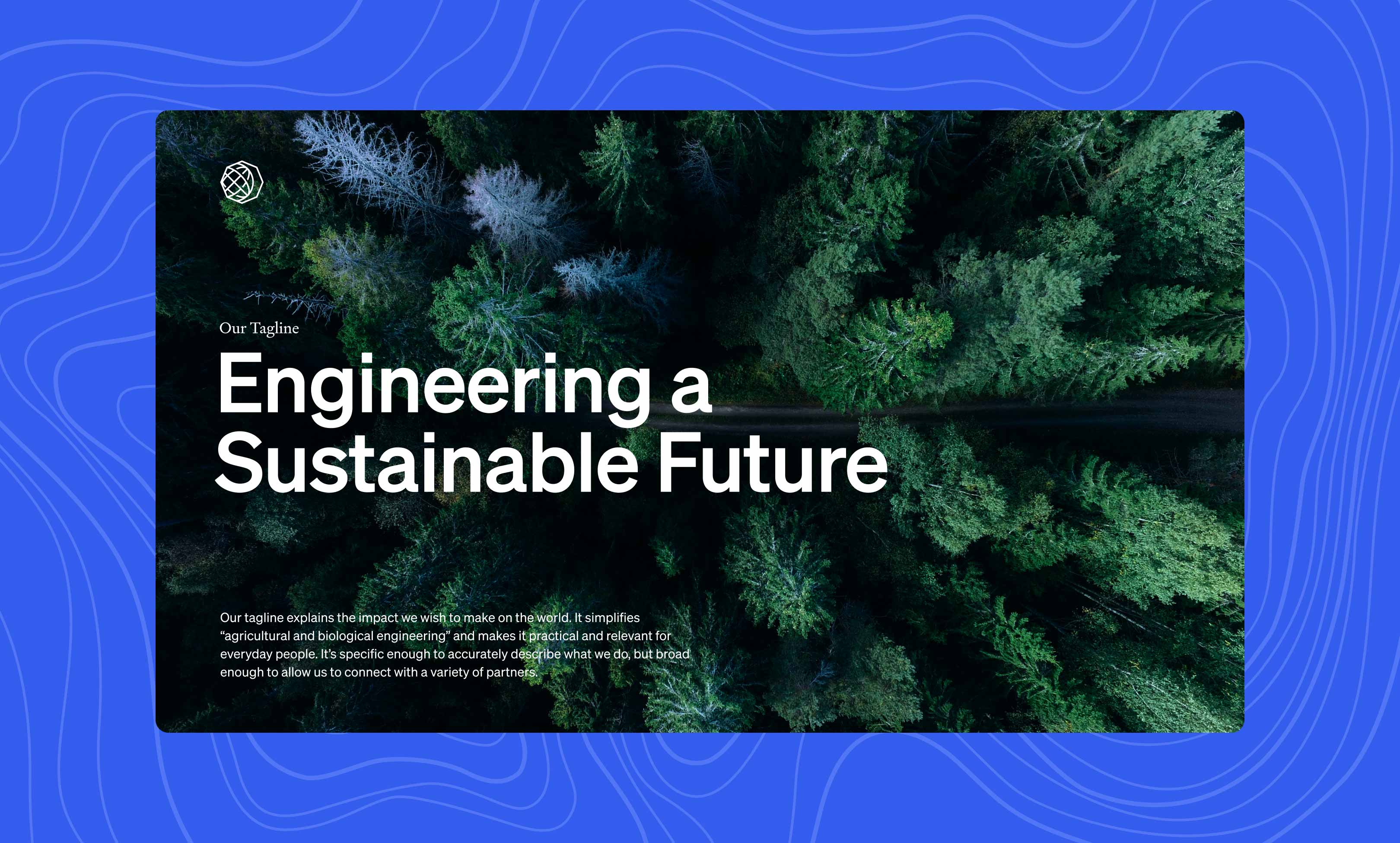
The bedrock of every great brand is a clear statement of purpose. Using the insights from our research, we worked with the ASABE team to refine their Society and Foundation vision & mission statements and develop a compelling tagline. Then we segmented that message for current members, prospective members, and key industry partners.
02
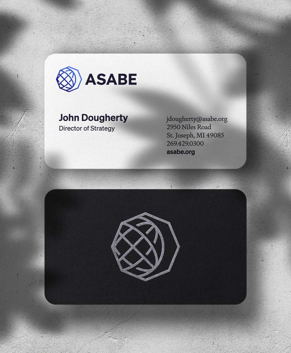
A logo for everyone
Our research showed that current members genuinely recognized and valued the existing logo – particularly, the globe and polygon. However, for the general public and younger engineers, the logo felt somewhat outdated and generic. We recommended keeping those recognizable elements (the globe and polygon) to retain the connection with current members, while giving the design a modern refresh and adding a tagline to make it more appealing to new audiences.
A fresh take


03
ASABE subbrands
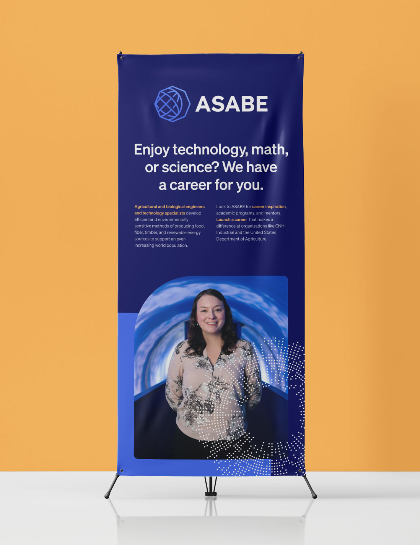
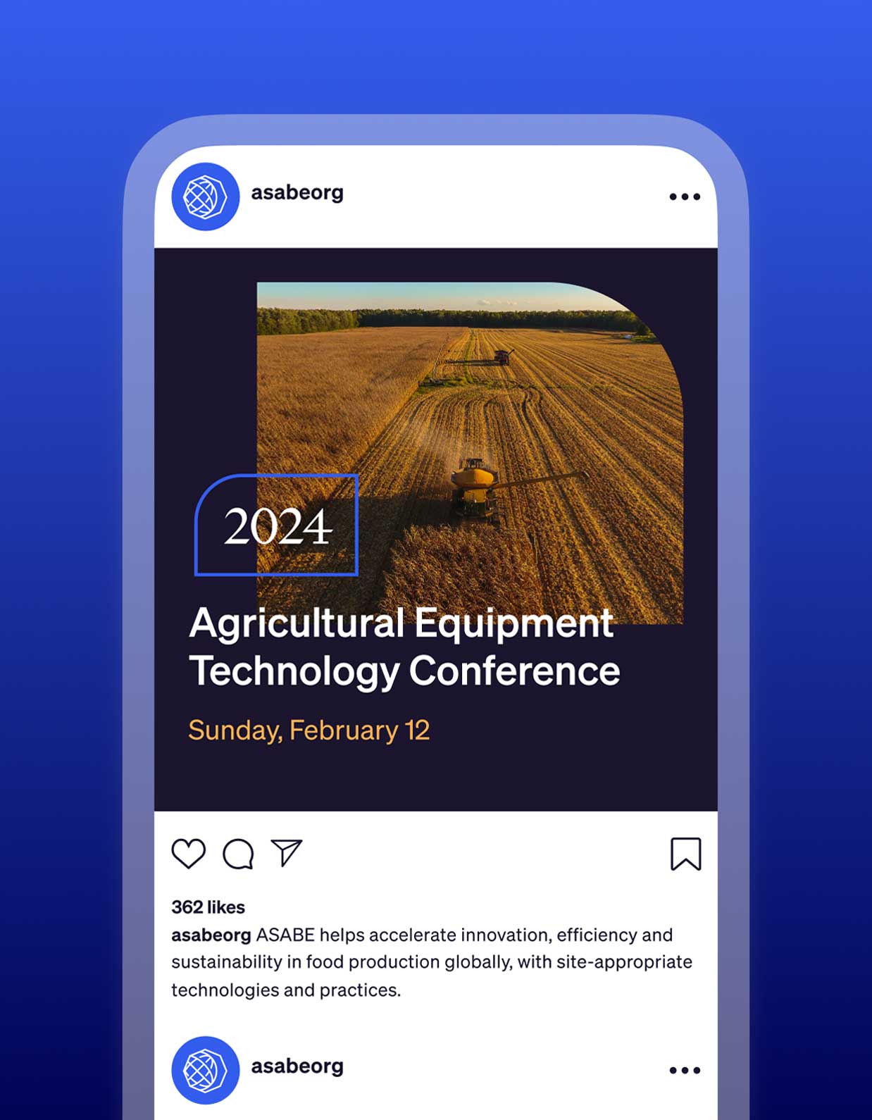
As an international organization, ASABE has a wide array of regional groups, events, and initiatives. We created a defined sub-brand architecture for these different branches.
Established, yet relevant
The new logo, colors, and fonts come together to position ASABE as an established organization while accounting for the tastes and needs of emerging engineers.
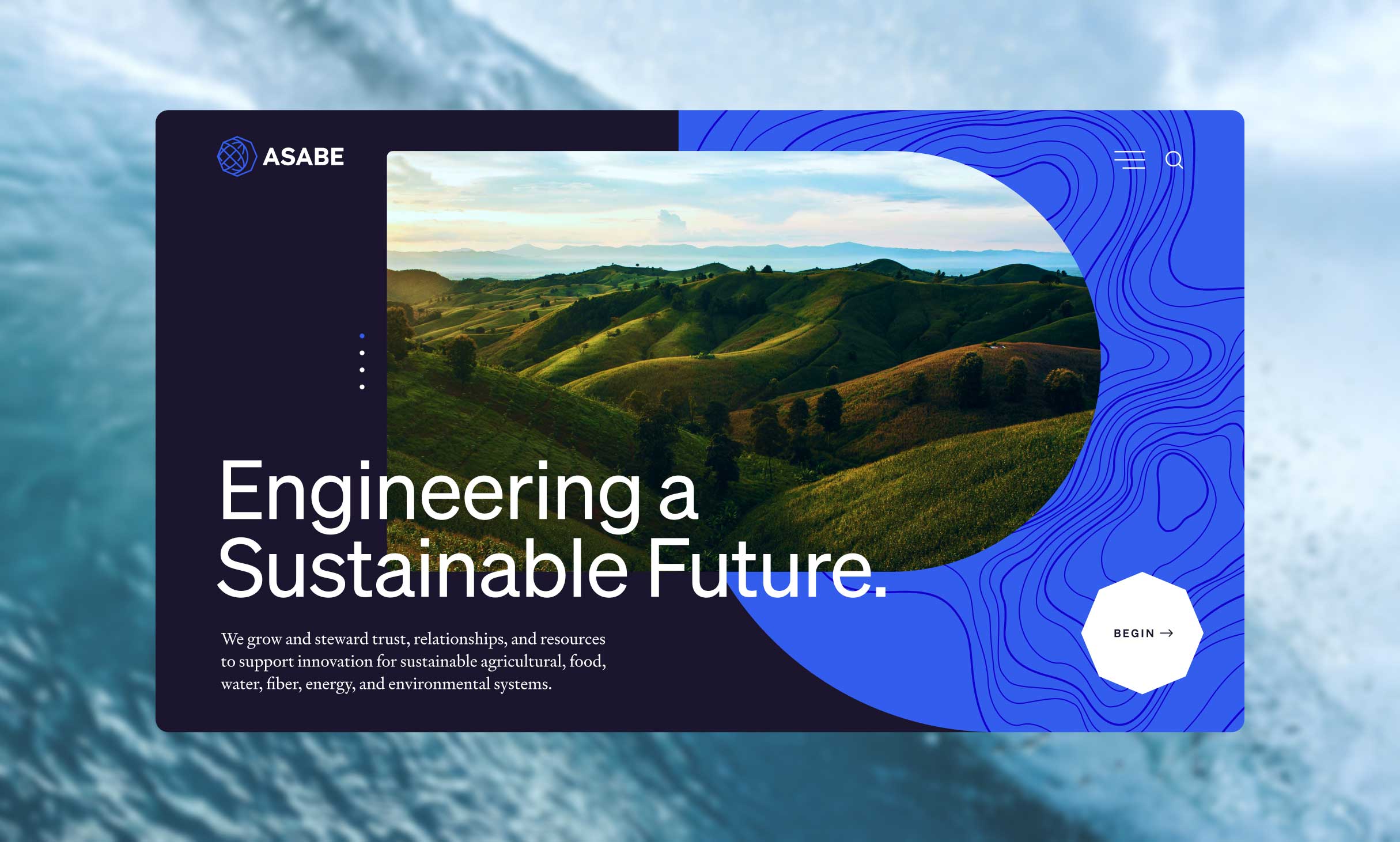
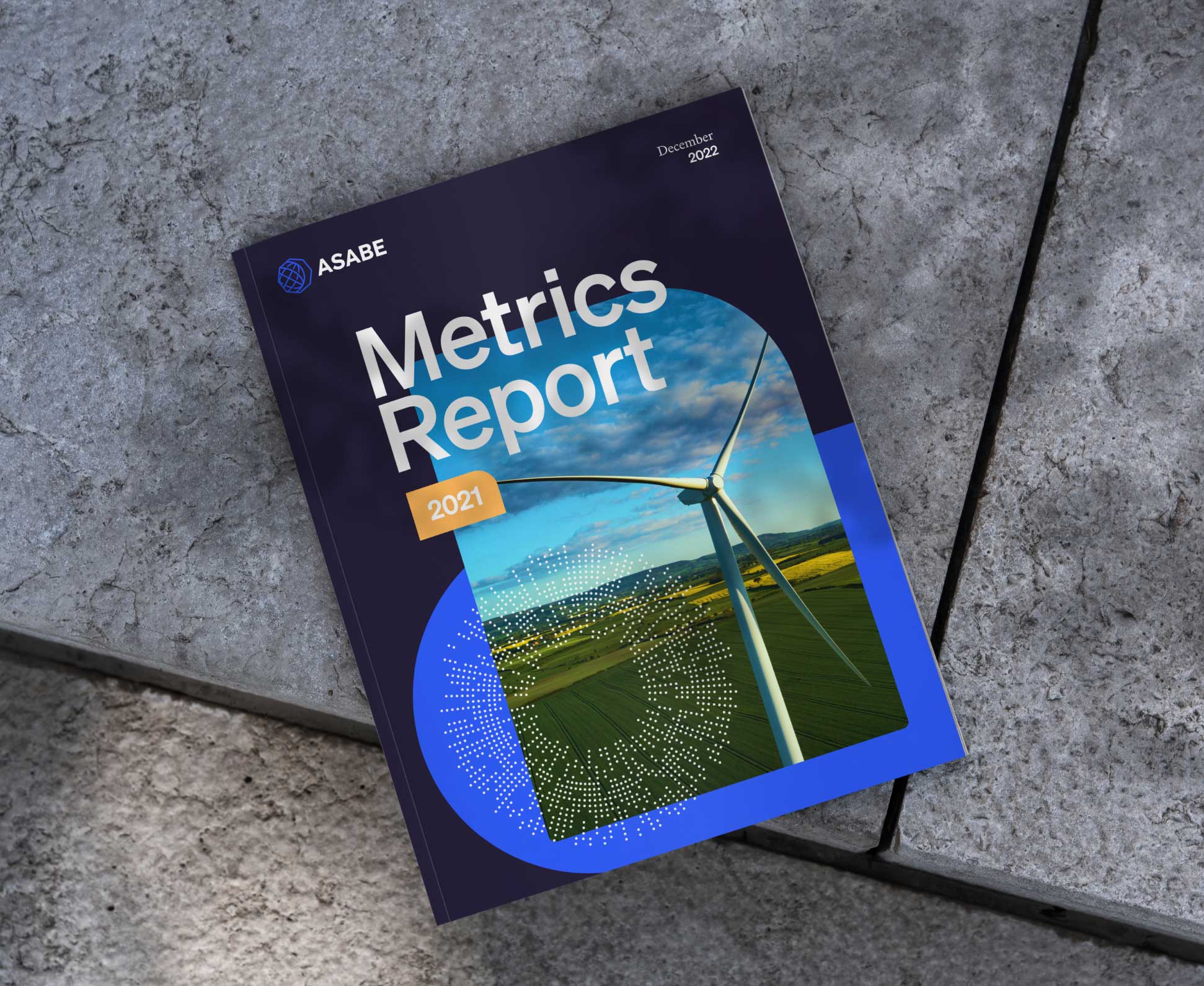
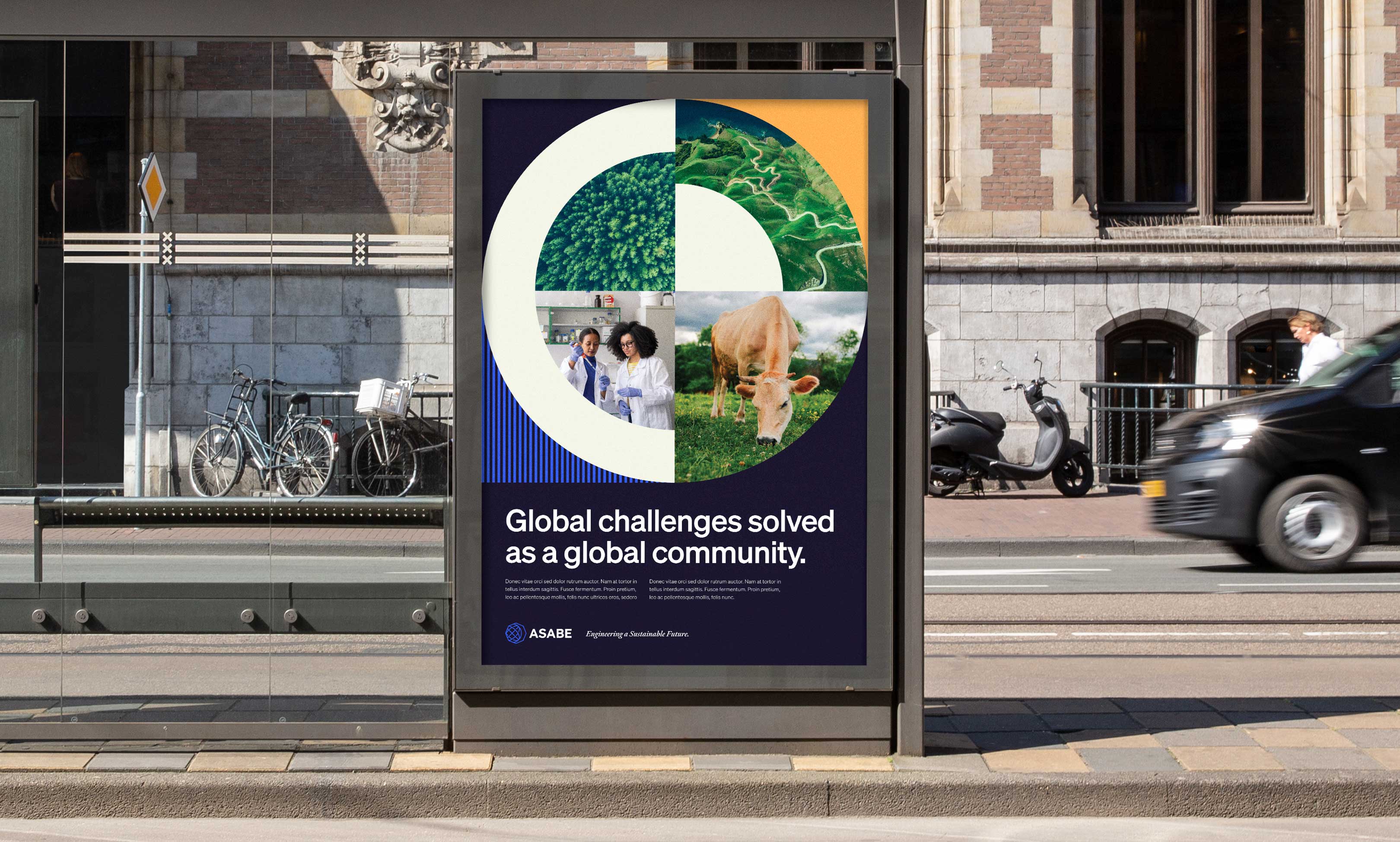
The outcome of our work with Push10 leverages the equity captured in the Society’s previous visual identity, while presenting it in a fresh, contemporary design and enhancing it with clear messages about who we are and what we do that are meaningful to new and existing audiences.
ASABE
Dana Porter, Board President
VISIT THE WEBSITEView Related Work
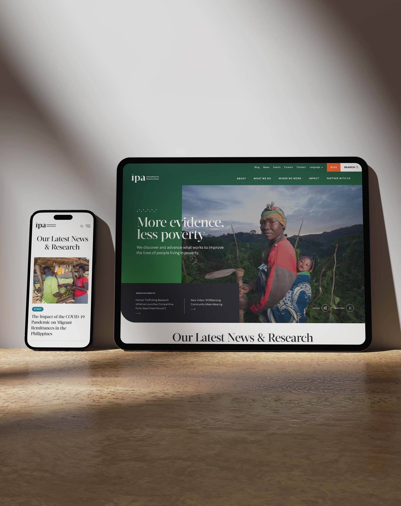
Innovations for Poverty Action
With a fresh new strategic plan, IPA engaged Push10 to construct a brand platform and website aimed at captivating and motivating a broad audience of researchers, policymakers, and donors to unite in the battle against poverty.