Sakhi
Centering Survivor Power
Founded in 1989, Sakhi has always been at the forefront of the survivor-led movement against gender-based violence. Over the years, they witnessed dynamic shifts within the communities they serve and the broader discourse around gender justice. It was time for their brand to shift, too.
01
Workshop & Strategy
We conducted workshops, surveyed staff, interviewed survivors, reviewed comparable organizations, and researched recent literature on gender-based violence in the South Asian + Indo-Caribbean Diaspora in the United States. The research helped us understand common perceptions and experiences of Sakhi’s services while assessing the inclusivity of their brand messaging.

Renaming Sakhi
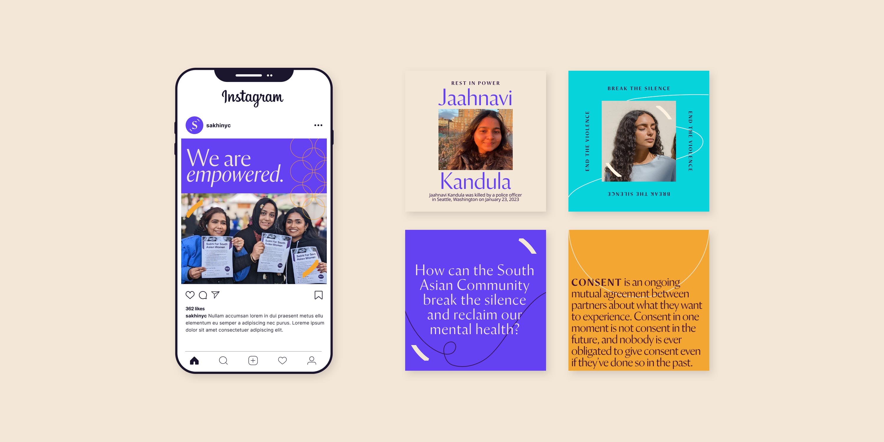
Originally founded as Sakhi for South Asian Women, it was time for a new and more inclusive name. Based on our research, “Sakhi” (which means “woman friend” in Sikh), has a lot of brand equity within the community. So, we recommended that the organization keep the spirit of the old name with a more inclusive twist. By popular vote, “Sakhi for South Asian Women” became “Sakhi for South Asian Survivors.”
02
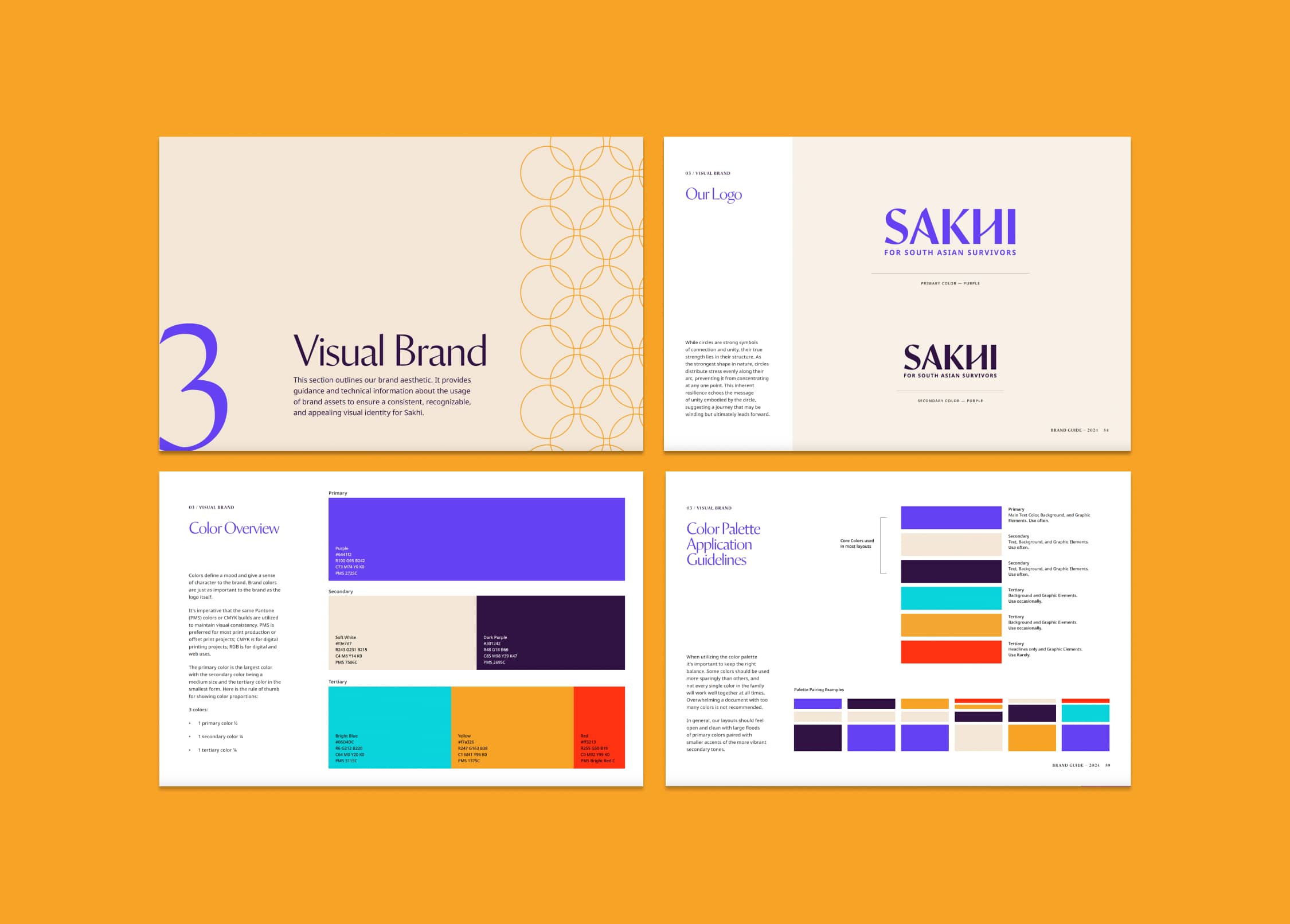
Visual Identity
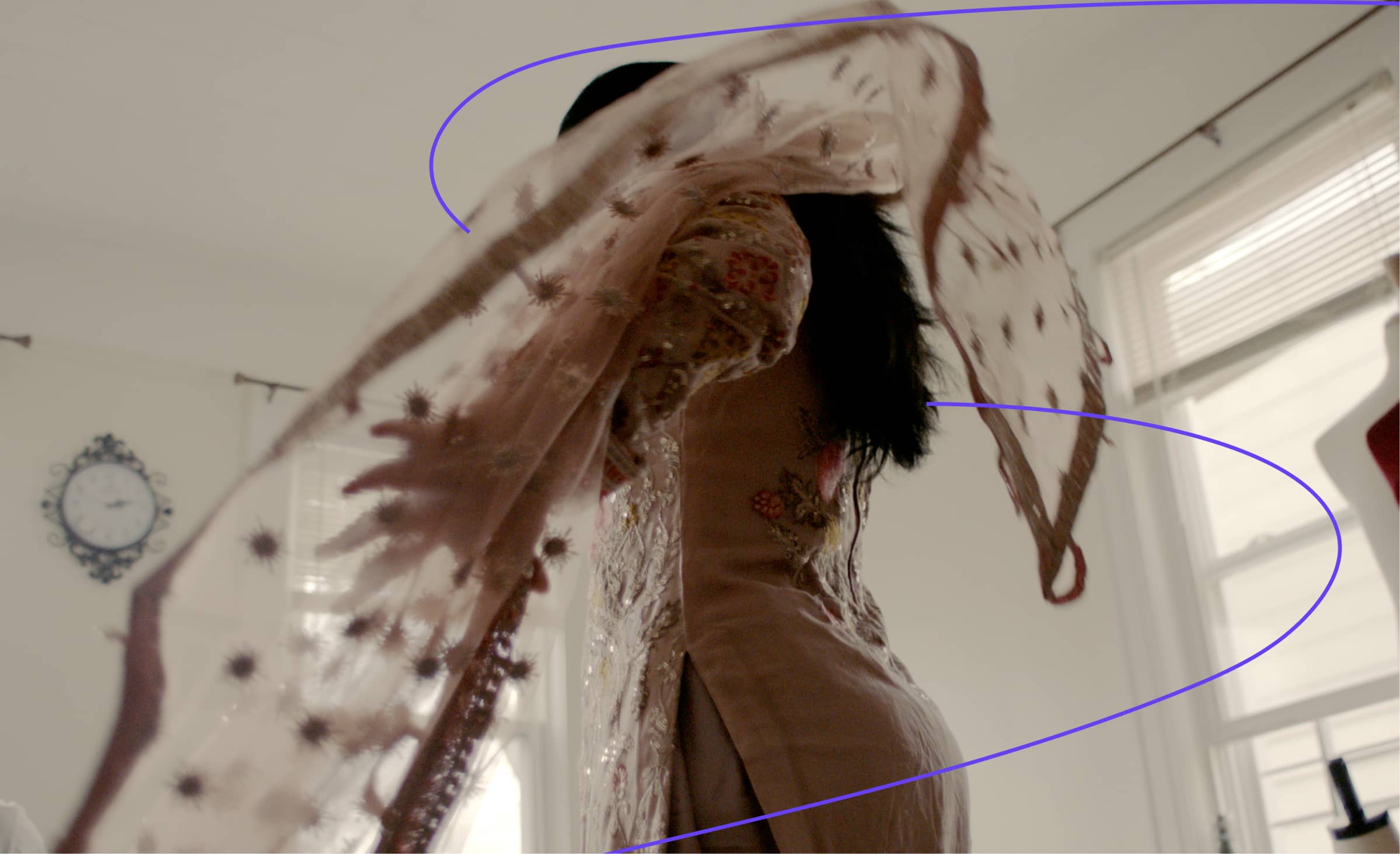
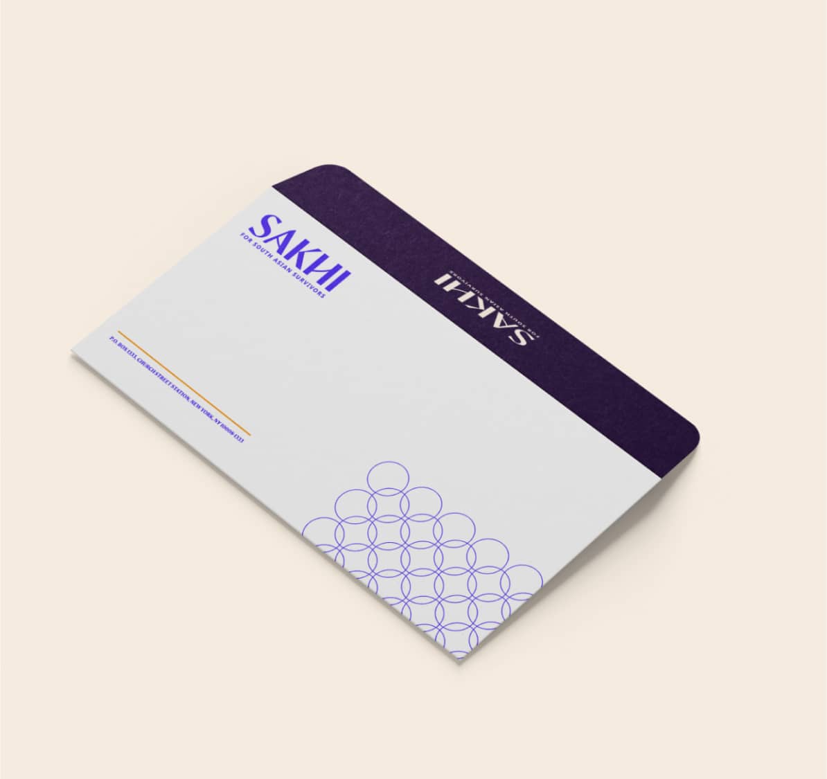
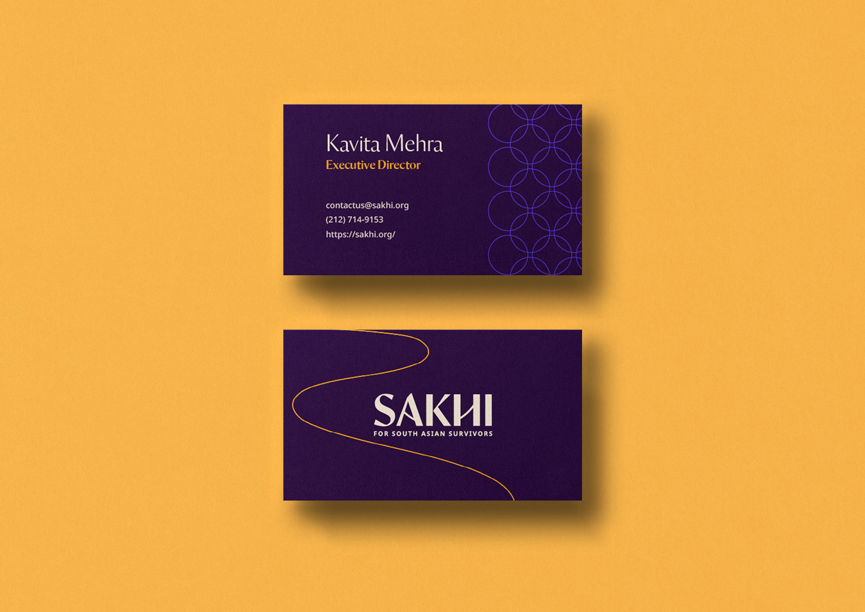
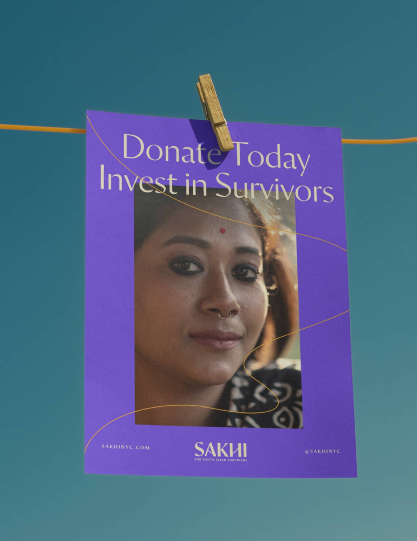
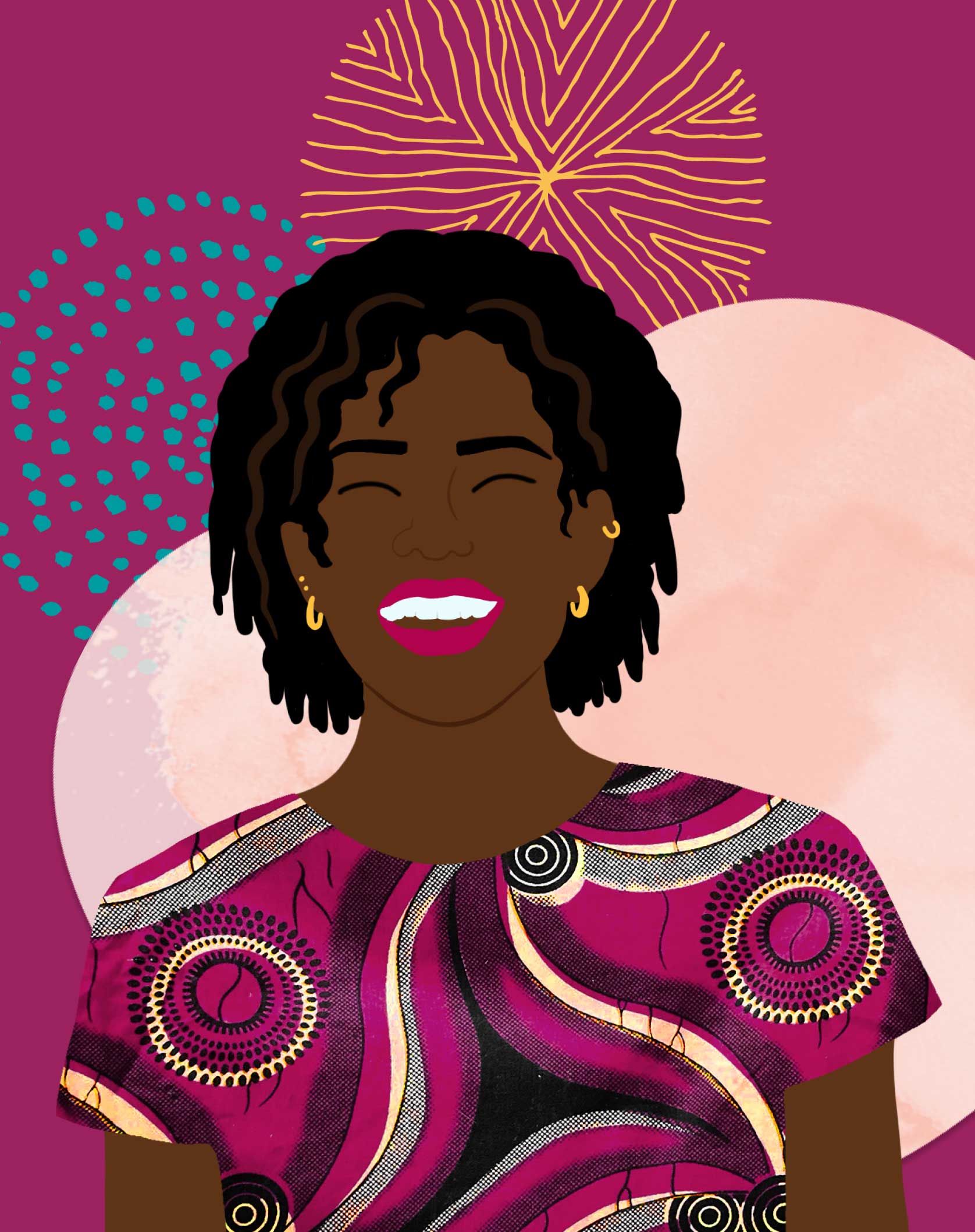
The current brand visuals were outdated and tired. We redesigned the logo, refreshed the color palette, and reimagined the typography to bring a more energetic and lively feel. We also recommended more inclusive and dynamic photography and graphic elements.
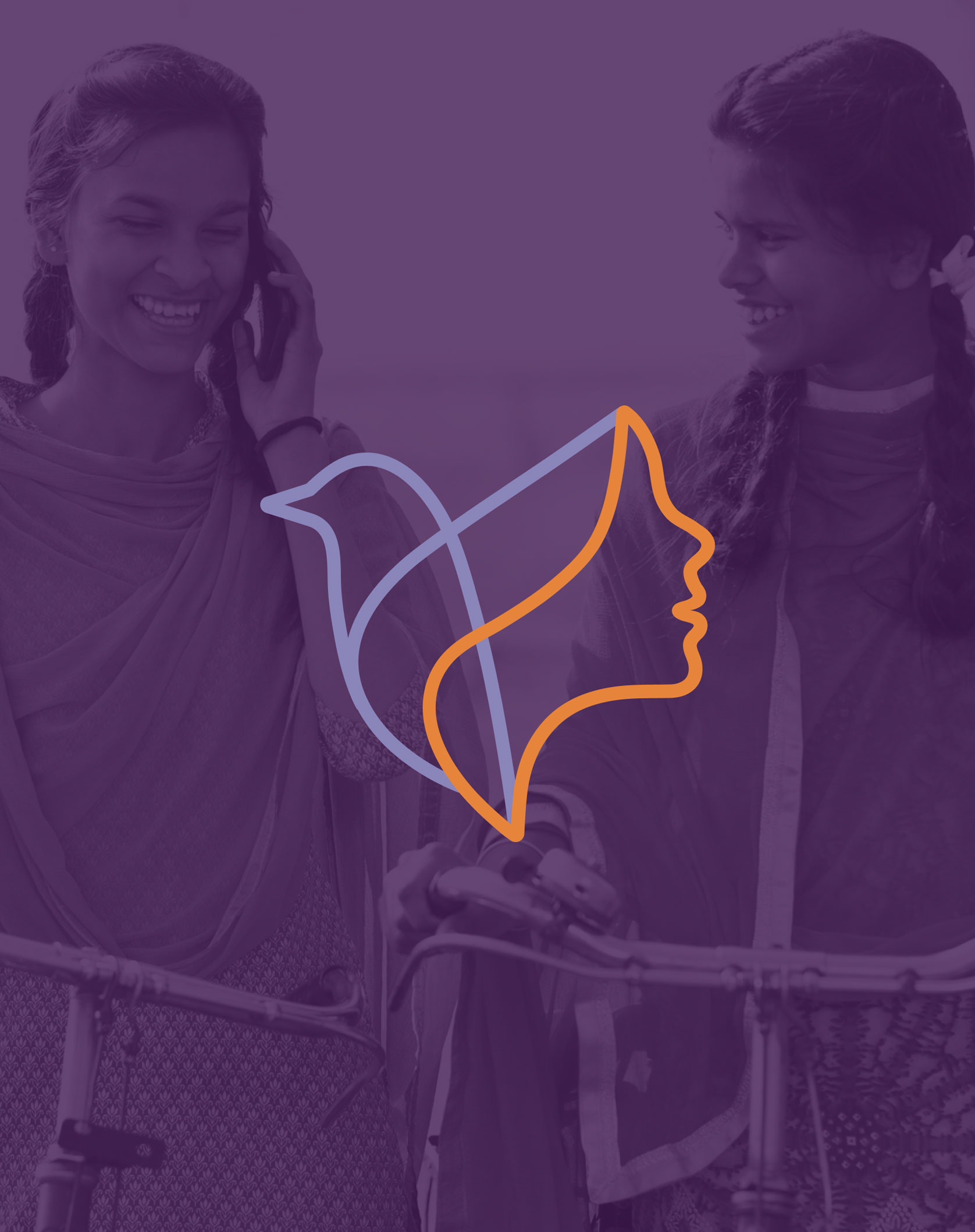
Logo Refresh
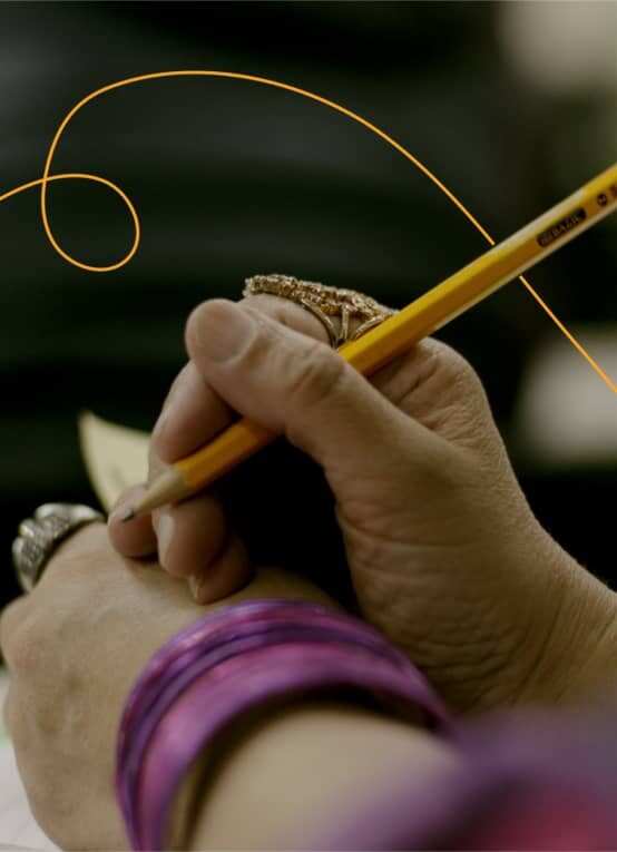
The new Sakhi logo is based on a circle. While circles are strong symbols of connection and unity, their true strength lies in their structure. As the strongest shape in nature, circles distribute stress evenly along their arc, preventing it from concentrating at any one point. This inherent resilience is a perfect symbol for Sakhi’s mission.


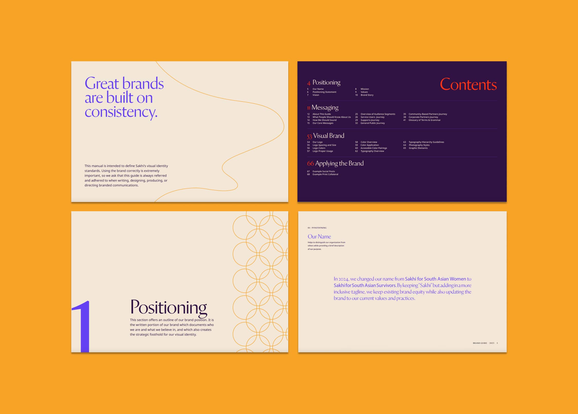
A Comprehensive New Brand Guide
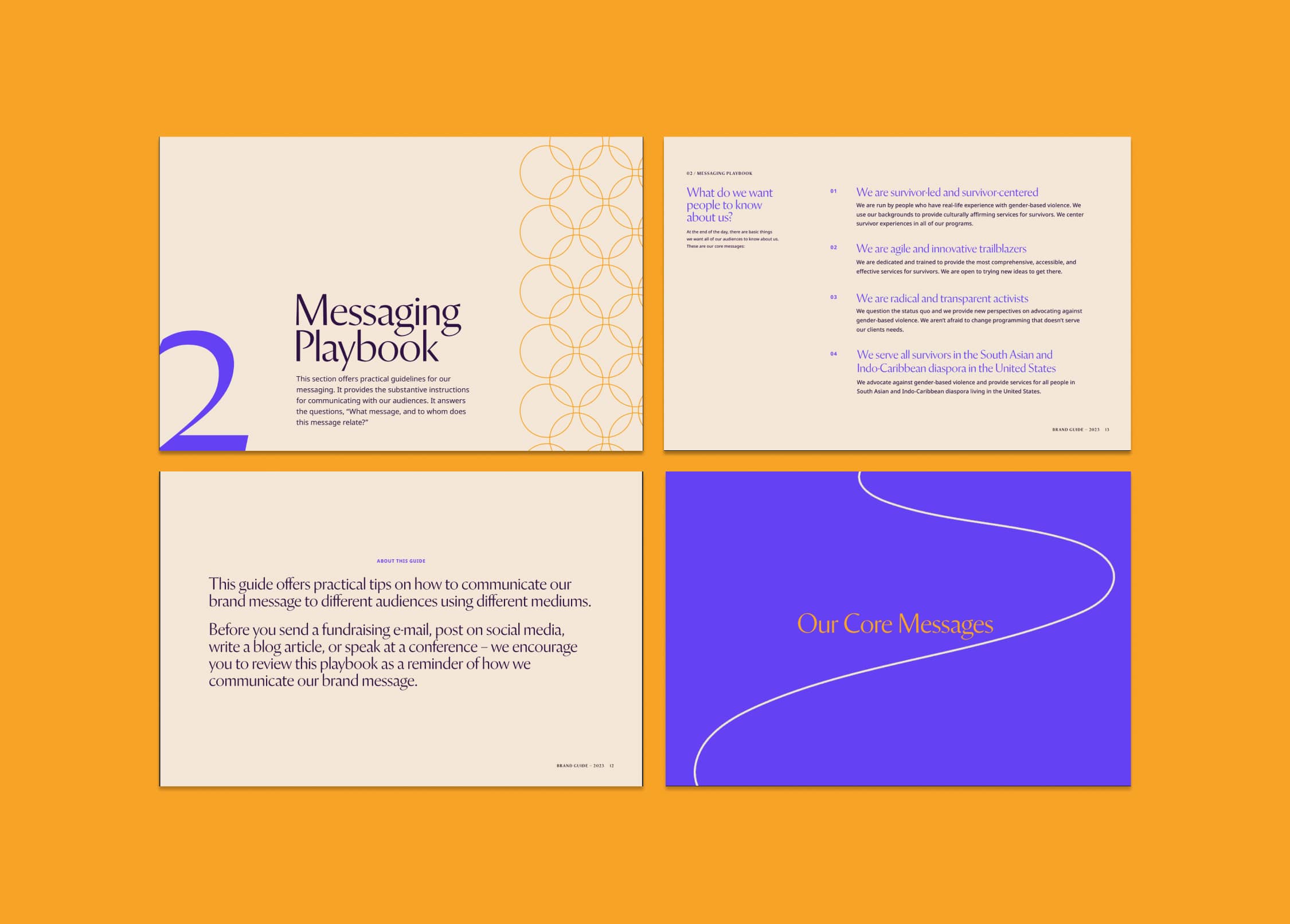
Understanding the sensitivity of Sakhi’s work, we worked closely with their team to clarify the language and terms used in various contexts. We developed a comprehensive glossary of terms to ensure all communications were culturally relevant and survivor-centered. Additionally, we refined the mission, vision, and core messages to more clearly articulate Sakhi’s values.
03
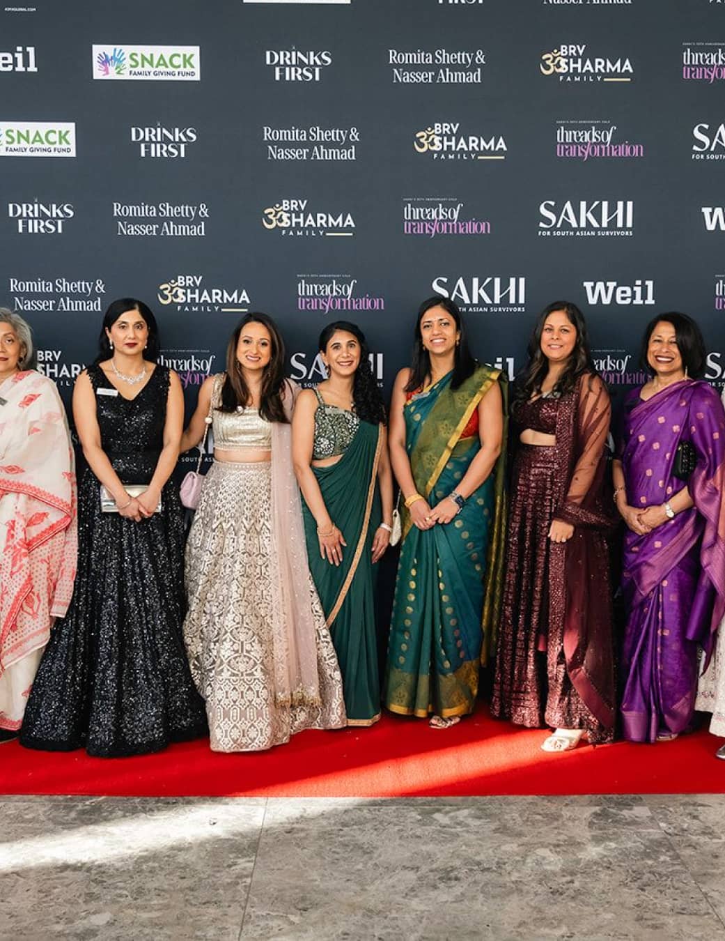
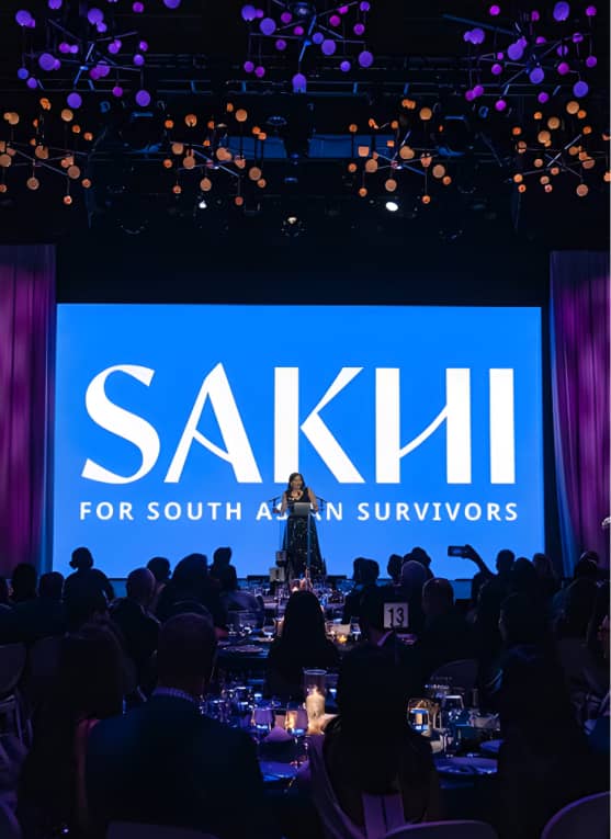
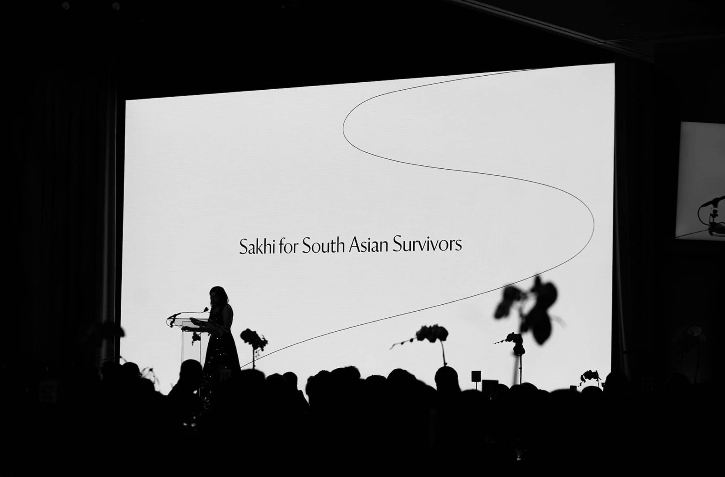
The Big Reveal
To ensure a successful rebrand launch, we provided extensive support for Sakhi’s 35th anniversary gala, “Threads of Transformation.” We prepared event graphics, social media templates, and even co-wrote the opening address with the executive director.
“Push10 served as a thought partner through every step of our rebrand process. They approached each conversation with patience, grace and curiosity, resulting in a stronger, more refined finished product.”
Sakhi
Kavita Mehra, Executive Director
View Related Work
Raising Voices
We collaborated with Raising Voices to create a vibrant, user-friendly website that showcases the impact of their work and improves access to important violence prevention resources.