October 23, 2019
Top Web Design Tips for Finance and Wealth Management Firms

No two web design projects are alike, even within the same industry. But there are many shared best practices.
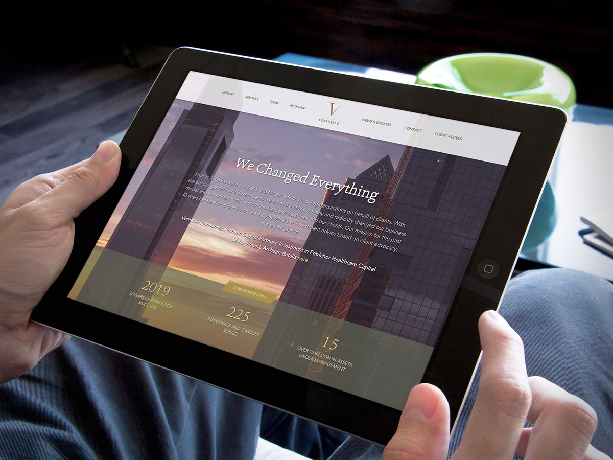
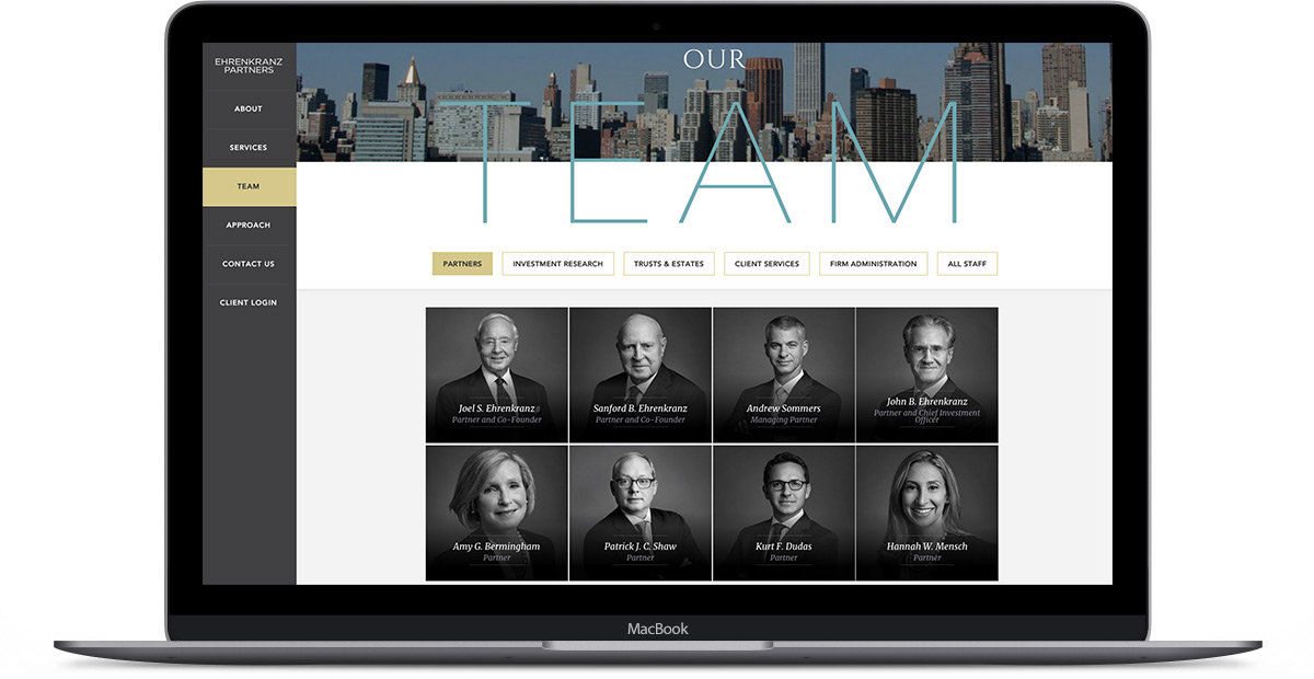
Over the years, we’ve worked with various finance and wealth management firms including Veritable LP, Ehrenkranz Partners, and Lincoln Financial Group to name a few. Not only have we seen similarities in goals, but we’ve also noticed patterns in what works… and what doesn’t.
Nail Your Brand First
The first tip for effective wealth management web design isn’t related to websites at all. If your firm doesn’t have a clear mission and actually fulfill its brand promise to your clients, then all the latest web design tips in the world aren’t going to help you succeed. Like many industries, the wealth management space is crowded with competitors who all do the same thing, more or less. You need to stand out. Among savvy marketers, it’s become common knowledge that a brand is much more than just a logo design. Your brand is what people say about you when you’re not in the room. To stand out, your brand needs to be unique, authentic, and trusted. Your website is simply a vehicle to communicate your brand promise to your target audience. If you’re able to establish a solid brand identity first, designing an effective website becomes a much easier process.
How do we do it?
Before we start thinking about a visual identity or web design, we begin by leading our clients through an elaborate brand strategy phase, in which we learn about their firm, their clients, their prospects, and their competition. We accomplish this through a various research tactics including stakeholder interviews, surveys, competitive audits, and more. When done, we’re able to identify opportunities within the market, solidify their mission/vision, and craft visual assets and brand messaging accordingly.

Digital Strategy & Planning
Armed with a killer brand, you’re ready to dive into a new web design right? Wrong. As a creative professional and former graphic designer, I was always excited to get to work on the interface design. For me, that’s the fun part. But if you want to ensure success, you need to walk before you run.
How do we do it?
At Push10, our digital strategy and website planning phase typically takes 4-6 weeks and consists of exercises and deliverables including surveys, interviews, goal setting, content strategy, UX strategy, testing, audits, visual brief, site architecture, interactive prototypes, and more. Combined, these activities help us paint a clear picture of the best path forward for each individual client. This strategic planning phase is the foundational bedrock of each project. Skip it at your own risk.
Design for Your Audience
Your interface design needs to be inline with your brand. Are you stoic and traditional? Or are you edgy and forward-thinking? Either way, a well-designed website will work hand-in-hand with your visual brand identity to form a consistent picture for your audience.
How do we do it?
It depends. Some clients engage us to build a new brand identity from the ground up. In this case, the transition to the web design phase is quite natural. In other cases, we are crafting websites around existing brands so we need to perform a careful audit of existing materials before we can design an appropriately-branded user interface.
Validate Your Firm
As you likely develop most of your client relationships offline, it’s important that for your website to validate the feeling the client had when they met you in person. A feeling of professionalism. A feeling of trust. A feeling of sophistication. Your suit says it. Your handshake says it. Your website should say it too.
How do we do it?
We create engaging visual design and memorable messaging that captures the heart of your brand. One look at your new site and your client should know it’s “you.”
Showcase Your People
More than anything, wealth management firms are selling their people and the expertise of their team. Your website should be professional, yet personable and relatable. Your online persona should align with your offline persona and at the very core, you need to communicate a sense of trust.
How do we do it?
We begin by creating unique bios with professional portraits and memorable stories. Some wealth managers are “suits and ties” while others are “jeans and tees.” There’s no right or wrong. What matters is authenticity. Your team should be creating thoughtful, impactful content both on your site, as well as on third-party platforms. We recommend pulling this content into each authors’ bio page to showcase the expertise of your thought leaders. Likewise, we typically recommend providing links to LinkedIn profiles and/or other contact information that will allow your target audience to feel a sense of connection with your team.
Rethink Your Services
Many of our wealth management clients have expanded their services beyond what they feature on their site. They might have family office services as well as corporate services. Or perhaps they offer legal or tax services to complement core offerings.
How do we do it?
We re-imagine website content and site architecture to better showcase the through-line between various offerings. In addition, we often help our clients re-write their website copy, allowing them to communicate otherwise “dry” financial information in an engaging, informative manner. After all, if your services pages are nap-inducing, then you will likely fail to communicate the intended message.
Communicate Your Unique Investment Approach
We’ve also found that, despite similarities, no two investment philosophies are identical. To generate trust amongst your audience, it’s important to explain your investment philosophy, in detail, and why it’s superior to your competitor’s approach.
How do we do it?
We create prominent calls to action to drive traffic to specific page(s) outlining investment strategies. Once there, we try to use plain language and infographics to better help users understand complicated investment models.
Maintain and Cultivate Current Client Relationships
It’s common business knowledge that it’s easier to keep your current clients happy than it is to attract new prospects. Staying actively engaged with your current client base and help reduce churn and provide a steady bottom line from which to grow your firm. We’ve found that many of our wealth management clients are very concerned about the overall experience of their current clients, yet often haven’t considered how the website strengthen those vital relationships. Many have outdated “portals” where clients are expected to log in, but they are often clunky, off-brand, and fail to meet expectations.
How do we do it?
We work with our clients to understand the baseline requirements of their client portals and make recommendations to improve the user experience. Often, we will provide design assistance as well, as it’s important to give the portal a fresh coat of paint, inline with the new brand identity and public-facing website. From public website to login to client portal, it’s key to have a continuous branded look & feel as it helps to reinforce trust. It’s important to continually engage your current clients outside of the user portal as well. We recommend creating content to provide valuable, useful information to your current client base. This content should be distributed via email, social media, your website, or perhaps all of the above.
Final Thoughts
While many best practices for web design are universal, wealth management websites require a special set of features and functionality to serve as effective marketing and client retention tools. It’s important to remember, however, that while your site may incorporate similar tactics as other firms, it’s vital that your web design is authentic, unique, and delivers on your firm’s brand promise.


