Premium Sushi for All
Deliverables
Brand StrategyPrint DesignPackage DesignEnvironmental DesignIllustrationGood sushi should delight your eyes as much as it delights your taste buds. Mai’s mission is to make this beautiful, delicious sushi accessible to hungry consumers everywhere. And with some ongoing brand design work from our team, they’re ever closer to realizing that goal.
Push10 serves CPG clients via Aid&Abet, its specialized food & beverage branding agency. As part of an ongoing partnership, Aid&Abet is helping to refine and enhance the burgeoning family of brands, just like Mai.
Tasteful Illustrations
A line is just a line until it becomes part of a story and evokes a feeling. The illustrations we designed for the Mai brand are rich with the inspiration of Japanese origami, the sophistication of a premium product, and the playfulness of Mai’s approachable personality.

Make Friends with a Sushi Brand
Shaping the personality of Mai’s brand wasn’t about having fun for fun’s sake or to flex a creative muscle. It was an intentional and strategic step toward achieving their business goal of developing a premium line of sushi that feels approachable to all. Like a good friend, an effective brand invites you in the door.
Stickers, meet Sticky Rice
Mai’s sushi is often served in fresh chef-to-shelf environments, requiring chefs to properly label packages on the fly. The clear, consistent labeling system we designed makes this process not just easy for chefs, but straight forward for consumers.
A Fresh Web Design
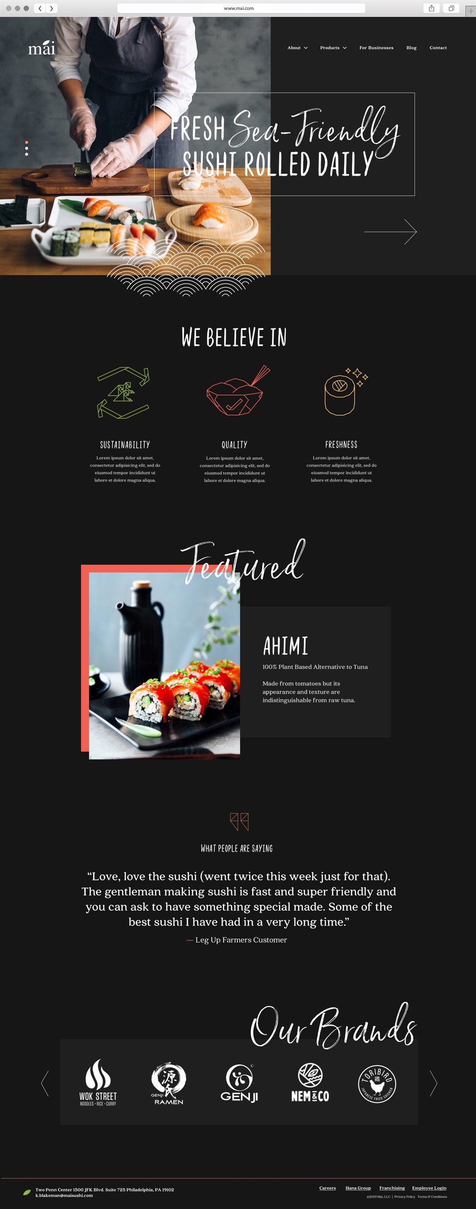
Mai serves exceptional, sustainable sushi to hungry consumers, but their website needed to serve more. Built as a tool for B2B marketing that was simultaneously consumer-friendly, the new Mai website furthers the consistent brand experience from in-person to online.
Products can be highlighted and easily updated with the season.
Instantly, website visitors understand who Mai is and what they offer to the world.


